Image of the day: Ali Sharaf identity by MashCreative
MashCreative's branding work for UAE-Based photographer Ali Shara is brilliant in its simplicity. We catch up with the man behind it, Mark Bloom, to find out more
Computer Arts: Tell us about the project ...
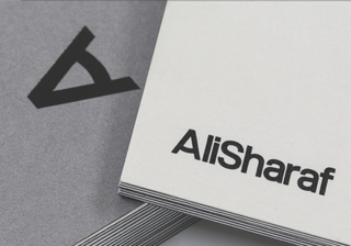
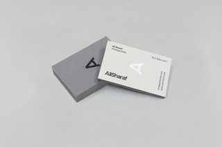
Mark Bloom: Ali Sharaf is a UAE-based photographer. He approached me to design his identity after seeing the work I had done for Tom Solo Photography. Like me, Ali is inspired by Swiss modernist design, so, with this in mind, I adopted a less-is-more approach to his identity. The result is a recognisable and relevant marque, which communicates his core brand values.
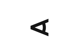
I didn't want to take the identity down the cliched route of a camera lens, or similar, as this has been done so many times before. I have always loved the FedEx logo: the hidden arrow is just genius. It inspired me to design a logo that had a subtle, double meaning. When you strip it back to basics, a photographer, even without a camera in their hand, is visualising the shot. A single eye is often used to look through the viewfinder to frame the shot. The marque symbolises both an eye and the letter A, rotated 90 degrees counter clockwise.

CA: How did you put the piece together?
MB: When it comes to designing identities, I normally spend a day or two researching before I even begin any design work. This will include sketching ideas and forming a picture in my head of the direction I intend the brand to take. The next stage is producing initial concepts, normally three-four variants, which are then presented to the client for feedback.
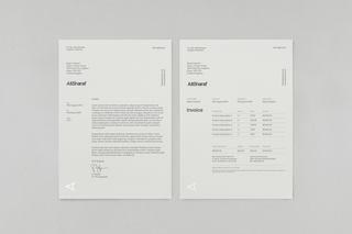
In this instance, the concepts went through several amendment and tweaking stages until the identity was finalised. As projects go, this was actually a fairly smooth process. As a one-man business, I generally spend a few hours every morning on admin – emailing clients, invoicing and so on. Late morning until evening is spent designing. Most of my work is vector-based, so I use Illustrator for identities and for larger multi-page jobs I use InDesign.

CA: Tell us more about your studio, MashCreative ...
MB: As mentioned earlier, Mash is essentially a one-man business and has been running since 2009. When designing an identity, I'll try to strip away anything that I deem unnecessarily or that may make the logo look busy or overly complicated. For me, a perfect logo will be created with as few lines as possible, remain timeless and have a clear, memorable message.
Most of my design inspiration comes from early Swiss modernist design. Wim Crouwel is my ultimate design hero – his work was always so far ahead of its time. Much of his early work still looks relevant today. Like Wim and Josef Mller-Brockmann, I design on a grid, this helps maintain structure to all my work.
Check out more from Mark Bloom at mashcreative.co.uk
Get the Creative Bloq Newsletter
Daily design news, reviews, how-tos and more, as picked by the editors.


Thank you for reading 5 articles this month* Join now for unlimited access
Enjoy your first month for just £1 / $1 / €1
*Read 5 free articles per month without a subscription

Join now for unlimited access
Try first month for just £1 / $1 / €1
The Creative Bloq team is made up of a group of design fans, and has changed and evolved since Creative Bloq began back in 2012. The current website team consists of eight full-time members of staff: Editor Georgia Coggan, Deputy Editor Rosie Hilder, Ecommerce Editor Beren Neale, Senior News Editor Daniel Piper, Editor, Digital Art and 3D Ian Dean, Tech Reviews Editor Erlingur Einarsson and Ecommerce Writer Beth Nicholls and Staff Writer Natalie Fear, as well as a roster of freelancers from around the world. The 3D World and ImagineFX magazine teams also pitch in, ensuring that content from 3D World and ImagineFX is represented on Creative Bloq.
