Hypnotic repeat pattern Advent calendar tears up the rulebook
When asked by a friend to help create an Advent calendar, designer Angelo Stitz came up with a plan to streamline the concept.

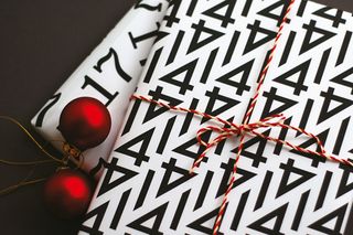
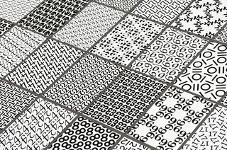
We're big fans of cool calendar designs here at Creative Bloq. So we were excited to see this unique take on the Advent calendar by graphic designer Angelo Stitz. After being invited by a friend to help create a new design, Stiz came up with a plan to streamline the concept, by transforming numerals into graphic patterns to be printed onto wrapping paper for each day's gift. We chatted to him to find out more.
What inspired this project?
The main idea came from a colleague, who asked me to draw some figures for her Advent calendar. We thought, why not use numerals themselves to design wrapping paper for your Advent calendar gifts? This way you don't need tiny boxes.
How did you develop the designs?
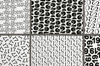
All the numerals were specially drawn for the paper, so that they are each shown off to their best advantage in the specific pattern. The idea was to create a journey through different typographic ages like classicism or baroque. I got inspiration from old specimen textbooks for pen and brush lettering like The Speedball Textbooks, and books like Meisterbuch der Schrift by Jan Tschichold.

What was the most challenging aspect?
I spent a lot of time designing the patterns for eight and 18. During the process I noticed that figures with closed shapes usually don't fit very well in patterns. Open shapes are easier because the shape interacts more with its surrounding white space. The design doesn’t depend on legibility, but more on a harmonic interplay of patterns. The main object
was to create an ornamental pattern, separate from the actual number.
Which is your favourite design?
The arrangement of numerals poses different challenges to usual typeface design. For example, the figure '1' in number 14 has the same edge-gated shape as the diagonal corner of the '4'. That's the reason why the design for number 14 is one of my favourites, because the numerals meld together perfectly to form a pattern. You don't realise the number immediately, only at second appearance. And I love the 23, just because I like fat type which uses deep black printing ink.

Based in Germany, Angelo Stitz specialises in drawing and developing custom typefaces, designing books, logos and wordmarks. This article originally appeared in Computer Arts issue 224.

Thank you for reading 5 articles this month* Join now for unlimited access
Enjoy your first month for just £1 / $1 / €1
*Read 5 free articles per month without a subscription

Join now for unlimited access
Try first month for just £1 / $1 / €1
Get the Creative Bloq Newsletter
Daily design news, reviews, how-tos and more, as picked by the editors.
The Creative Bloq team is made up of a group of design fans, and has changed and evolved since Creative Bloq began back in 2012. The current website team consists of eight full-time members of staff: Editor Georgia Coggan, Deputy Editor Rosie Hilder, Ecommerce Editor Beren Neale, Senior News Editor Daniel Piper, Editor, Digital Art and 3D Ian Dean, Tech Reviews Editor Erlingur Einarsson and Ecommerce Writer Beth Nicholls and Staff Writer Natalie Fear, as well as a roster of freelancers from around the world. The 3D World and ImagineFX magazine teams also pitch in, ensuring that content from 3D World and ImagineFX is represented on Creative Bloq.
