How helloMuller created Zero's distinctive and vibrant cover
Designer helloMuller experimented with ripped pages, fluoro paper and deliberate print errors for a special edition of spy comic Zero.
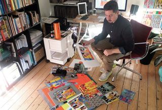
Already responsible for the covers and brand design direction of Zero, a monthly spy comic from writer Ales Kot, hellomuller aka Tom Muller was tasked with creating a cohesive design for a special collected edition of the first five issues, as he explains here...
Zero is published by Image Comics and written by Ales Kot, who created and owns the series. I started working on Zero around March last year, after Ales had got in touch to ask if I was interested in working with him on the series and creating the covers.
I thought it was the perfect opportunity to combine our talents. The brief was fairly straightforward: to create a comic with covers like nothing else on the shelves. As the series has progressed, my work has expanded to not only designing the covers, but all interior pages that aren't comic story - synopsis and character bio pages, prose text, chapter titles, and so on.
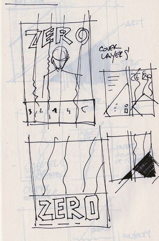
What intrigued me most about Ales' proposition on Zero was that I was given the opportunity to create full publication designs on an ongoing basis. Rather than just supplying a logo, I'd be helping to shape the look and feel of the series, with the freedom to experiment and push the boundaries of cover design in comics.
One thing that sets Zero apart from other ongoing series is that each issue is drawn by a different artist. As such there was a need to have the covers as a constant; tying the series together. Even though each cover is designed differently, the visual discord and a few constant elements link the books together. Aside from myself and Ales, the only regular collaborators on the series are Jordie Bellaire, the colourist, and Clayton Cowles, who letters the books.
The Zero series was initially scheduled for May 2013 but we pushed it back to September, giving Ales time to flesh out the story and lock down artists. The first issue finally launched in the third week of September 2013. The collected edition encompasses the first five issues, and went on sale in February 2014.
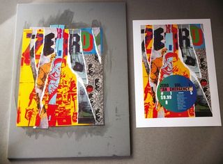
Work in progress
The Zero team is located all over the world. Ales and Clayton, who letters the books, are in New York, colourist Jordie is in Ireland, I'm in London, and Image Comics is in California. Then we have the artists, who are spread internationally.
Get the Creative Bloq Newsletter
Daily design news, reviews, how-tos and more, as picked by the editors.
Ales wanted each issue as a stand-alone story within the wider narrative, with each set in a different location and point in time of the lead character Edward Zero's life. So the theme of each issue already informs the direction the design will take. The difference in narrative and artist for each issue gave me the opportunity to experiment and play with different approaches. I started with concept sketches, even just thumbnail-sized to gauge proportions, then designed the work in the CS6 suite. I used Illustrator and Photoshop CS6 for the type design and image creation.
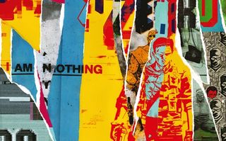
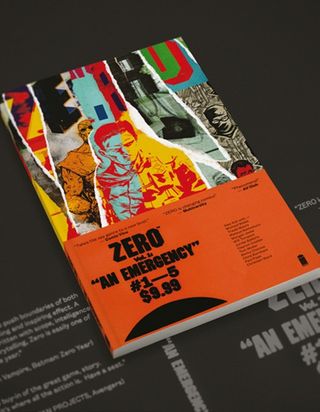
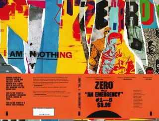
For the collected edition, the main challenge was to create a design that distilled the first five issues. I wanted to show that the book was made from the single issues, and hint at the multi-layered, fragmented storyline that runs through them. We agreed on the torn collage concept to represent that idea.
Initially I wanted to tear up the actual comic covers but since I had to create the design before issue 5 was printed, I created multiple prints of the individual covers and used those to assemble the cover. To form the end product I experimented with printing on fluoro papers, scanning and assembling printed elements, including deliberate print errors in the design to add an extra layer of tactility to the book, in keeping with the off-kilter theme of the series.
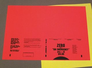
I used InDesign CS6 to assemble it all and output it for print as prepress PDFs. All of those files were then uploaded to the Image Comics FTP for final proofing and assembly before going to print.
Conclusion
The Zero series was announced in June 2013 and the first issue launched on the third week of September 2013. This was followed by the first collection (issues one to five) on 19 February 2014.
I think the collection design is another step up on the Zero ladder. The beauty of this project is that we can reinvent the comic every single issue, and in the process refine the 'there is no formula' formula. My main goal for the collected edition was to capture the idea that the book is made from the pieces of the single stories, within a striking design, and I think we achieved that.
The way the series, and each issue, is created is - deadlines permitting - a very open, collaborative process that allows for creative experimentation. The intent has always been to make a statement with this and we're doing just that. And if I wanted to do anything differently, there's always the next issue of Zero.
Image Comics offers massive support in terms of marketing, sales and production. The team will comb through the final design deliverables, assist with production cost estimates and make sure the books get printed and shipped. They're great champions of creator-owned comics and a good partner to have in your corner.
Ales Kot said every single person involved in this project was a great artist, adding: "I hired everyone to collaborate in an open space, putting our creativity and our will together to reach a new destination in contemporary fiction. We succeeded."
Zero has been incredibly well received by press and readers alike, with the cover designs helping to create a buzz and awareness in a marketplace - and industry - where design and designers are largely invisible. Personally, its very gratifying to make a dent in the perception of comics and how they're designed.
Words: Tom Muller
This article originally appeared in Computer Arts issue 224.

Thank you for reading 5 articles this month* Join now for unlimited access
Enjoy your first month for just £1 / $1 / €1
*Read 5 free articles per month without a subscription

Join now for unlimited access
Try first month for just £1 / $1 / €1
The Creative Bloq team is made up of a group of design fans, and has changed and evolved since Creative Bloq began back in 2012. The current website team consists of eight full-time members of staff: Editor Georgia Coggan, Deputy Editor Rosie Hilder, Ecommerce Editor Beren Neale, Senior News Editor Daniel Piper, Editor, Digital Art and 3D Ian Dean, Tech Reviews Editor Erlingur Einarsson, Ecommerce Writer Beth Nicholls and Staff Writer Natalie Fear, as well as a roster of freelancers from around the world. The ImagineFX magazine team also pitch in, ensuring that content from leading digital art publication ImagineFX is represented on Creative Bloq.
