How to design the spaces in-between
Top designer Tom Muller explains why you should design the whole kitchen, right down to the patterns on the tea-towels...
Every good design lecture needs a quote. One of our favourites of Reasons To Be Creative 2014 so far has come (unexpectedly) from graphic designer Tom Muller's dad:
"When you design a kitchen, you should also design the patterns on the tea towels and the graphics of the coffee mugs. It's never about the big picture: it's everything that sits within that big picture."
As Muller went on to explain during an particularly inspiring speaker session – entitled 'Designing the spaces in-between' – this was his dad's version of Massimo Vignelli's "If you can design one thing, you can design everything."

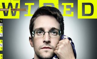
It's a philosophy Muller has applied to his entire career, and one that seems to be working. After all, this is the comic book-loving designer who was recently allowed to manipulate WIRED magazine's masthead for a top-secret issue featuring an exclusive with Edward Snowden ("I thought it was pretty cool to distort a masthead of a magazine with a print run of that scale," he casually throws in).
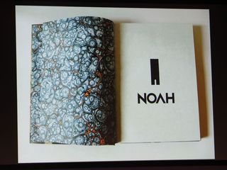
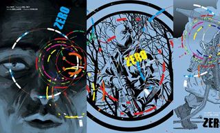
Recently he's worked with writer Ales Kot on the critically acclaimed spy fiction series Zero, collaborated with Darren Aronofsky on the graphic novel Noah, and he's also responsible for the design of multi-award-winning anthology Comic Book Tattoo for Tori Amos.
It's taken 15 years – and a lot of different paths – to get to where he is now. We caught up with Muller after his talk at Reasons To Be Creative 2014 to find out more about his philosophy and why it's so successful...
Can you elaborate on your dad's analogy? Isn't a kitchen good enough?
Growing up I spent a lot of time in my dad's studio, surrounded by, amongst other things, Knoll books and catalogues (designed by Vignelli) and so I'm sure he knew Vignelli's "If you can design one thing…" idiom.
Get the Creative Bloq Newsletter
Daily design news, reviews, how-tos and more, as picked by the editors.
He was also part of a generation of designers schooled in Modernism and he firmly believed that as a designer everything hangs together and you need to be as knowledgeable about every facet of design in order to get a better understanding of the whole.
So yes, when you design a kitchen, that kitchen isn't an empty space – you need to think as much about what goes in it as the space itself.
How have you applied this philosophy to your own career?
I'd say its one of the guiding principles of how I work. I don't see the need to categorise design into digital/print/product/UI or between designing for corporates, startups or for the entertainment industry because largely the same principles apply in order to create a successful design solution.
I always look to break those walls down, and apply what I learn on one project to another. A specific example would be that I worked with Flipboard, designing their partner magazines for their platform.
I got the project on the back of my experience in designing digital content, but had to design all the magazines in InDesign (as opposed to markup in HTML/CSS or Photoshop). This project forced me to quickly learn the ins and outs of InDesign, and now I can use that knowledge when I work on projects, like the NOAH graphic novel.

You mentioned that you occasionally chose to work at a reduced rate. Can you tell us more about this decision?
Just want to make clear: I rarely work for free or at reduced rates. But yes, I've made strategic choices in taking on certain projects without being paid because they offered me the opportunity to either break into a new part of the industry, or gave me creative free reign – giving me a platform to expose my work to a bigger audience.
This is how, years ago WIRED found me, and offered me editorial projects – the recent logo treatment for their Ed Snowden cover being the latest work I did for them.
How important is originality to you?
I'm trying to take all these bits and pieces, throw them in a box and see what comes out. I want to do as many different things as possible in design, and cross-pollinate creative approaches in projects.
Instead of boxing myself into a certain mindset for a specific problem, I want to see how I can solve something by injecting it with an unexpected approach that you wouldn't necessarily associate with it. Case in point, the Zero publication design is more rooted into 'zine' design and propaganda posters than what you'd call 'traditional' comic book design.

What advice would you give to anyone stuck in a creative rut?
If you're stuck in a creative rut go do something else. Stop procrastinating and give yourself space to breathe. You can't force yourself to be creative, it has to come naturally.
Get 10 free issues of CA!
Calling all overseas readers of Computer Arts and Creative Bloq. Get up to an incredible 10 free issues of Computer Arts magazine with a two-year subscription!
This limited-time subs offer is available for all non-UK readers. You can sign up here, or find out more about this special offer for the world's leading design magazine here.

Thank you for reading 5 articles this month* Join now for unlimited access
Enjoy your first month for just £1 / $1 / €1
*Read 5 free articles per month without a subscription

Join now for unlimited access
Try first month for just £1 / $1 / €1

Julia is editor-in-chief, retail at Future Ltd, where she works in e-commerce across a number of consumer lifestyle brands. A former editor of design website Creative Bloq, she’s also worked on a variety of print titles, and was part of the team that launched consumer tech website TechRadar. She's been writing about art, design and technology for over 15 years.