How to create pixel-perfect web graphics
Web designer and illustrator Matt Hamm reveals how to combine Kuler with Illustrator to create harmonious web graphics that scale crisply.

In this guide, I'll explain how to create scalable, web-ready graphics with harmonious colour schemes. I won't literally show you how to recreate the graphics here - think of this as a best-practice checklist rather than a conventional walkthrough.
Along the way, I'll be using Adobe's Kuler iPhone app in a slick colour workflow, and Illustrator to create crisp, pixel-perfect graphics. The two applications make a great combination, and using your mobile as part of your workflow can break you free from your desk, too, which almost certainly helps creativity.
01. Ditch the defaults
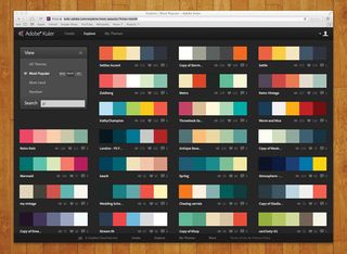
Whatever you do, never use those default colours in the illustrator swatches panel. Thanks to Kuler, Adobe's colour-scheme generator , gorgeous colour palettes are only a few clicks away. You can sign up for a Kuler account at the address above, or just log in with your Adobe ID.
02. Use the Kuler app
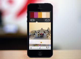
Download the free Kuler iOS app from the app store (currently not available for Android). Log in and capture colour inspiration from anywhere with your iPhone or iPad camera. The app provides live colour palettes from anything you point the camera at, with often unexpected and inspiring results.
03. Saving palettes
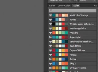
Save any of your colour palettes on your iPhone or iPad, and they appear in the Kuler panel in Illustrator. You can sync, search and add colour palettes from Kuler directly into your swatches. Using the web interface you can browse the most popular or most used colour themes and mark your favourites.
04. Create square graphics
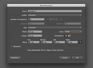
To ensure your Illustrator artwork appears pixel-sharp on the web, it really helps to create perfectly square artboards - that way, the exact centre of the artboard will always fall at the corner of a pixel, and not in the middle of one. Of course, this won't always be possible, but is always worth bearing in mind.
05. Pixel Preview
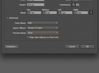
Ensure colour mode is set to RGB, and raster effects to screen (72ppi). If you set preview mode to pixel, when you zoom into the artwork you see pixels rather than smooth vector shapes. Checking Align New objects to Pixel Grid can cause display issues, but you can turn it off in the transform panel.
06. Trouble-free pixels
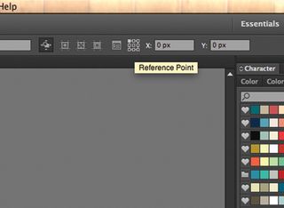
With the artboard tool selected, click the reference point icon (the grid of squares). Select the top-left square, and the artboard will always resize from the top-left corner and stop the pixels shifting. Double check the X and Y values have no decimal places - values of 0.5px can cause artwork to miss the grid.
07. Snap happy
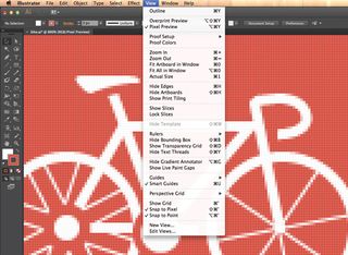
Open up the view menu, and make sure that pixel preview is ticked. As you'll notice, the option further down the menu will then automatically change from Snap to Grid to Snap to Pixel for pin-point accuracy. This setting can be toggled, depending on the view.
08. Group alignment
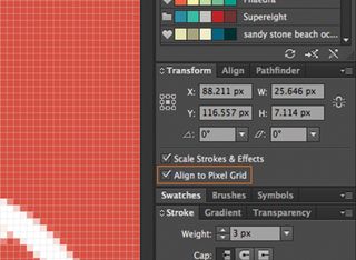
Check Align to Pixel Grid in the Transform panel to ensure that your artwork can be nudged in precise increments. To save time when lining up any stray objects, simply click Select>Object>Not Aligned to Pixel Grid, and then edit those objects as a group.
09. And finally...

By default, Illustrator aligns the path of any stroke with an odd width (1px, 3px, 5px etc) on a sub-pixel level. If you change the alignment to outside, inside or centre in the stroke panel, the shape will try to compensate, but bear in mind that if you're using SVG format, it will only support centre alignment.
Words: Matt Hamm
Matt Hamm is creative director and co-founder of Guildford-based web design studio supereight. He specialises in logos and icons, and has been designing websites since 1998. This article originally appeared in Computer Arts issue 224.

Thank you for reading 5 articles this month* Join now for unlimited access
Enjoy your first month for just £1 / $1 / €1
*Read 5 free articles per month without a subscription

Join now for unlimited access
Try first month for just £1 / $1 / €1
Get the Creative Bloq Newsletter
Daily design news, reviews, how-tos and more, as picked by the editors.
The Creative Bloq team is made up of a group of design fans, and has changed and evolved since Creative Bloq began back in 2012. The current website team consists of eight full-time members of staff: Editor Georgia Coggan, Deputy Editor Rosie Hilder, Ecommerce Editor Beren Neale, Senior News Editor Daniel Piper, Editor, Digital Art and 3D Ian Dean, Tech Reviews Editor Erlingur Einarsson, Ecommerce Writer Beth Nicholls and Staff Writer Natalie Fear, as well as a roster of freelancers from around the world. The ImagineFX magazine team also pitch in, ensuring that content from leading digital art publication ImagineFX is represented on Creative Bloq.
