Greatest fonts countdown: 59 - Lyon
We're counting down the 100 greatest typefaces in existence. Here is number 59...
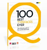
FontShop AG, the renowned type foundry, conducted a survey based on historical relevance, sales at FontShop.com, and aesthetic quality. With a few additions from the experts at Creative Bloq and Computer Arts magazine, the best fonts ever were selected for the new book, 100 Best Typefaces Ever.
Here we are counting down the 100 greatest fonts, but you can read interviews with some of the typefaces' creators, a brief history of type, the anatomy of a font, and much, much more in the book – find out how to get your copy in print or digital formats at the foot of this post.
But without further ado, here is the 59th best typeface…
59. Lyon

- Kai Bernau, 2009-2010
Typeface and book designer Kai Bernau originally designed Lyon Text in 2006 as his degree project for the Type + Media MA program at the Royal Academy of Art in The Hague, and later reworked the family for release by Commercial Type.
Lyon made its debut in the New York Times Magazine in 2009 when paper sizes were shaved. "We were attracted to Lyon because it's well drawn, very legible and nice to look at, but also slightly more condensed than our previous body copy, which in turn allows for more words per line," said Design Director Arem Duplessis in a 2009 interview with The Society of Publication Designers.
According to Commercial Type, Lyon 'takes a serious approach to history, working from punch-cutter Robert Granjon’s 16th century masterworks, but views it through the lens of up-to-the-minute contemporary type design techniques, perfectly balancing tradition and innovation'.
Lyon is geared towards books and publications, retaining a 'decisively digital outline treatment that reveals the modern repertoire of tools, and the typeface itself as a modern design tool. This paired with a certain Times-like unobtrusiveness in text sizes, contrasts nicely with Lyon's 16th century heritage'.
In 2010, designer Bernau expanded the typeface, sharpening the serifs and softening the hard corners on the ball terminals and the lowercase g. The result is – again, according to Commercial Type – 'a decidedly contemporary take on the Oldstyle tradition, with relatively high contrast and a wide weight range'.
The 100 Best Typefaces Ever

This is an extract from The 100 Best Typefaces Ever, the definitive guide to the greatest fonts ever created, in association with FontShop AG. Over 180 premium pages, the book dissects the world's greatest typefaces, bringing you some insightful background on each and interviews with their creators.
You can pick up the book at all good newsagents today or order it online. Or you can download a digital edition directly to your iPad from the Computer Arts app on iTunes.

Thank you for reading 5 articles this month* Join now for unlimited access
Enjoy your first month for just £1 / $1 / €1
*Read 5 free articles per month without a subscription

Join now for unlimited access
Try first month for just £1 / $1 / €1
Get the Creative Bloq Newsletter
Daily design news, reviews, how-tos and more, as picked by the editors.
The Creative Bloq team is made up of a group of design fans, and has changed and evolved since Creative Bloq began back in 2012. The current website team consists of eight full-time members of staff: Editor Georgia Coggan, Deputy Editor Rosie Hilder, Ecommerce Editor Beren Neale, Senior News Editor Daniel Piper, Editor, Digital Art and 3D Ian Dean, Tech Reviews Editor Erlingur Einarsson, Ecommerce Writer Beth Nicholls and Staff Writer Natalie Fear, as well as a roster of freelancers from around the world. The ImagineFX magazine team also pitch in, ensuring that content from leading digital art publication ImagineFX is represented on Creative Bloq.
