Gorgeous poster design combines characters and typography
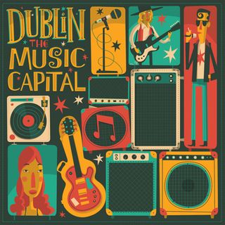
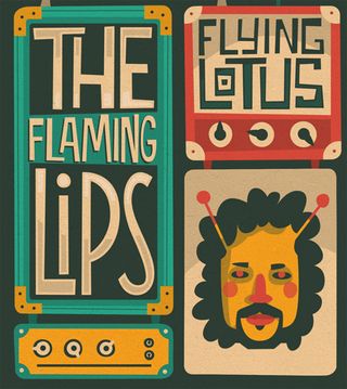
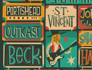
This live music poster for VisitDublin.ie features colourful characters and addictive type design.
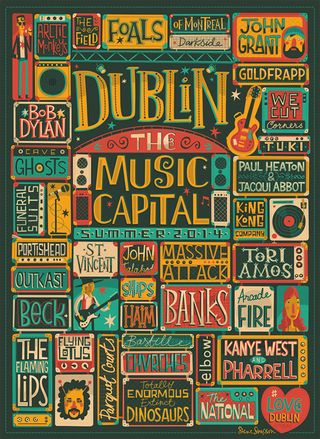
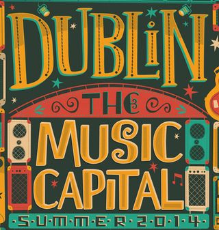
In any guide to modern poster design, one thing's for sure - it has to be eye-catching, informative and above all, creative. Combining a number of design elements is always a wonderful and unique approach and this latest design for the Dublin music festival uses typography, colour and character design to their fullest potential.
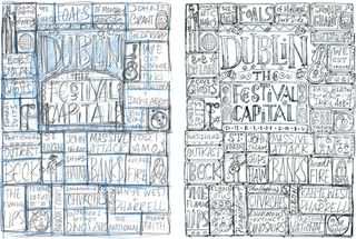
"This Dublin poster project was a fairly quick turnaround," Irish designer Steve Simpson explains. "Brief came in on the Friday morning, intial rough followed by cleaned-up sketch by Friday evening and sent to client, approved Monday morning. Artwork fininished and sent to client Wednesday afternoon, minor tweaks and signed-off Thursday afternoon."
Below, you can see some of the sketches Simpson worked on before diving into the beautiful creation. We love the mix of colours and the wonderful take on some of the biggest names in music.
See more brilliant work from Steve Simpson over on his website.
Have you seen an inspiring poster design? Let us know in the comments box below!

Thank you for reading 5 articles this month* Join now for unlimited access
Enjoy your first month for just £1 / $1 / €1
*Read 5 free articles per month without a subscription

Join now for unlimited access
Try first month for just £1 / $1 / €1
Get the Creative Bloq Newsletter
Daily design news, reviews, how-tos and more, as picked by the editors.
Sammy Maine was a founding member of the Creative Bloq team way back in the early 2010s, working as a Commissioning Editor. Her interests cover graphic design in music and film, illustration and animation. Since departing, Sammy has written for The Guardian, VICE, The Independent & Metro, and currently co-edits the quarterly music journal Gold Flake Paint.
