Google homepage gets a bold new look in this design concept
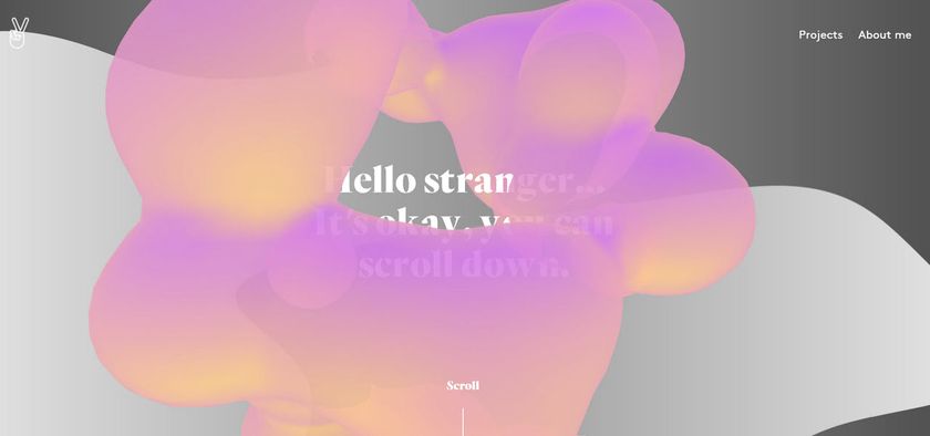
A handful of designers have redesigned the Google homepage. Which effort do you like best?
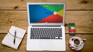
Many have attempted to redesign various aspects of Google including Google fonts and Google Chrome logo, with one designer even redesigning Monopoly for the Google era. Here, we witness the redesign of Google's homepage from a whole host of designers.
The Letter Society is a collaborative and challenge-based design blog, which is comprised of eight members that submit their solutions to the current project every three weeks. This latest project tackles the Google homepage and some of them are really rather impressive.
This design from Erik sees colour take centre stage. "I wanted to bring Google’s color palette forward and create a vibrant, larger-than-life presence for the search function," he explains. There are more redesigns featured on the site, so be sure to check them all out!
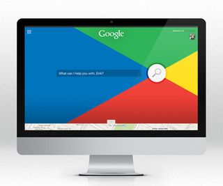
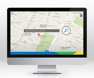
See the entire range of redesigns over on the Letter Society.
What would you change about the Google homepage? Let us know in the comments box below!

Thank you for reading 5 articles this month* Join now for unlimited access
Enjoy your first month for just £1 / $1 / €1
*Read 5 free articles per month without a subscription

Join now for unlimited access
Try first month for just £1 / $1 / €1
Get the Creative Bloq Newsletter
Daily design news, reviews, how-tos and more, as picked by the editors.
Sammy Maine was a founding member of the Creative Bloq team way back in the early 2010s, working as a Commissioning Editor. Her interests cover graphic design in music and film, illustration and animation. Since departing, Sammy has written for The Guardian, VICE, The Independent & Metro, and currently co-edits the quarterly music journal Gold Flake Paint.
