Give your photos a pattern kick
Bram Vanhaeren demonstrates how to liven up your photographic compositions by incorporating your own graphic patterns.
In this tutorial I'll show you how to add a bright, graphic edge to your photographic pieces by working in your own colourful pattern designs.
First we'll be creating patterns in Illustrator (alternatively, you can find some I've made earlier on the disc) then blending them into photographic compositions in Photoshop. We'll then look at the best methods of colouring and blending. In the end, it's all about having fun and experimenting with your new patterns.
Click here to download the support files (1MB)
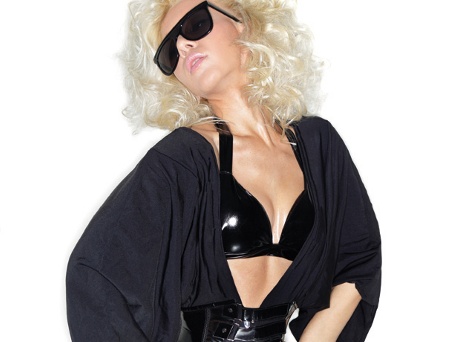
01 I always start by browsing for photography stock images. I organise my stock images so I can easily find the perfect photograph. Picking the perfect stock is like picking the right colours - it's hugely important to the mood of your piece, so be sure to choose wisely.
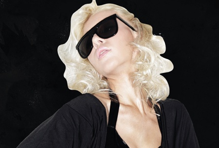
02 Once you've made up your mind about the right stock picture, the fun starts. In Photoshop, cut the image out as cleanly as possible, then place it on a background that's a high-contrast colour such as black, to help you check the edges for any missed spots.
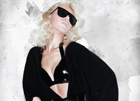
03 Once I've cut my model out properly, I create my grungy background. I begin with a white paper grunge stock, then play around with various grunge textures to create a soft, dark, messy background. Be sure to take your time to make it nice and subtle. I then turn my white background into a black one (Ctrl/Cmd+I.)
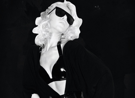
04 Now that I have the model and background ready to work with, I adjust the Contrast and Brightness accordingly, desaturate her and used the Burn tool to make the edges of her clothing blend into the background. You can also do this at the end of the tutorial, if you prefer.
Get the Creative Bloq Newsletter
Daily design news, reviews, how-tos and more, as picked by the editors.
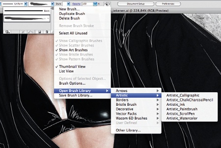
05 Open Illustrator and use the Pen tool to outline contours and shadows on the model's clothing. Don't forget to remove the fill color in your Tool palette. Once you have your lines ready, add a Brush style to your stroke by going to Open Brush Library>Artistic and selecting Artistic_Ink. Change the stroke to 0.25pt. Now drag these Illustrator layers into your Photoshop file.
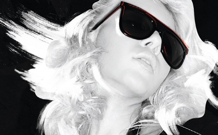
06 We'll use our Brush tool to make some painterly brush strokes. You can download stock brushes from various websites, but it's a lot more fun to create your own. Place white paint brushes around the model's hair, and bright spots on her body. We're going to use more black paint brushes later on to blend the patterns into her clothes, so be sure to find some good brush strokes.
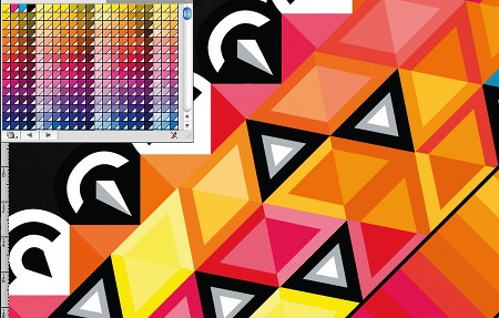
07 Now we're going to have some fun in Illustrator to make our patterns, the most crucial part of this tutorial. First of all I always prepare my colour palette. I love to use the colour swatches in Color book>Pantone Color Bridge CMYK. It's important that you find your perfect color palette as early in the creation process as possible, and stick to it, so that the patterns and the final piece are homogenous.
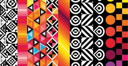
08 Let's create our patterns. Before you start, in Illustrator make sure the grid is viewed and have Snap to Grid on. This makes it much easier to create the following shapes, and makes it easier to play around. Experiment with squares, triangles and circles to make your patterns, using the Pen tool and your color swatches. Above is what I've created (find it on the disc). It might look complicated, but if you look closely you'll see it's made up of very simple shapes.
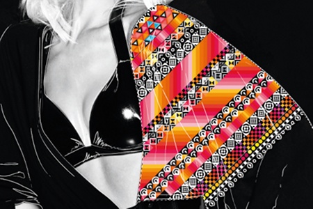
09 Now that we have our patterns, it's all about blending them into our work. Drag your patterns into your Photoshop file, and rasterise your Illustrator layer so you can actually work with them. I've made a path from the right side of the model's top and used it to cut out the patterns by selecting the Path (Ctrl/Cmd+click on layer).
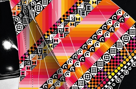
10 Now we have added our pattern, it's difficult to see the depth in the clothing as the lines we created earlier have been covered. But we can fix this. Using your Pen tool, again in Photoshop, create a selection to erase soft parts of the clothing with a soft round brush. I target areas such as under the model's arm and on her shoulder to create shadows and depth.
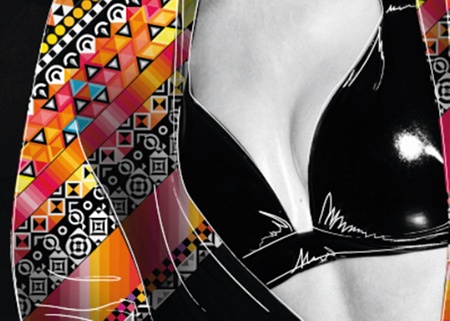
11 I do the same thing with the left side of the clothing. Experiment with the placement of your patterns; I simply changed their position a little. Make sure you refer to the initial, untouched photograph of the model to study the shadows and shapes of her clothing, and adjust your shadows accordingly on your patterns.
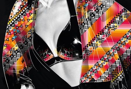
12 I haven't really blended the patterns into the clothing yet. For the next step, take your paint brushes again as in Step 6, this time brushing black on the lower side of the model's clothing to blend the pattern in a touch with the rest of her black clothes.
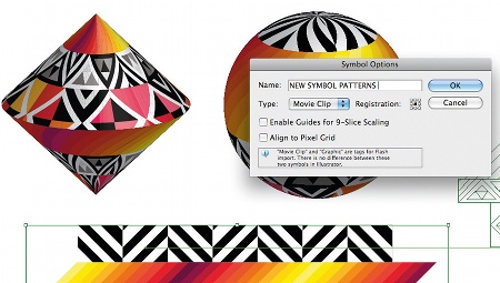
13 Now we're going to create 3D objects with our patterns on. Open the Illustrator file with your patterns. Create a nice strap with the patterns, and drag this into your Symbol swatch, creating your own symbols to use as map art when making your 3D object. Take a half-circle or half-square, then select 3D Revolve>Map Art, load your new symbol and place it on your 3D object. Create a few of these.
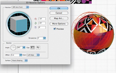
14 Now place your 3D objects around your model to create a fantasy feeling in the environment. In my piece they represent flying planets, moving all around the model; use your imagination. I have also blurred one 3D ball in order to give a little more depth to the picture
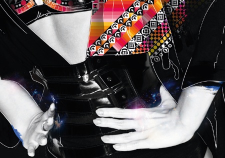
15 To add some fun details and lighting, I've downloaded some Nebulae stock images - you can find them on every stock image website. With blending mode on Screen, I've placed some blue nebulae images around the model's hands and glasses, which complements the orange in the picture. Blue and orange work perfectly together.
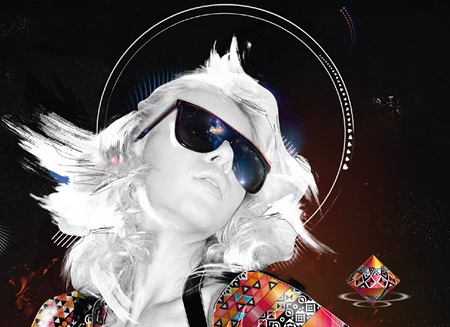
16 I've also added some circles around the model's head and placed some small painted dots around the scene. I create a circle in Illustrator and add the ink brush again on the strokes give it an illustrated effect. I then use a simple brush and draw small dots around the circles. I always love to add details like this. Some people find it distracting, but it's a matter of taste. Feel free to experiment here.
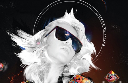
17 To finish off, I used some layer masks to change the colour balance a little. In this case I add +15 Blue on Midtone and -10 yellow highlights in the Color Balance palette. This gives the monochrome model a yellow shine, with a little blue, complementing the other colours . Make sure to work with masks so you can easily adjust or remove them later.
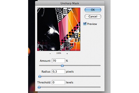
18 Now our artwork is done, we want to share it on the web.Since I worked on more then 5000 pixels width artwork at 300 dpi, I have to change the image size to 900. First, I reduce the size to 1600 and use my first Unsharp Mask at Amount: 60% and Radius: 1 with Threshold: 1. Then I go to the actual size I want to present my work - in this case 600x900 - and use another Unsharp Mask at Amount: 40%, Radius: 0.3. We need to save for web which will reduce the dpi to 72 automatically. This trick should get the most detail and quality out of your work to present on the web. You can play around with it, and make sure that you don't forget to sharpen it a little after downsizing.
Bram Vanhaeren
Bram is a 20-yearold digital artist who has been developing his style since his first experiments with the Pen tool in Illustrator about five years ago. His style ranges from simple illustrations and typography to mixed media artwork. www.bramvanhaeren.com

Thank you for reading 5 articles this month* Join now for unlimited access
Enjoy your first month for just £1 / $1 / €1
*Read 5 free articles per month without a subscription

Join now for unlimited access
Try first month for just £1 / $1 / €1

The Creative Bloq team is made up of a group of art and design enthusiasts, and has changed and evolved since Creative Bloq began back in 2012. The current website team consists of eight full-time members of staff: Editor Georgia Coggan, Deputy Editor Rosie Hilder, Ecommerce Editor Beren Neale, Senior News Editor Daniel Piper, Editor, Digital Art and 3D Ian Dean, Tech Reviews Editor Erlingur Einarsson, Ecommerce Writer Beth Nicholls and Staff Writer Natalie Fear, as well as a roster of freelancers from around the world. The ImagineFX magazine team also pitch in, ensuring that content from leading digital art publication ImagineFX is represented on Creative Bloq.
