Elliot Jay Stocks
The multitalented designer tells Abi Bliss why print is an antidote to his web frustrations, and explains how he enjoys the best of both worlds
According to Elliot Jay Stocks, the key to making the move from print to web design is to “let go of the rigidity that one enjoys as a print designer. There is no way to ensure that what you design will be experienced in the same way by everybody else.” He adds: “It’s about not seeing that as a bad thing.”
Cultivating this kind of open-mindedness has certainly worked wonders for Stocks, who, like many designers could once be found touting hand-drawn comics to his school friends, but whose present-day talents have been called upon by clients including Microsoft, Virgin, email marketing service MailChimp and web developers Neutron Creations. Not to mention numerous projects in print design, illustration, branding and the publication of his own visually sumptuous magazine, 8 Faces.

Stocks’ design career started when he was working in a Virgin Megastore during a year out between school and university. “A bunch of us in the store had bands and we released a compilation CD of our own music. I designed the point of sale stuff and the website for it.”
One inspirational landmark was the website created by design studio Hi-ReS! as a suitably intriguing counterpart to the film Donnie Darko. “It looks really dated now and we all laugh at how excited we got. But to me that was someone doing something really different and interesting with the medium. It opened my eyes to what you could do.”
His BA in Contemporary Media Practice from the University of Westminster briefly covered the use of Flash, but it was mainly extra-curricular design for his own and friends’ bands that bagged him his first full-time job as a junior web designer for EMI.
“Being thrown in at the deep end was a big way of learning on the job for me,” he remembers. “On one of my first days at EMI, I had to edit some HTML stuff and I suddenly realised that I’d been so involved with Flash that I had pretty much zero knowledge of HTML. It wasn’t until later that I really started really getting into web standards and building websites with HTML and CSS. That was a very important part of learning – just having to do it.”
After EMI, Stocks went on to work for Sanctuary records, before joining web events company Carsonified as a senior designer. Since turning fully freelance in 2008, his work has spanned web design, blog themes, illustrations and custom icons for companies such as Virgin, Microsoft and The Money Pig.

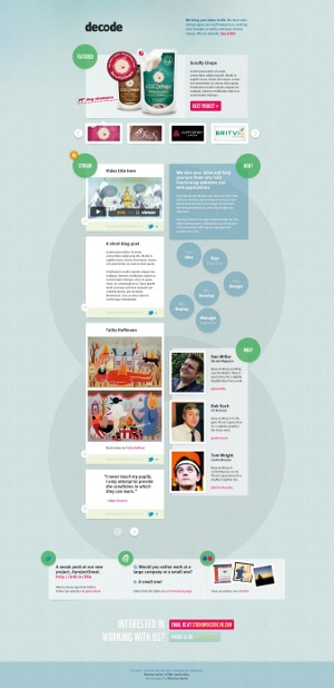
He distilled his know-how into the 2009 book Sexy Web Design, and also provided interior illustrations for Andy Clarke’s Hardboiled Web Design. He’s even done his part to coax pasty web types away from their Macs and into the great outdoors with Activate, a one-day networking and adventure event held in August, which was organised in association with Kent-based web development studio Decode.
When considering what qualities as a designer may have led to his current success, he protests: “It’s hard to say without blowing your own trumpet. But maybe I’m not afraid to do stuff that is a little out of the ordinary. I’ve never really been interested in fitting in with trends, because a lot of the time you can see them for what they are, which is fads that come and go.”
Stocks may have started out using Flash, but his accessible ethos is a world away from the bandwidth-hogging intros and pirouetting animations that have come to be associated with the platform. With several speaking engagements in his diary each year, he often takes the opportunity to voice his opinions on the pitfalls of being dazzled by the latest programming features. “A couple of years ago, I did a talk called ‘Destroy the Web 2.0 Look’, which was meant to be a rallying cry against applying gloss and gradients and rounded corners to everything. Not because they were bad in themselves, but because people were adding stuff to sites without thinking about it.
“Now I’m doing a talk called ‘With Great Power Comes Great Responsibility’, which is about people just adding all of the new CSS3 stuff to their designs. People are getting carried away with new technology and not thinking about the effect they’re having on the end product.” Last year he caused some lively Twitter debate after he tweeted, “Honestly, I’m shocked that in 2010 I’m still coming across ‘web designers’ who can’t code their own designs. No excuse.” Although he subsequently qualified this view in a blog post, he still maintains the importance of having some idea of how to develop a web design beyond the stage of Photoshop eye candy. “Perhaps in some scenarios it’s not necessary for you to code. But coding will always be a benefit: it will never hamper you, because it adds context to what you’re doing.”
He explains: “It’s more important for designers to be able to code these days, because we’re working in the browser more than ever. Gone are the days of producing fixed Photoshop comps and sending them off. If you’re designing something that’s responsive to resizing the browser window, with media queries that kick in at, say, 600 pixels, it would take forever to design that in Photoshop. I work with Photoshop to get the bigger picture, but as soon as a rough sense of layout starts coming together I build that out in HTML and CSS, put it in the browser and start testing.”
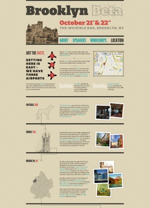
His words are backed up by the elegant website he designed for Ampersand, a web typography conference that took place in Brighton in June this year. Resizing the browser window causes all the text and layout elements to rearrange themselves neatly into the new space, a feature that has captured his imagination in recent months. “You can have very fluid layouts that flex depending on the size of the browser window, or use things like media queries to bring in different styles at different widths, to optimise them for a large desktop screen and for the landscape or portrait orientation on an iPad.”

At the same time that Stocks is excited by the increasing flexibility of web design, he acknowledges the role print has played in shaping his design philosophy. “A lot of my web design takes a heavy influence from print. Even though I do much more web work than print work, it’s got that graphic design element to it that perhaps a lot of web work doesn’t.” He sees the differences between the two as a bonus: “They both appeal to me because one is almost the antithesis of the other. Once you get bogged down with having to fix CSS bugs for Internet Explorer and stuff like that, I’ve found moving on to a print project has this freedom: I know a design is going to look exactly the same, no matter how it’s viewed. It’s an antidote to the frustrations I have with the web. But with print you have the fact that if you print 3,000 copies of something and there’s an error in it, you can’t change that. Then I jump back to the web to rejoice in its changeable nature. So for me, the difference between print and web is about embracing the restrictions of one and the other and enjoying the benefits of each.”
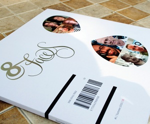
Traditional print publishers may still be learning painful lessons about surviving in the internet age, but Stocks has found an audience of typography fans for his first large-scale print project, 8 Faces, which launched last year. In its pages, eight of his design heroes answer the question, ‘If you could only use eight typefaces for the rest of your life, which would you choose?’ The first issue’s print run of 1,000 sold out in under two hours and the second was equally popular. At the time of interview, the third issue is also imminent.
For Stocks, designing the magazine has him brought other benefits. “Making an 88-page publication forced me to learn a lot of stuff that I’d skipped over before, especially with print and the finer points of typesetting in general,” he says. “Going back to web work, all of the things that I’ve learned through doing 8 Faces, about baseline grids and designing from the type outwards, suddenly opened my eyes up to this whole other world that I hadn’t really been thinking about beforehand.”
Like many type enthusiasts, he is finding that his passion need no longer be put aside each time the monitor is switched on, thanks to font delivery services such as Fontdeck, Typekit and WebINK that now allow web designers to draw from a hugely expanded range of faces. “Because type on the web is finally becoming a viable reality, typography has suddenly become very exciting to web designers. It’s been overlooked for so long. For web designers it’s this whole other world, and once you start delving into it, you go down a rabbit hole.
“I feel I’ve grown up through doing so much print work and then coming back to the web with all these things in my mind that I wasn’t considering before,” he concludes. Whether Stocks’ enduring curiosity leads him into a typographic wonderland or back and forth through the looking glass between web and print, the results are bound to be well worth seeing.

Thank you for reading 5 articles this month* Join now for unlimited access
Enjoy your first month for just £1 / $1 / €1
*Read 5 free articles per month without a subscription

Join now for unlimited access
Try first month for just £1 / $1 / €1
Get the Creative Bloq Newsletter
Daily design news, reviews, how-tos and more, as picked by the editors.

The Creative Bloq team is made up of a group of art and design enthusiasts, and has changed and evolved since Creative Bloq began back in 2012. The current website team consists of eight full-time members of staff: Editor Georgia Coggan, Deputy Editor Rosie Hilder, Ecommerce Editor Beren Neale, Senior News Editor Daniel Piper, Editor, Digital Art and 3D Ian Dean, Tech Reviews Editor Erlingur Einarsson, Ecommerce Writer Beth Nicholls and Staff Writer Natalie Fear, as well as a roster of freelancers from around the world. The ImagineFX magazine team also pitch in, ensuring that content from leading digital art publication ImagineFX is represented on Creative Bloq.
