The designers and technologies that shaped the web
It appeared in 1991 but the 21st century has witnessed the birth of the internet's true creative potential.
Happy World Internaut day! 25 years ago today, the web went live at the hands of Tim Berners-Lee, and it's come a long way since August 23, 1991. A mere nine years later the dot-com bubble burst and $5trillion in shares disappeared almost overnight.
Yet the dot-com crash didn't suppress the work of designers and developers in the way it crippled corporate institutions. While start-ups were calling in liquidators and financial backers were counting their vast losses, the World Wide Web Consortium (W3C) persisted in ratifying web standards, and forward-thinking designers continued to push new ideas into the digital realm. In many ways, 2000 can be seen as the year dot for visually rich web design.
Over the last decade, web design has grown from the dispersal of information to a pure form of design. Prior to 2000, few designers had broken the bounds of conformity. The web was primarily about sharing information – or attempting to make money from it – and a rich, defined aesthetic came a poor second to the need to display data.
What changed this forever was Flash. Though FutureSplash Animator had been compiled in 1996 as a means of quickly rendering game and interface graphics, with the unison release of Flash Player, designers could now share their visually complex creations with a global audience. The web had shifted from content to creativity in one swift move.
Gabocorp 1997
The initial sign of this aesthetic revolution appeared in 1997 in the form of Gabocorp (the website is archived here). Suddenly the web was no longer static.
"This was the equivalent of TV going colour," explains Rob Ford, founder and principal of Favourite Website Awards, which has been archiving and showcasing the very best web designs since 2000.
"Gabo Mendoza's website says: 'You are about to enter a new era in website design. This is the new standard for all things to come.' If someone wrote that today they would be laughed off the web, but when Gabo published his site way back then, with those couple of sentences, little did he know how true they would turn out to be.
Get the Creative Bloq Newsletter
Daily design news, reviews, how-tos and more, as picked by the editors.
"Gabo made things move on user interaction. He made things move right across your screen. He set the new standard and the rest is history."
Mendoza's site may be cited as the moment that web design broke new ground, but it was still an anomaly among the thousands of bland pages that populated the net. What Mendoza did manage, however, was to create a template for others to build on.
Flash MX
The release of Flash MX in 2002 and the ongoing browser wars allowed new media designers to think about design from the outset of a project, and reach a far wider audience. Flash Player was being distributed with all AOL, Netscape and Internet Explorer browsers from 2000, and when two years later it shipped with Windows XP, 92 per cent of online audiences had the capacity to view Flash sites. Now Flash had become mainstream, designers and developers had the technology and audience reach to bring experimental design to the masses.
One of the key highwater marks of this period was another personal portfolio site – but this one was markedly different to Mendoza's. Upon its release, 2Advanced's Expansions site was a revelation, combining a genuinely new aesthetic with interactivity and jaw-dropping transitions.
"Expansions was one of the most famous Flash websites of all time," says Ford, pinpointing how Eric Jordan, founder and creative director at 2Advanced, melded futuristic design work with Flash's interactive capabilities to create a site that looked and functioned like nothing before it.
"I think that this site became so successful for a few reasons; the first being the moving cloud sequence that can be seen as if you are looking up and out of some high-tech building. This, combined with futuristic sound effects and simple yet original page transitions, took the site to a whole new level," he explains. "At the time it felt like the perfect website, and made a lot of people pick up the web design baton and get creative."
Yet with this success came the inevitable imitation, and the reputation of Flash-based sites soon tumbled from frontier-defining design to pure facsimile through creative lethargy.
Redefining the web

It took the work of interactive pioneer Joshua Davis to redefine what a website could be. While Google, Amazon and Apple incorporated ever-more intuitive interfaces to deliver precisely what an audience required, Davis saw the web as a creative playground.
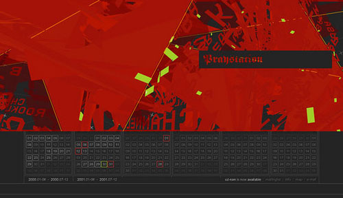
Davis' site, Praystation, and latterly his 'gallery space', Once Upon a Forest, was created with the sole intent of exhibiting the new design work and generative art experiments that he created. He became the world's first new media artist, and his work was inducted into America's national education facility, the Smithsonian, in 2007.
Davis' personal creations were only a single strand of Praystation's importance, however. By releasing the code to each experiment he posted, Davis was actively educating his audience, and allowing his followers to pick apart, refine, and reuse his code. In many ways, this marked the beginning of the open-source ethos upon which web design has come to depend so heavily upon.
"Praystation became a place where I tried out small interactive ideas – offered as open source," says Davis. "And Once Upon a Forest became a place where I applied Praystation ideas as art using the internet as my canvas."
Davis, for one, believes that an open-source, collective attitude was a key factor in the advancement of digital design during the mid-noughties, harnessing the power of the many and fuelling progressive ideas. "You can't do Once Upon a Forest – only I do Once Upon a Forest," explains Davis. "That work looks a certain way because of the forms I draw' the colours I choose' the arrangements I create' the composition that I refine – there's no denying it.
Praystation became a place where I tried out small interactive ideas – offered as open source
Joshua Davis
"But I'll give you everything that I used to create that work' because our collective imagination will show me something that I didn't think of to do' and the inspiration comes full circle. This enables me to elevate my work to places that were previously confined to the limits of my own imagination."
New creative possibilities
While Davis was concentrating on bringing digitally generated art to the internet, and thus helping others to follow and adapt his ideas, W3C ratified CSS 2.1 in 2005. This style sheet language opened up new creative possibilities for front-end web designers, freeing HTML content from design elements.
But CSS also delivered uniformity and, many argue, blandness to site design. "CSS helps create smart websites but nothing that will make you spray coffee over your screen," says Rob Ford. "CSS, for me, is like someone from Carnaby Street. Smart, well-turned-out and quite cool. I prefer the web to be like those kids who are laying out cardboard anywhere they can and breaking out some crazy moves – not afraid to get their clothes dirty."
It's an interesting parable to draw, and one on which many designers agree with Ford. CSS and the widespread adoption of WYSIWYG HTML editors such as Dreamweaver led to a raft of generic, standards-compliant sites that adhere to, rather than stretch, the boundaries of design. This look, compounded by the success of WordPress templates and plug-ins, came to stand for Web 2.0; a visual aesthetic that owed more to a generic design than an evolution of the internet itself.
"The Web 2.0 buzzword has, unfortunately, led to an overuse of a particular aesthetic approach to site design," says 2Advanced's Eric Jordan. "I feel that it's detrimental to the web to aim for an overly consistent, unified look.
"In my opinion, the landscape of the internet should be as diverse and different as any architectural landscape in the world. Imagine always looking at a city skyline in which all the buildings were exactly the same – it would make for a pretty uninteresting view."
The WordPress revolution

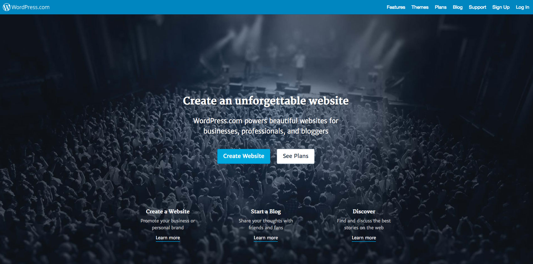
But the WordPress revolution enabled designers with bolder aspirations to tinker and tailor their sites to something more experimental and personal. As Joshua Davis points out, WordPress plug-ins have taken the place of complex Flash snippets to bring interactivity and a network-based experience to web design.
"I can install WordPress in 11 minutes' and right out of the box I have access to thousands of plug-ins, and a level of social-networking functionality that we all expect to have on a site. I should also mention that WordPress and all the plug-ins can be modified to suit your visual needs. Try the same thing in Flash - it won't just take 11 minutes. And it might even be longer than 11 days."
As Davis identifies, the emergence of blogs and associated blogging tools - including the latent growth of Twitter – has been the most recent realignment of web design, together with the appearance of open-source API functionality.
Yet it's the growth of multiple platforms and online applications that hints at the future direction of web and interactive design. The demo of Flash CS5 at the Adobe Max Conference in October 2009 showed how Flash users can now turn their design skills to mobile applications. Meanwhile, extended platforms and the growth of mobile web will define the next decade of web design - if we even still refer to it as that.
"Mobility, scalability, portability," states Davis defiantly. "This is why WordPress has been so successful, and why Flash is having a harder time. The next decade will continue to refine and push these three ideals. I can upgrade WordPress and you would have no idea it had happened. I can tear down my current theme and create a new one' and the content sitting in my database wouldn't care less. I can show you this project on a desktop computer, or my phone. But this project exists as a singular entity and is able to adapt to the changing displays in which it's viewed.
"So design isn't 'web design' anymore, it isn't 'mobile design' anymore, it isn't 'broadcast design', 'outdoor design' or 'print design' anymore. It's just going to be design' and will need to live in all these spaces as a singular entity."
Web design at the beginning of the decade focused on the dispersal of information and links, before the likes of Josh Davis, Jon Maeda, Michael C. Place and Matt Pyke came along. They picked up the open source baton and reinterpreted what web space could be used for.
At the same time, subsequent technologies opened the doors to more vivid and creative designs. With HTML 5 now under ratification, and CSS 3 also on the horizon, we're awaiting a new generation of visionary designers who will push the boundaries for the next decade of interactive design.

Thank you for reading 5 articles this month* Join now for unlimited access
Enjoy your first month for just £1 / $1 / €1
*Read 5 free articles per month without a subscription

Join now for unlimited access
Try first month for just £1 / $1 / €1

Tom Dennis is a journalist, editor and content director with more than a decade’s experience working on international magazines, newspapers, and websites. While Tom is an expert on all things tech, having previously edited sister Future sites T3 and Computer Arts and picked up a PPA award for being a 'Digital Native', he still has a soft spot for the printed word. Tom has since moved into digital content marketing.
