Creative reflections: making a Truman Show-inspired mirror
Design duo Crispin Finn pushed their technical skills to new limits to create a screenprinted mirror for Up Side Up.
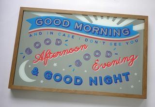
Design writer and editor Angharad Lewis got in touch with us about her self-initiated design project, Up Side Up. She approaches graphic designers whose work she loves and invites them to create unique, limited-edition products which will be available to fund and buy from the project website.
After some thought we decided that rather than outsource a process that might be expensive to fund, we could use this as an opportunity to further our skills and hand-make a piece of work in a new material. Screen printing has always been a primary means of making work for us, to the extent that we set up a printing studio adjacent to our office. So this presented a great opportunity to try and extend our capabilities in this area. It also made financial sense to make the product ourselves, since outsourcing production can often require ordering huge quantities for it to be commercially viable.
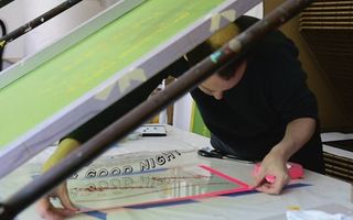
We've long been inspired by Victorian reverse-printed mirrors – the kind you often find in early 20th century pubs – and printed glassware such as the old milk bottles with messages and seasonal illustrations across them. Not only are they beautiful, they combine elements that we are fascinated by, namely typography, printmaking and functionality. We wanted to make an object that had a function but which could also be an artwork in its own right, and that we could fabricate in our studio. The idea of exploring the form of a printed mirror immediately appealed to us.
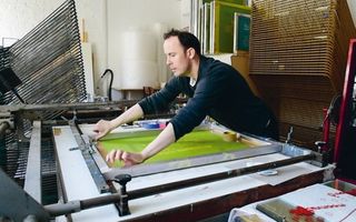
Work in progress
Having decided on the kind of product we wanted to make, we set about exploring both the materials and techniques we would need to work with and also what might work in terms of the illustrated design on the mirror. We wanted to create an optimistic, modern, typographic-based design that would resonate with the concept of the object itself.
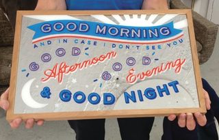
We're both movie fanatics and we soon found parallels between film references and the item we were making. Discussions around themes of reflection, observation and appearance led us to appropriate an iconic quote originally used as a friendly greeting, and later as a poignant farewell, in Peter Weir's 1998 film, The Truman Show: "Good Morning, and in case I don't see you, Good Afternoon, Good Evening and Good Night!" We thought it was a charming idea that the mirror and your own reflection would greet you like this each morning and that you might carry that sentiment around with you for the rest of the day.
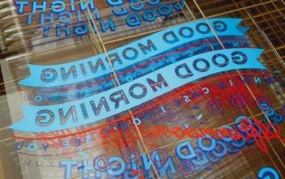
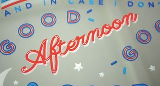
In terms of design, we wanted to reference the historical heritage of reverse-printed mirrors while avoiding pastiche. We employed elements of shadow type to play with ideas of illusion and depth, and set the type in a variety of fun elements. Key considerations included trying to make a design that would be eye-catching, achievable using the chosen method and functional – so there would be enough room around the type to still use the mirror for its primary purpose.
Although we usually only work in two colours, we chose to use four colours for the final design – including two blues to allow for a little more depth within the shadow type. These were then separated out at the digital artworking stage to create four separate 'positives' (one for each colour) for exposure onto separate screens for eventual printing.
Get the Creative Bloq Newsletter
Daily design news, reviews, how-tos and more, as picked by the editors.
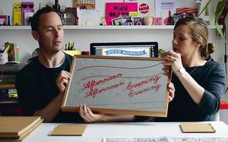
We used specialist silk screen inks for printing on glass. Each one contained a colour pigment and a hardener (like a kind of super glue) which when mixed together create a substance that dries permanently onto the glass, and requires protective masks to be worn during printing. Each printed layer was air-cured overnight, so it would be ready for the next colour to go down the following day. We had to be careful when handling the glass and made a template for the sheets to sit within when printing so as to prevent the silk screen from ripping on the sharp edges as the print squeegee passed over it.
Printed mirrors are usually made of two elements: a sheet of clear glass for the reverse print, and a separate sheet of mirror to be placed behind it to create the reflective surface. This makes them quite heavy, which meant the frame was a crucial element of the product. We wanted to find a natural material that fitted in with the red, white and blue colourway that we use in our personal work. So we sourced a warm cherry wood that complemented our design and the overall product.
Over the years, we've worked extensively with framer Roy Richards and he helped us to produce prototype frames to experiment with. He also provided us with the glass and mirror sheets cut to our specifications for the printing process.
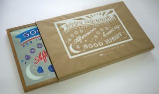
Another major consideration throughout was the packaging and posting. We wanted the object to be packaged safely but also beautifully. We looked at a lot of different options and the box we eventually chose ended up informing the format size of the mirror itself. We also designed packaging that would ensure the mirror's safety and designed a screen-printed kraft paper wrap to hold the protective packaging and object neatly together.
Conclusion
It's been a fascinating project to work on and the challenge presented by Up Side Up encouraged us to explore new ideas of production as well as head into new territory, in terms of what we consider achievable in-house.
Up Side Up cultivates real creative ambition in supporting designers to explore projects that might otherwise be beyond their means. They do this by either using a purchasing model that can help fund the completion of the work or – as with this project – challenging us to explore new methods of production and create a sophisticated but economically viable product from start to finish.
We're excited to see the final work near its launch date and finally go out into the world. We're also wondering whose reflections will be appearing in the mirrors we've created.
Words: Anna Fidalgo & Roger Kelly Photography: Fyfe Photo
Anna and Roger are the London-based design duo known as Crispin Finn. they have worked together since 2008 on illustration, design, screen prints, stationery and home prints. This article originally appeared in Computer Arts issue 230.

Thank you for reading 5 articles this month* Join now for unlimited access
Enjoy your first month for just £1 / $1 / €1
*Read 5 free articles per month without a subscription

Join now for unlimited access
Try first month for just £1 / $1 / €1
The Creative Bloq team is made up of a group of design fans, and has changed and evolved since Creative Bloq began back in 2012. The current website team consists of eight full-time members of staff: Editor Georgia Coggan, Deputy Editor Rosie Hilder, Ecommerce Editor Beren Neale, Senior News Editor Daniel Piper, Editor, Digital Art and 3D Ian Dean, Tech Reviews Editor Erlingur Einarsson and Ecommerce Writer Beth Nicholls and Staff Writer Natalie Fear, as well as a roster of freelancers from around the world. The 3D World and ImagineFX magazine teams also pitch in, ensuring that content from 3D World and ImagineFX is represented on Creative Bloq.
