Create a striking exhibition poster
Luke O’Neill shows you how good asset management can be key to streamlining multi-format projects
09 Now to get a little more creative and start fleshing out the poster. Source an interesting texture to be used as part of the background – in this case I’ve used some old parchment paper. In Photoshop, convert it to grayscale, hit Ctrl/Cmd+I to invert it, increase the contrast and save it out as a grayscale JPeg.
10 In InDesign, select our central rectangle shape and, using Ctrl/Cmd+D, place our grayscale image within the frame and position it to fill the frame. The beauty of using grayscale images is that we’re able to colour them directly within InDesign. Set up two new contrasting colour swatches and, using the Direct Selection tool, colour the background of the image. Select the contents of the frame using the Direct Selection tool and colour the foreground in a contrasting colour.
11 Now to create a vector pattern to contrast with the textured paper. Setup an A3 document in Illustrator and begin to draw some very simple shapes using the drawing tools. For the purposes of this poster we want to keep it fairly sparse. Now drag your shapes into the Swatches panel to make it a pattern swatch. Delete the original shapes, draw a large rectangle to fill the whole A3 document, choose the pattern swatch as the fill option and save it.
12 Back in our main document, select the background rectangle and fill it with one of the two colour swatches we created earlier. Now place the pattern file within the frame. As it’s a vector file we can resize it within InDesign to whatever size we want. Use the Direct Selection tool to select the pattern and enter 300% in the X and Y scale fields at the top.
13 It’s time to source our main image now – as our imaginary exhibition is called Sirens, I want an image that fits. In an ideal world we’d shoot our own model, but for this tutorial I’m using a stock photo. Scour image libraries and try out the low-res preview files in the document until you’re satisfied that you’ve found a good fit.
14 Following on with the two-tone theme, save the image as grayscale, place it in the foreground frame and colour it two different tints of purple. To carry the image into the background, duplicate the background pattern frame using step and repeat, copy the image from the foreground frame, hit Ctrl/Cmd+Alt/ Opt+V to paste the image into the background frame, and it will continue seamlessly. Now colour this in two contrasting colours.
15 I decided that the black isn’t punchy enough, so I coloured all the text white and the main Sirens logotype a slightly off-yellow colour to contrast with the two-tone colour scheme. I also added some final details, such as the date and address of the exhibition. Once you’re happy with everything, add all of these elements to your InDesign library.
Get the Creative Bloq Newsletter
Daily design news, reviews, how-tos and more, as picked by the editors.
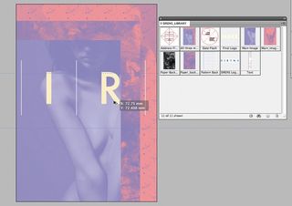
16 Now that all of our elements are contained within one InDesign library, whenever we need to create some new artwork for the exhibition or campaign, all we need to do is launch the library, drag off the required elements and re-size them to fit the chosen format, whether it be a flyer, sticker or billboard.

Thank you for reading 5 articles this month* Join now for unlimited access
Enjoy your first month for just £1 / $1 / €1
*Read 5 free articles per month without a subscription

Join now for unlimited access
Try first month for just £1 / $1 / €1
The Creative Bloq team is made up of a group of design fans, and has changed and evolved since Creative Bloq began back in 2012. The current website team consists of eight full-time members of staff: Editor Georgia Coggan, Deputy Editor Rosie Hilder, Ecommerce Editor Beren Neale, Senior News Editor Daniel Piper, Editor, Digital Art and 3D Ian Dean, Tech Reviews Editor Erlingur Einarsson, Ecommerce Writer Beth Nicholls and Staff Writer Natalie Fear, as well as a roster of freelancers from around the world. The ImagineFX magazine team also pitch in, ensuring that content from leading digital art publication ImagineFX is represented on Creative Bloq.
