Create retro type with Smart Guides
Smart Guides are an invaluable tool for precise alignment in Illustrator. Steven Bonner explains how to make the most of them in your work.
Smart Guides in Illustrator are a feature that I can't live without - I have them constantly turned on whenever I work.
While some designers feel that they cause on-screen clutter and choose not to use them, for me, the benefits of using this feature far outweigh a little distraction here and there.
In this tutorial, I give you an idea of the sorts of uses that Smart Guides can have, from the simple alignment of objects, to maximising the output of Illustrator's Rotate and Scale tools. Over the following pages, we create some retro inline lettering using a few very simple techniques, and then move into Photoshop to add the finishing touches to the piece.
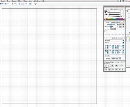
01 Create a new document. I've set mine at 220x220mm, and have modified the background grid to show a gridline every 20mm with eight subdivisions. To change the setting go to Illustrator>Preferences>Guides and Grid.
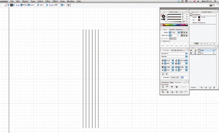
02 If you haven't already, switch on Smart Guides (Ctrl/Cmd+U) from the View menu, and using the grid as a guide, draw five vertical lines with the Line Segment tool (\).
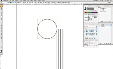
03 Notice that when you hover over an element on the pasteboard with the Smart Guides switched on, that element is highlighted - it can be disconcerting at first, but you'll soon get used to it. Now, using the Ellipse tool (L), draw a circle from the top anchor of your first line. When you run your cursor over an anchor point, it will either bring up a label to tell you that it's an anchor point, or a set of coordinates (depending on which version of Illustrator you are using). Drawing your circle from this label will mean that its anchor point is perfectly aligned to that of the line, making smooth transitions easy.
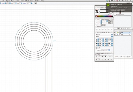
04 Now hover over the right-hand anchor point of your circle, hold down Shift+Alt, click-and-drag to make a copy, and align it with the anchor point of the next line. Again, using your grid as a guide, resize the circle so it's equal at the other side, and repeat these steps until all five lines are complete.
Get the Creative Bloq Newsletter
Daily design news, reviews, how-tos and more, as picked by the editors.
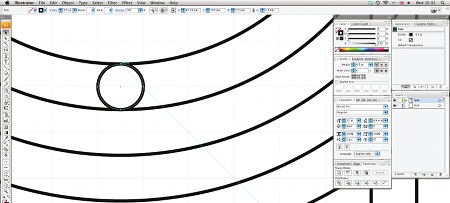
05 At the bottom anchor of the innermost circle, use the Ellipse tool (L) to draw another circle, which you'll use to connect the lines together. Use the same technique of aligning your cursor with the anchor point first, and drawing until it aligns with the next anchor point. Now use the Line Segment tool (\) to draw a line from the top anchor of the same circle to the edge of the larger circle. With this still selected, go to View> Guides>Make Guides, or hit Ctrl/Cmd+5. This will give you a new 45 angle guide, which will become useful in the next step.
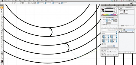
06 Using the Smart Guides, align your smaller, connecting circles to the guide you just drew. Then, using the Scissors tool (C), cut the circles at the anchor points where they intersect with the larger circles, and also where they meet the vertical line you drew earlier. As before, the Smart Guides will help you make sure you're cutting in the precise areas where you'll connect everything together.
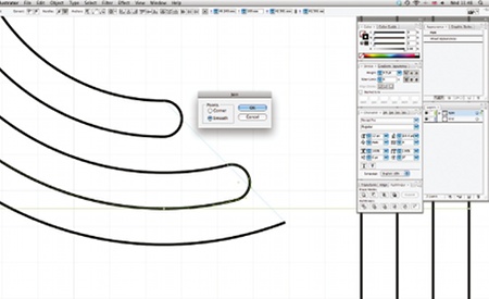
07 Select the connecting points with the Direct Selection tool (A). Then press Ctrl/Cmd+J, and select Smooth to join them together. This will combine the segments into one path. Repeat for the rest of the parts, and then use the same technique at the bottom of the vertical lines so that you have one long path.
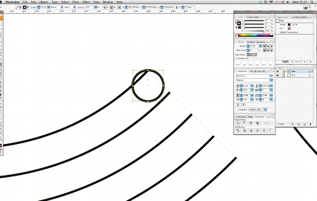
08 You can also use the Smart Guides when resizing and rotating objects - such as the connecting circles - as you go along. To do this, simply click-and-drag the crosshair in the centre of your element when using either tool to your desired anchor point, then click on the opposite anchor point to place the elements precisely.
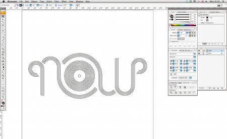
09 Keep drawing lines until you have a composition that's similar to the image shown above. You will need to turn Snap to Grid on and off every now and again, to allow for precise positioning, but bear in mind that if you have Snap to Grid turned on you won't be able to use Smart Guides.
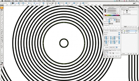
10 Now you have the basic lines, create the centre label by selecting the smallest circle and bringing it to the front (Ctrl/Cmd+Shift+]), and then Shift-clicking the next circle up in size, and using the Pathfinder to subtract the shapes. This will leave the label shape for you to colour separately later.
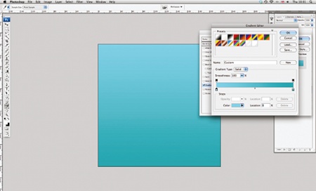
11 Next, open Photoshop and create a new document at 220x220mm. Then, on a new layer, fill the background with white. Using the Layer Styles window (the 'fx' icon on the Layer Palette), create a Gradient Overlay and fill it with a soft transition - I've used c:50, m:0, y:8, k:0 and c:75, m:15, y:30, and k:0 as my two colours, but you can use whatever you think works best.
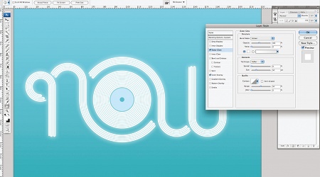
12 Copy and paste the vector lines into your Photoshop file, but be sure to keep the main linework and centre label as separate Smart Objects as you'll be colouring those differently. Using the Effects palette again, create a colour overlay of c:25 for your centre label. Then for the main type, create a Colour Overlay of white, and an Outer Glow of white, set to 40% Opacity and a size of 50px. Click OK.
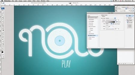
13 Now create a new layer, and type the word 'PLAY' in any font you like. I've chosen Univers Thin Ultra Condensed to give the piece a light but authoritarian edge, and to contrast with the whimsical flavour of the custom type. Next, add another layer, and create a radial Gradient Overlay from transparent in the centre to black at the outside edge. Add a slight amount of noise, and set the layer to Overlay. You might want to reduce the opacity of this layer a little, but it depends entirely on your own taste.
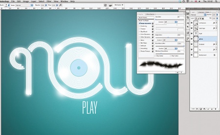
14 Create another layer and name it 'Glow'. In the Brushes palette, set the Hardness of your brush to 0%, and the Roundness Jitter to 100%. Experiment with the Minimum Roundness to find what works best; I've set mine to 20% so that the brush doesn't paint too thin. Now using white as you colour, paint in a few blurry glows amongst the lettering to replicate light. Be as random as you like and work from eye.

15 All that's left to do is add in a background image to give the type a context. I've used an image of some decks for a background texture. Simply up the contrast a bit, and then set the layer to Soft Light at 40%. Finally, boost some of the colours using the Curves dialog box, and you're finished.
Steven Bonner
Based in Stirling, Scotland, Steven is a multi-disciplined designer and illustrator working for clients such as Harper Collins, Cadbury and the Scottish Government. A love of type is a recurring feature of his work. See more of Steven's work at: stevenbonner.com

Thank you for reading 5 articles this month* Join now for unlimited access
Enjoy your first month for just £1 / $1 / €1
*Read 5 free articles per month without a subscription

Join now for unlimited access
Try first month for just £1 / $1 / €1

The Creative Bloq team is made up of a group of art and design enthusiasts, and has changed and evolved since Creative Bloq began back in 2012. The current website team consists of eight full-time members of staff: Editor Georgia Coggan, Deputy Editor Rosie Hilder, Ecommerce Editor Beren Neale, Senior News Editor Daniel Piper, Editor, Digital Art and 3D Ian Dean, Tech Reviews Editor Erlingur Einarsson, Ecommerce Writer Beth Nicholls and Staff Writer Natalie Fear, as well as a roster of freelancers from around the world. The ImagineFX magazine team also pitch in, ensuring that content from leading digital art publication ImagineFX is represented on Creative Bloq.
