Create a newsprint publication
From planning stages to the final product, Tim Wan explains how to get to grips with newsprint designs
Creating your own newsprint publication doesn’t have to be difficult. With some forward planning and a smooth workflow in place, it’s possible to produce a well-designed publication with a clear purpose. Key to this process is having a clear knowledge of what your publication will be and who you’re targeting it at.
This tutorial provides a basic insight into the process of developing a publication, highlighting key points during the design process that’ll help you to develop a newspaper or magazine from the initial concept through to the finished product. I’ll cover the thought process, workflow and some important aspects to consider when designing for print. We’ll be using InDesign, with a minor step into Photoshop to prepare the images for print.
01 First identify what type of publication you want to produce: what’s the content going to be, who’s your target audience, what’s your budget and, ultimately, what are your intentions for producing this publication? For me, I wanted to develop a concept magazine that informed people of things I believe they should know. Therefore, Thought Publication became a magazine that offered readers an alternative read on subjects that isolate themselves from current affairs and popular culture.

02 Gather your content through primary and secondary resources before you even start thinking about any design ideas. Often, for me, the research stage is a highly influential part of the process, which regularly determines my initial thoughts and direction of the project.
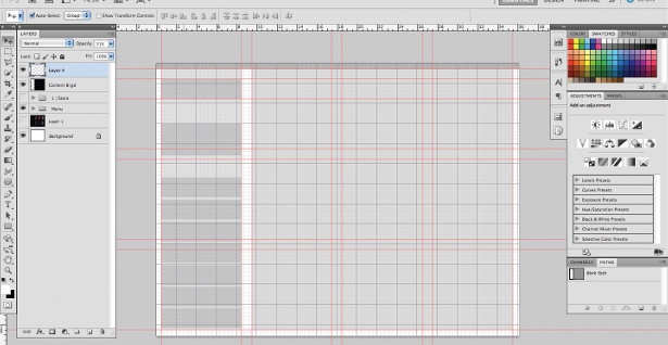
03 First, set up your new document in Adobe InDesign (New>Document). I’ve used a nine-column grid with 3mm gutters and 15mm all-round margins on an A3-size page. A nine-column grid gives you the flexibility of using several different widths for the text. Normally I’d increase the inner margins, but because it’s only six sheets folded in half it’s not essential in this case. Adjust your grid depending on your own preferences.

04 Set up an A-Master template with rows (Layout>Create Guides) – I’ve used nine rows with 3mm gutters – and apply this master to all the pages. I often prefer to work purely on the baseline grid, but I wanted a minimal and functional layout for this publication that would be bold and dynamic. The master document is useful when setting up page numbers, master guidelines and so on.
05 Experiment and start developing the visual approach of your publication. Decide on the typefaces you want to use and test them on several different locations – such as the front cover or case study spreads. Colour is another aspect to consider at this stage, as well as the layout treatment.
06 I decided to print my publication in two colours to keep it content-focused and reduce print costs. This also meant I could introduce a different colour following the same design direction in future issues. There are several ways to convert images into your desired spot colour: I prefer to put grayscaled images from Photoshop into InDesign and change the image colour there by selecting the image with the Direct Selection tool and choosing a fill. This is handy if you’re still experimenting with different colour palettes.
Get the Creative Bloq Newsletter
Daily design news, reviews, how-tos and more, as picked by the editors.
07 Start laying out pages of your publication, remembering to maintain a consistent approach. The copy in my publication runs over three columns on copy-heavy spreads, and in two columns on the case study spreads, to keep the publication interesting and functional. Various layout considerations and ideas can be used in a publication at once, but they need to be implemented consistently throughout. You should remember to keep a relatively low number of variables in relation to the number of pages you have.
08 Once you have the basic structure of the publication with all the content inserted, you can shift things around, experimenting with the pace of the publication and the layout, and really get into the detail of the typography. This is a good time to start playing around and pushing your design further: is the type and leading right? Is it all consistent? Does it flow well? Are there any missing links to the images?
09 Print mockups can help you identify any issues that might sometimes be difficult to spot on the screen, and are particularly important when you’re checking things such as image resolution, legibility and pace. Remember that you’re designing a physical product, so try to make a habit of printing pages out so that you can test folds, format, scale and other elements.
10 There are several ways to prepare your document for print – one of the most common formats for export is PDF (File>Export>PDF). Sometimes you might have to package it (File>Package), which means that everything – including all the fonts and files within the document – is saved as a separate file. All you need now is to find a company that prints decent quality newspapers at low print runs and reasonable prices. One place I’ve found is the Newspaper Club.

Thank you for reading 5 articles this month* Join now for unlimited access
Enjoy your first month for just £1 / $1 / €1
*Read 5 free articles per month without a subscription

Join now for unlimited access
Try first month for just £1 / $1 / €1

The Creative Bloq team is made up of a group of art and design enthusiasts, and has changed and evolved since Creative Bloq began back in 2012. The current website team consists of eight full-time members of staff: Editor Georgia Coggan, Deputy Editor Rosie Hilder, Ecommerce Editor Beren Neale, Senior News Editor Daniel Piper, Editor, Digital Art and 3D Ian Dean, Tech Reviews Editor Erlingur Einarsson, Ecommerce Writer Beth Nicholls and Staff Writer Natalie Fear, as well as a roster of freelancers from around the world. The ImagineFX magazine team also pitch in, ensuring that content from leading digital art publication ImagineFX is represented on Creative Bloq.
