Create a line-based vector portrait
Ruslan Khasanov on how to manipulate vector linework and gradients to bring an unusual sense of movement to your work
In this tutorial we will create a series of vector shapes through line-manipulation, building up a portrait in the style of Joy Division's cult album, Unknown Pleasures.
I'll show you how to create shapes from flowing linework, and how to use curving gradients to create atmosphere and a sense of movement in your work. You don't have to stick with two or three-coloured gradients, as used here - feel free to experiment with more complex arrangements. You could also add some radial fills for an even more striking image.
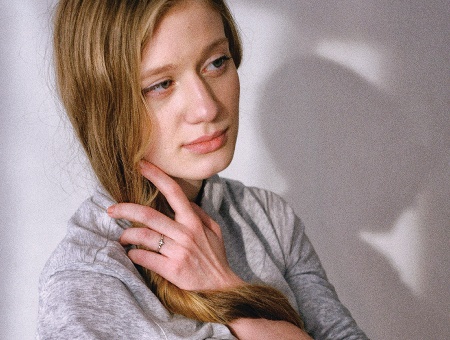
01 Use a photograph as your base. This is an original photo of a girl, taken with an ordinary 8-megapixel camera. Take as many pictures as possible, from different angles, and play with different poses.
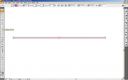
02 In Illustrator, using the Layers panel create a new layer and fix your chosen photo onto it. Create another layer above it - this is what we will be drawing on. Draw a horizontal line across your whole image with the Line Segment tool.
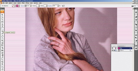
03 Now we will create a base consisting of a row of straight lines. Select your line, press Alt/Opt+Shift, and copy it, moving the copy a little above the original line. With both selected, press Ctrl/Cmd+D and duplicate them until you've filled the image.
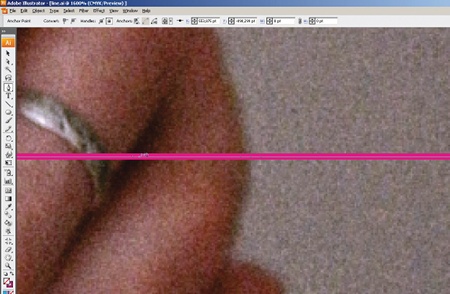
04 Starting near the bottom, create points along each line - along the borders of each main shape - using the Pen Tool (Ctrl/Cmd+P). To smooth them, select the points and select 'Convert selected anchor points to smooth' on the top panel. The border between the shape and the background will be fixed with the anchor points, which we are not going to touch. The background will be smooth.

05 Now we begin to edit the shape of each line. Move the points upwards using the Direct Selection tool, making sure you represent key features in your model that break the horizontal flow of the line. You'll almost need to use sculpting skills for this.
Get the Creative Bloq Newsletter
Daily design news, reviews, how-tos and more, as picked by the editors.
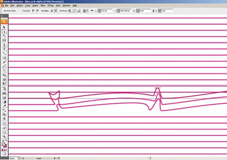
06 When the base line for a key feature is finished, move up to the next line and edit it in the same orientation, following the shape. In those places where you need a clearly defined shape, the points must be located as closely to each other as possible.
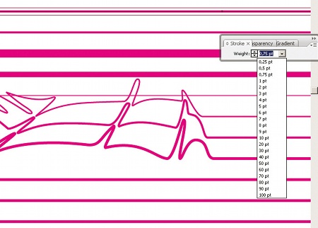
07 Edit the thickness of the lines using the Stroke options. Use a range of sizes - each individual line should have a different weight. By using a range of thick and thin lines, you'll be able to add extra dynamics to the image. Of course, it'll take some time, but stick with it and the result will be impressive.
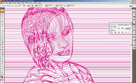
08 When your line image is ready, copy it and hide the copy in a new layer - you will need a duplicate later. Now it's time for experimentation. Select your image and go to Object>Expand. This will turn your lines into Contiguous objects. Now go to Pathfinder>Add To Shape Area>Expand.
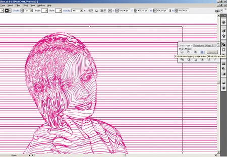
09 Next we select the borders of our image. Draw a rectangle with a solid colour above it. Select all, and go to Pathfinder>Exclude Overlapping Shape Areas> Expand. Next, click Release Compound Path.
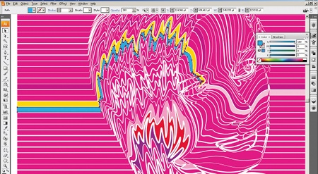
10 Now we have a sort of a cast. Remove all unnecessary elements so that only your shapes are left, ready for a colour fill. You might choose only one gradient, or a variety of colours - but use specific shades for specific objects.
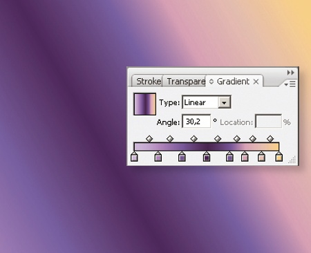
11 First create a background. An appropriately chosen gradient will help to create the illusion of material. You can create your own gradient, or go to Window>Swatch Libraries>Gradients and choose one of the existing gradients.
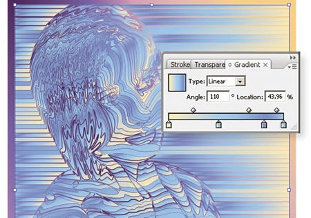
12 Select your image and go to View>Hide Edges (Ctrl/Cmd+H) for the easier Fill set-up. Now we can edit the gradient with no visual obstacles: move the slider bars on the Gradient slider, choose different Angle options, and experiment with the colours.
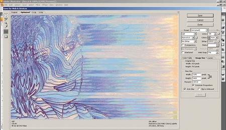
13 When contrasts face each other head-on, it can lead to striking results. To create interesting effects, let's export the image as a GIF. Choose No Dither for the dither algorithm, set Lossy at a number greater than zero, and experiment with the other parameters. The result will be an interesting destructive effect - almost as though our image has been caught up in a pixel storm.
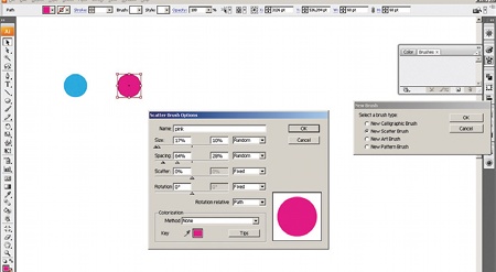
14 Let's now explore the options for how you can use your line image. Open your prepared duplicate. Create a vector object and use it to create a new scatter brush. A window will appear where you can choose the brush size and its other parameters. We will use this brush to treat our lines.
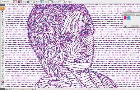
15 Copy the image and then experiment with different brushes, changing the size values and colours as you prefer.

Thank you for reading 5 articles this month* Join now for unlimited access
Enjoy your first month for just £1 / $1 / €1
*Read 5 free articles per month without a subscription

Join now for unlimited access
Try first month for just £1 / $1 / €1

The Creative Bloq team is made up of a group of art and design enthusiasts, and has changed and evolved since Creative Bloq began back in 2012. The current website team consists of eight full-time members of staff: Editor Georgia Coggan, Deputy Editor Rosie Hilder, Ecommerce Editor Beren Neale, Senior News Editor Daniel Piper, Editor, Digital Art and 3D Ian Dean, Tech Reviews Editor Erlingur Einarsson, Ecommerce Writer Beth Nicholls and Staff Writer Natalie Fear, as well as a roster of freelancers from around the world. The ImagineFX magazine team also pitch in, ensuring that content from leading digital art publication ImagineFX is represented on Creative Bloq.
