Create light with the Transparency palette
Carolina Torres explains how to manipulate Illustrator's Transparency toolkit to obtain brilliant effects
Illustrator's Transparency palette is full of options for adding depth and dynamism into your work.
In this tutorial, I'll show you how to take full advantage of the different blending modes and opacity settings to create dramatic lighting effects, as well as a sense of motion, in your illustrations.
Through clever colour choice, it's possible to produce striking images with a real sense of atmosphere. Experimentation is key; so once you've mastered the basics here, start applying them to your projects and see what new effects you can create.
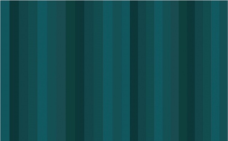
01 First open Illustrator, select the Rectangle tool and make a background of vertical rectangles. To add more personality, colour the rectangles in varying shades of a limited colour palette. I've gone for blue and turquoise.

02 Next, add some background elements. This image is a nightscape, so with the Ellipse tool create a series of little circles for stars, and spread them across the canvas. For the clouds, draw rounded rectangles with three circles placed above, then group these shapes, remove the stroke and fill them with grey (I've gone for 32% black).
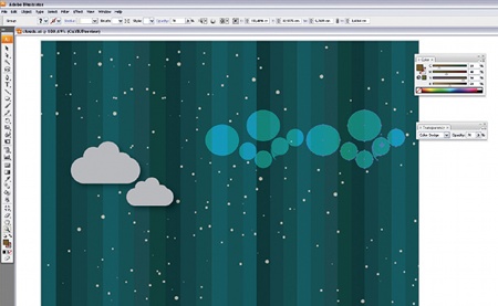
03 The other very simple, circular cloud forms are also created with the Ellipse tool. Colour these circular clouds - I've set mine to C:18, M:40, Y:90 and K:50 - and go to Window>Transparency then select Colour Dodge from the drop-down menu. This effect helps to accentuate the background colours.

04 Now to add a blue gradient. Draw a rectangle then click on the Gradient button. With the rectangle selected, in the Gradient palette select the black slider. Holding Alt/Opt, in the Swatches palette click on a dark blue colour. Expand the rectangle to fill the image and go to Window>Transparency>Multiply.
Get the Creative Bloq Newsletter
Daily design news, reviews, how-tos and more, as picked by the editors.
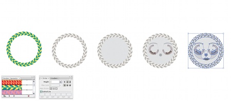
05 For the moon, draw a circle and go to Window>Brush Library>Borders> Borders_Geometric>Geometric 10. Select the border, go to Object>Expand Appearance, then ungroup. In Swatches>Swatch Library>Default Swatches>Print select the Greyscale swatches. With the Magic Wand tool, select the border green then click on a mid grey. Repeat with the border yellow and a lighter grey. Colour the inner circle a third shade of grey, then draw a face in it. For the glow, make a white circle, blur it (Filter>Blur), and change the blending mode to Colour Dodge.
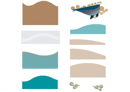
06 Now for the sea. To achieve a sense of depth, it's all about superimposing shapes. Using the Pen tool, draw a series of simple wave shapes. I've arranged mine from background to foreground, as you can see here. Next we'll colour them.
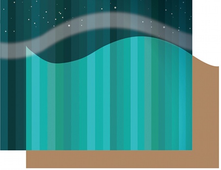
07 Colour your first wave brown (I've set mine to C:31%, M:46%, Y:66% and K:5%). Give the wave a Colour Dodge transparency, and position it in your image. To help create atmposphere, place a white mist above it: draw a white wave-shaped form, give it a percentage of blur (Filter>Blur), and select Colour Dodge from the Transparency palette, setting Opacity at 100%.
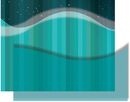
08 Select another wave shape, give it a bright blue colour (I've chosen C:100%, M:17%, Y:41% and K:0) and a black drop shadow (Effect>Stylize>Drop Shadow). Select Normal from the Transparency palette and change the Opacity to 77%. When you're happy, arrange it in front of the first wave. This process starts to create a sense of volume in the sea.
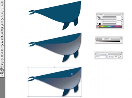
09 Next in line is the whale. The body is made from a simple pair of shapes, as shown. Fill the upper part with a dark blue, and fill the lower part with a white-toblack gradient, then go to Window> Transparency>Lighten. Give this an Opacity of 70% and add the shapes to make the fins, tail and eyes.
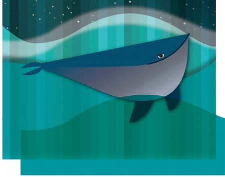
10 Position the whale in your image and add another wave on top to achieve a greater sense of depth. Make this a bright blue colour (I've opted for C:100%, M:17%, Y:41% and K:0%), and then select Multiply from the Transparency palette, changing Opacity to 100%.
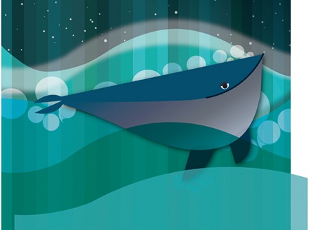
11 Now add some bubbles. To help balance the composition, I've used the same forms that I used for the clouds behind the moon. Send each backwards (Object> Arrange>Send Backward) until they're where you want them. Next, add another blue wave (C:36%, M:11%, Y:30% and K:0%) in front, with Transparency set to Normal and Opacity set to 77%.
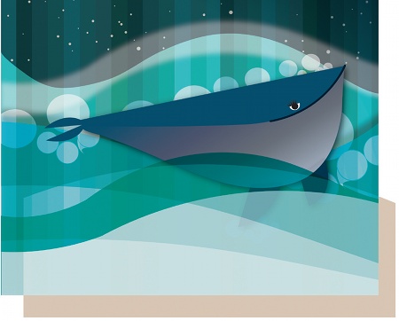
12 Incorporate some final smaller waves, each one set to a light brown colour, with Colour Dodge selected from the Transparency palette, and Opacity set to 40%. Again, these different layers all add to the sense of depth being created.
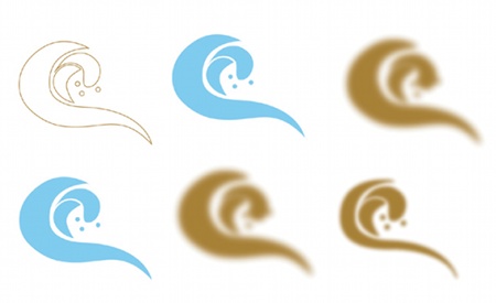
13 To complete the sea, we'll add some foam. With the Pen tool, draw a series of simple, swirling shapes. Fill them light blue, select Normal from the Transparency palette and set the Opacity to 45%. Copy the form, fill it with a brown colour, add some blur, select Lighten from the Transparency palette and set Opacity to 100%. Copy the blue form again, but cut down the shape so that it's thinner. Colour it brown, select Colour Dodge, and change the Opacity to 60%. Now position the blue shape onto the brown shape, and finally add the thinner shape on top.
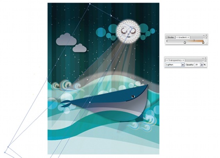
14 With the Pen tool, draw some rays of light, adding a white-to-light orange gradient. Select Lighten from the Transparency palette and set Opacity to 19%. Now make copies of the ray and position them around the moon.
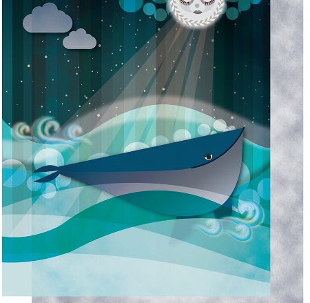
15 To finish off the image, make some final colour adjustments to bring your design together as a whole. Use Hue/ Saturation to adjust the individual colour presets and simplify your colour scheme. Unify your design by choosing the same selection of colours for both layers.

Thank you for reading 5 articles this month* Join now for unlimited access
Enjoy your first month for just £1 / $1 / €1
*Read 5 free articles per month without a subscription

Join now for unlimited access
Try first month for just £1 / $1 / €1

The Creative Bloq team is made up of a group of art and design enthusiasts, and has changed and evolved since Creative Bloq began back in 2012. The current website team consists of eight full-time members of staff: Editor Georgia Coggan, Deputy Editor Rosie Hilder, Ecommerce Editor Beren Neale, Senior News Editor Daniel Piper, Editor, Digital Art and 3D Ian Dean, Tech Reviews Editor Erlingur Einarsson, Ecommerce Writer Beth Nicholls and Staff Writer Natalie Fear, as well as a roster of freelancers from around the world. The ImagineFX magazine team also pitch in, ensuring that content from leading digital art publication ImagineFX is represented on Creative Bloq.
