Create a kaleidoscopic effect
Martin Sati shows you how to add motion to your vector shapes
In this tutorial, I'll walk you through you how to add a sense of motion to your work by combining vector illustrations with Photoshop's Pen tool to create a kaleidoscopic effect.
Focusing on my image 'Stampede' as a starting point, we'll mix vector drawings with pixels, incorporating a series of different forms - animal, vegetable, mineral and synthetic - to make a complex, fluid image. This technique is like a chemistry experiment and the results can be unpredictable: it's a great way to add dynamism to your work.
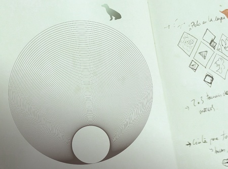
01 Before you begin, think about the concept of your drawing and make some notes. I usually print out a few sketches to see what kind of lines I will use; however, for this illustration I've kept the process organic, doing no preliminary sketches.
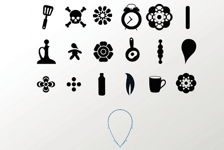
02 The next step is to create a series of vector-based shapes and icons that you can use in your illustration. Open Illustrator (or any drawing software of your choice) and start experimenting with different shapes.
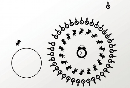
03 Select some of your elements and start creating circular patterns. You can use the Rotate tool to do this - simply hold Alt/Opt with an object selected, choose a centre point and use the dialog that appears to specify the number of repeats.
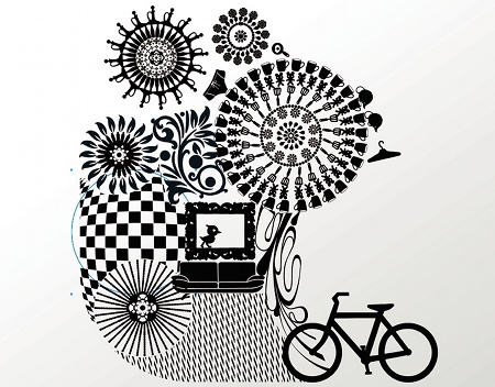
04 Still working in vectors, continue to build up a variety of different scenes from your elements. Experiment to see how different patterns interlink with each other, varying the sizes.
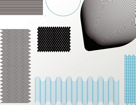
05 Now is a good time to create some line-based textures that you might want later to fill any gaps between different scenes. Experiment here, and make a variety of different effects.
Get the Creative Bloq Newsletter
Daily design news, reviews, how-tos and more, as picked by the editors.
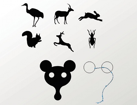
06 To finish the vector part of the process, design an array of different animals to integrate into the final piece. Some of mine are modified icons, while others were created from scratch.
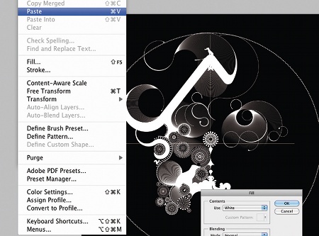
07 Still in Illustrator, create an ellipse with a dashed stroke, then open Photoshop and paste it onto a black background. Place your vector scenes within the circle, and play around with their positioning. Work with lots of layers so you can move objects freely.
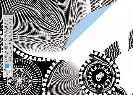
08 When you're happy, start filling any holes in your design with the textures that you created earlier. There are many different ways to do this, but I cut out different shapes and place them in the holes.
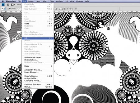
09 Next, subtly place some of the animal shapes you created in your pattern to give the composition rhythm and strength. Use the Pen tool to refine the lines and fill in any gaps. The integration of the animal objects helps give movement to the image.
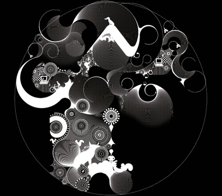
10 Continue working around the circle, completing it with different scenes and linking them with linear textures. The process is similar to laying bricks.
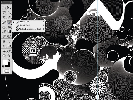
11 Continue to work on multiple layers. This will enable you to position scenes exactly where you want them.
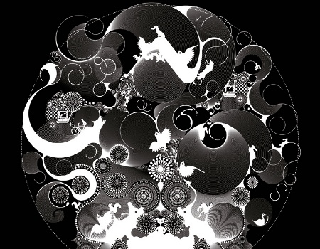
12 Now select the Pen tool, stroking paths to make a series of curved lines, integrating the animals with the different elements. In this way internal movements are created within the piece.
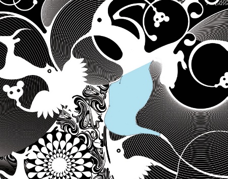
13 I finish the finer details directly using a Wacom Cintiq tablet and the Brush tool. I find that working directly with a stylus is more accurate than using a mouse.
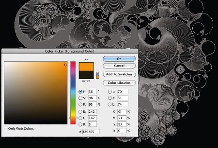
14 When the picture is almost complete, start thinking about what kind of colour palette you'd like to use. This will depend on the final outcome of your composition - it's an organic process, so you don't always know from the start how it'll end up. In this case I choose a yellow-orange gradient to give contrast and strength to the image.
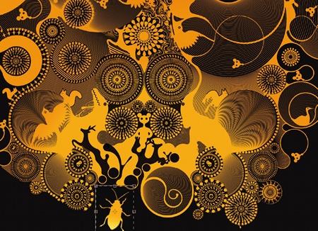
15 Finally I position an insect creature slightly below the main drawing to give a feeling of movement and panic. That's it, you're done.

Thank you for reading 5 articles this month* Join now for unlimited access
Enjoy your first month for just £1 / $1 / €1
*Read 5 free articles per month without a subscription

Join now for unlimited access
Try first month for just £1 / $1 / €1

The Creative Bloq team is made up of a group of art and design enthusiasts, and has changed and evolved since Creative Bloq began back in 2012. The current website team consists of eight full-time members of staff: Editor Georgia Coggan, Deputy Editor Rosie Hilder, Ecommerce Editor Beren Neale, Senior News Editor Daniel Piper, Editor, Digital Art and 3D Ian Dean, Tech Reviews Editor Erlingur Einarsson, Ecommerce Writer Beth Nicholls and Staff Writer Natalie Fear, as well as a roster of freelancers from around the world. The ImagineFX magazine team also pitch in, ensuring that content from leading digital art publication ImagineFX is represented on Creative Bloq.
