Create illustrated type for advertising
Speed up your workflow in Photoshop and pick up some essential tricks along the way. Kyle Wilkinson shows you how.
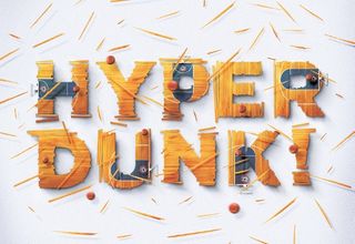
When a client needs an image-led solution to a problem as soon as possible, you often have to rely on your Photoshop workflow and in-depth knowledge of tricks and techniques. These factors usually dictate whether you can get through the project by the end of the day, rather than by the start of the next morning.
In this guide, we're going to use a fictional brief in which a sports company is looking to feature a slogan in an illustrated style. It's a common type of commission and one that you should be able to whizz through in very little time – as long as you have the correct workflow in place. In fact, we think you'll be surprised by the impressive results that can be achieved.
In this walkthrough, we'll take you through the creation of this image, but its main purpose is to bring you tricks and techniques to speed up your own Photoshop workflow. Note that when working on an illustrative type piece like this, you can use existing letters and fonts as a base to work from. Choose something that is suitable to the end image and brief.
Now read on and discover some new vital tricks to speed up your image-creation work.
01. Compose and plan
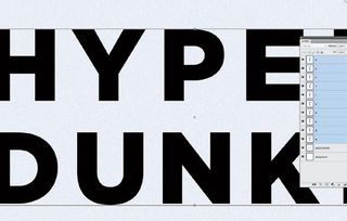
Here we'll transform Gotham into something more exciting. Lay out your type into a rough composition. Put the letters on separate layers and create grid lines. With the Selection tool, drag and arrange them around your image. This is useful if you're working towards a golden ratio, like the rule of thirds.
02. Get creative with masks
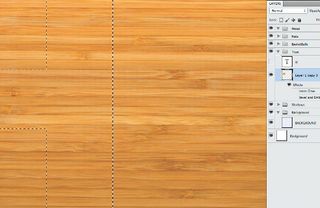
Layer masks let you transform images into any shape in a non-destructive way. We'll use our letters as a template to mask out this photograph of wooden flooring. Add more shapes to the letters with the Marquee selection tools; this gives each letter more character. Don't be afraid to experiment.
03. Determine a light source
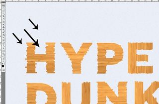
Decide where the light will come from before turning it on; planning avoids corrections later. Type in a number when the Brush tool is selected to quickly alter its opacity. To create shadows, Cmd/Ctrl+click on the layer and fill this selection with black onto a new layer. Use Filter>Blur>Gaussian Blur to soften.
Get the Creative Bloq Newsletter
Daily design news, reviews, how-tos and more, as picked by the editors.
04. Nudge with arrows for accuracy
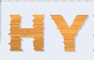
Move the shadow layer below and nudge it a few pixels down and right. Reduce the layer opacity by 20%. Repeat this process, alternating the opacity to build shadow depth and length. Refine the shadow layers once in place. Mask out the areas that shouldn't have shadow with varying brush settings.
05. Duplicate layer masks
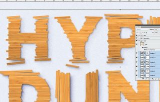
If you have a layer mask to apply to multiple layers, duplicate it to save time. Drag the mask onto another layer, holding the Alt/Option key to make a copy. To add length to the shadows, make another copy of the shadow layer and use Filter>Blur>Motion blur at 250 pixels. Check for areas that shouldn't have shadow.
06. Create duplicate templates
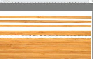
Create templates to make quick duplicates of additional images. To quickly make a copy, hold the Alt/Option key with the Move tool and click and drag on the object. Clone in some blemishes and marks onto your duplicates. This gives them more character so they don't look repeated or duplicated.
07. Add colour with blend modes
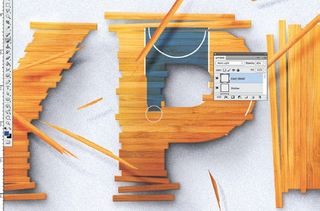
On a separate layer, use the Brush tool to paint in colour details. Then choose a layer blending mode that enables the texture and reflections of the surface to come through. Cycle through blending modes quickly using Shift++ and Shift+-. Always keep an eye out for elements you can re-use.
08. Inner Shadow Layer Style
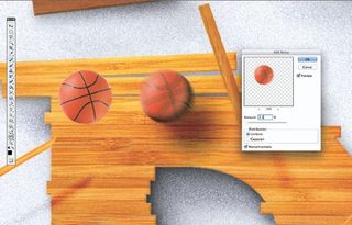
Use the Inner Shadow Layer Style to add more shadows to your objects; untick Global Light, then angle the effect to the opposite of your light source. For elements with motion, use the Motion Blur filter. You can add noise to help diffuse the movement by using Filter>Noise>Add Noise at 3%.
09. Flexible adjustment layers
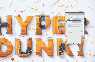
For more punch, add a Contrast adjustment layer that affects every layer. You can adjust the opacity and layer blending modes to alter the strength of the effect. Make multiple colours and tones balance up using the Colour Balance adjustment layer. Do this at the end to make sure the image works as a whole.
Words: Kyle Wilkinson
Kyle is a 26-year-old Yorkshire creative who works across a variety of design-related areas including typography, brand identity, lettering and illustration. He is creative director and co-owner of UK-based studio DMSQD. This article originally appeared in Computer Arts issue 229.

Thank you for reading 5 articles this month* Join now for unlimited access
Enjoy your first month for just £1 / $1 / €1
*Read 5 free articles per month without a subscription

Join now for unlimited access
Try first month for just £1 / $1 / €1
The Creative Bloq team is made up of a group of design fans, and has changed and evolved since Creative Bloq began back in 2012. The current website team consists of eight full-time members of staff: Editor Georgia Coggan, Deputy Editor Rosie Hilder, Ecommerce Editor Beren Neale, Senior News Editor Daniel Piper, Editor, Digital Art and 3D Ian Dean, Tech Reviews Editor Erlingur Einarsson and Ecommerce Writer Beth Nicholls and Staff Writer Natalie Fear, as well as a roster of freelancers from around the world. The 3D World and ImagineFX magazine teams also pitch in, ensuring that content from 3D World and ImagineFX is represented on Creative Bloq.
