Create flexible imagery for the web
Stephanie Rewis shares her expert tips for designing images that will work fluidly in any browser.
Moving designs onto the web can be a frustrating process for many creatives. Used to the precise control that's possible in printing, designers can be tempted to strive for the same pixel perfection on the web. However, rigid designs tend to break under the stress of modern screen dimensions, which can range from compact mobile interfaces to generous television monitors.
In addition, static sites have now been replaced with more contemporary ones, which are easily updatable using content management systems, and with baby boomers continuing to age, some users will be viewing your site using an increased text size.
Your graphics need to be able to adapt to all of these potential content and viewing changes. So, whether you're writing code or handing designs to a developer, this tutorial demonstrates some key ways to make your graphics more flexible and, crucially, accessible to a larger variety of users.
Click here to download the support files (909KB)

01 A common web design technique involves the use of three or four boxes of equal height positioned in a line. However, content amounts can be unpredictable with a CMS - or for users with increased text size - and if the boxes flow out of their boundaries, some content will be hidden. Websites exist to provide content, so it's important to ensure your design enables people to access the information they need.
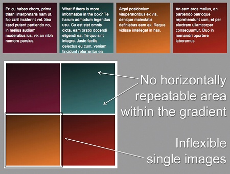
02 Open 01>equal-heights.html from the support files in your browser. Each background image has been created separately, with no horizontal area that can be repeated - the gradient extends over the full height - so it's not possible for any content to extend past the specified height of the image. As a result, some of the content in the teal box has been lost.
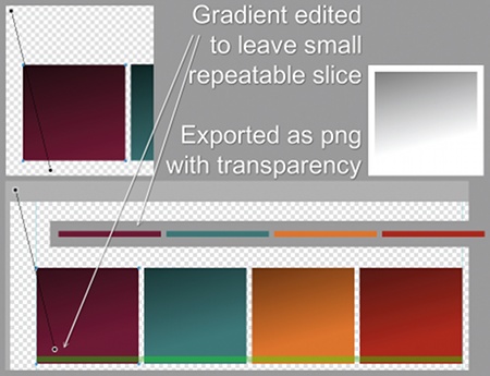
03 When creating any equal-height box effect, a full-width horizontal slice needs to be available across all boxes, whether it's a paper effect, pattern, gradient or shadow. Here, I changed the gradient so that it ends before the bottom of each box (I did this in Fireworks, but Photoshop or Illustrator would suffice). A small slice was made, and the image is repeated vertically on the container of the four boxes. The gradient itself was exported as a PNG with transparency and placed in each box.
Get the Creative Bloq Newsletter
Daily design news, reviews, how-tos and more, as picked by the editors.

04 Open 01>equal-heights-final.html to view the new effect in a browser. Place more content into any of the columns and notice how the boxes now seem to remain the same height. This effect, called faux columns, is a common technique used to create an appearance of equal heights on the columns of your overall page design. The gradients in each box can be created without an image, should you wish, thanks to an excellent new feature in CSS3 that enables you to use pure code.

05 Another common web design element is tabbed navigation. A frequent mistake, though, is to export each tab as a single image - including the text. This can be an SEO nightmare, and troublesome to keep updating. Another mistake is to export the tab as a single image background and use real HTML text, perhaps with some CSS3 effects. This is better for SEO and any future editing, but it can cause the same problems we saw in the last example: it's inflexible and the copy can overflow.

06 One of the best ways to create a flexible tab using images is with a method called 'sliding doors'. This uses real text and lets the tab expand if the copy becomes longer or taller. It requires a sliced image that's as wide as you expect any of the tabs to be and approximately three times as tall. You can create this large tab, or use the 9-Slice Scaling tool in Fireworks, say, to stretch the repeatable areas without losing clarity (see above).
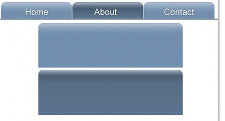
07 Make sure the gradient and other effects on the large tab keep the same height they originally had on the small tab - don't just allow them to grow proportionately. When you place the large image on the navigation, it will appear to be the original, small tab, just as you initially designed. With CSS3 becoming more widespread, you'll soon be able to create these tabs image-free using rounded corners, gradients and drop shadows.
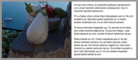
08 One common alignment technique used in both print and online work is to set an image alongside a text column, both at equal heights. It works well in print, but the text can grow beyond the height of the image on the web in some situations, ruining the look. Open 03>equal-columns.html to view some of the problems with the strategy.
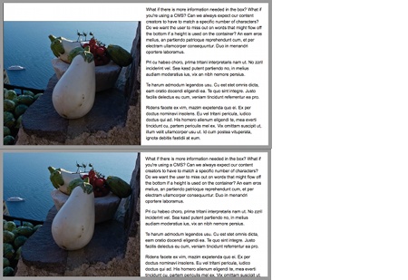
09 If the image is of a fixed size, surfing with increased text size or adding more words than it was originally designed to accompany will destroy the balanced look. Space might be added between the image and the top of the container, or the copy could be cut off at the bottom if a height on the container is used - again, users will miss the content. However, if you're savvy about the images you choose, there's a better way.
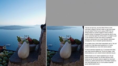
10 By using a tall background image you can add more text or increase the copy size, keeping the look balanced. When choosing and cropping an image, look for a picture in which you can retain more height. It might have more room on the top or bottom - maybe both. Set the background image to the centre, top or bottom, depending on the framing needed. On your disc, open 03>equal-columns-final.html to see the flexible result.

11 Many designers prefer to work with a fixed width when creating web layouts, because it's predictable, but it's not overly difficult to make this layout flexible. Open 04>equal-columns.html. This example shows a fixed-width image in a banner, used on a fluid (percentage-based) layout. Because the background image in the header is positioned in the centre and the layout is wider than necessary, there's space on both sides. With smart planning, you can make this beautiful.

12 This is the full original image. As you plan your banner, envision a thin strip with your desired framing on the left, right or centre. From this photo, I created a lovely banner - 250px tall - that could comfortably be viewed as wide as 1680px. Note that by setting a maximum width on the container, I was able to prevent the user's viewport becoming wider than the largest available length.
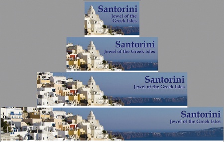
13 Open the file 04>equal-columns-final.html in a browser. Set your browser to a variety of widths to emulate the various options: mobile devices, 800px, 1280px and 1680px. With the background image in the centre of the header, it looks pleasing at any size. Set the background position on the image to the left, right or centre, based on what you think looks best.
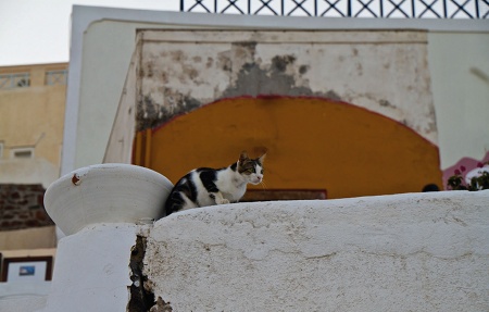
14 Interestingly, with these methods a poorly cropped picture might give you more photo area to work with than a well-framed one, especially if the textures are interesting or the background makes it easy to use Content Aware Fill in Photoshop to fix missing pieces or remove unsightly bits. There are a variety of directions in which this cat image could be cropped, for example, and still provide a flexible background.
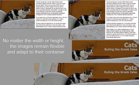
15 Open 05>equal-cat.html and 05>flexible-banner-cat. html in a browser. Add your content and change the browser size. The cat banner is attached to the right of the layout. The background image next to the text is attached at the centre, enabling the image to reveal more, both at the top and bottom. These are just a few creative effects you can use to develop flexible, fluid web layouts that are viewable in any browser.
Stephanie Rewis
A front-end developer, speaker and author, recently-married Stephanie (Sullivan) is an expert consultant brought in by clients to handle difficult projects or train web departments. She loves beach volleyball and 80s music. Read more at: www.w3conversions.com

Thank you for reading 5 articles this month* Join now for unlimited access
Enjoy your first month for just £1 / $1 / €1
*Read 5 free articles per month without a subscription

Join now for unlimited access
Try first month for just £1 / $1 / €1

The Creative Bloq team is made up of a group of art and design enthusiasts, and has changed and evolved since Creative Bloq began back in 2012. The current website team consists of eight full-time members of staff: Editor Georgia Coggan, Deputy Editor Rosie Hilder, Ecommerce Editor Beren Neale, Senior News Editor Daniel Piper, Editor, Digital Art and 3D Ian Dean, Tech Reviews Editor Erlingur Einarsson, Ecommerce Writer Beth Nicholls and Staff Writer Natalie Fear, as well as a roster of freelancers from around the world. The ImagineFX magazine team also pitch in, ensuring that content from leading digital art publication ImagineFX is represented on Creative Bloq.
