Create distorted typography in Photoshop
Chris Golden explains a simple way of experimenting with typography in your work
08 Next, change the colour of your pattern. I Ctrl/right-clicked on the layer, and changed the blending mode to Color Overlay to make the pattern in my image blue.
09 For your final top layer, add the photo you scanned in earlier. I’m a big fan of exotic photographs, but finding them can be tricky. Usually I have to go hunting through garage sales or flea markets, which I try and do often to find new content that I can archive for future projects.
10 Once you have your composition set as you want it, add a blue layer and set the blending mode to Screen to help unify the composition. Now switch into Illustrator and experiment with different typefaces until you find one that works with your piece. For this example, I used PrioriSan. I find that san serifs work well because they are easier to read after adding distortion, whereas a custom typeface might not work as well.
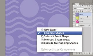
11 We’re now going to bring in three different type layers and create a custom wave shape. Begin to drag your type into Photoshop. When doing so, keep the type as a Smart Object, so that any changes you make are non-destructive.
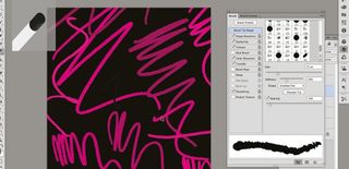
12 Now for the fun part. Once you have your type in place and it’s sized correctly, head over to the Filter menu, select Distort and click on Shear.
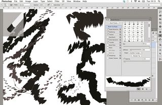
13 In the Shear panel, click on Wrap Around and move the points to experiment with how the type will distort. I like to see how far I can take it, so play around. Remember that you can also use the Shear filter on images as well.
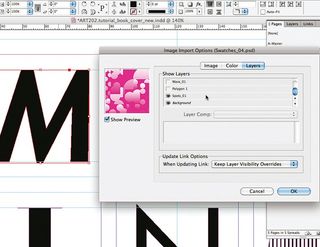
14 Once you have the type for one of your words where you want it, repeat the process for any other groups of type you have – in my case, ‘An’ and ‘Fast Vol. 4’. Next, Ctrl/right-click on the layer, change the blending mode to Color Overlay and pick the colours you want to use – in this case, white.
Get the Creative Bloq Newsletter
Daily design news, reviews, how-tos and more, as picked by the editors.
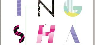
15 Lastly, duplicate your type layers and drag them to fill the composition. We’ve covered a very flexible technique here, which you can play around with to create a unique look.
For more info on type terms, check out the What is Typography post on our sister site Creative Bloq.

Thank you for reading 5 articles this month* Join now for unlimited access
Enjoy your first month for just £1 / $1 / €1
*Read 5 free articles per month without a subscription

Join now for unlimited access
Try first month for just £1 / $1 / €1
The Creative Bloq team is made up of a group of design fans, and has changed and evolved since Creative Bloq began back in 2012. The current website team consists of eight full-time members of staff: Editor Georgia Coggan, Deputy Editor Rosie Hilder, Ecommerce Editor Beren Neale, Senior News Editor Daniel Piper, Editor, Digital Art and 3D Ian Dean, Tech Reviews Editor Erlingur Einarsson, Ecommerce Writer Beth Nicholls and Staff Writer Natalie Fear, as well as a roster of freelancers from around the world. The ImagineFX magazine team also pitch in, ensuring that content from leading digital art publication ImagineFX is represented on Creative Bloq.
