Create custom type from existing fonts
Typefaces you already own can be as effective in commercial art as custom lettering, reveals illustrator Steven Bonner.
I draw letters for a living. I get to play and experiment with new styles every day as part of my commercial work, and I'm very lucky to have the chance to do so. However, there are times when you need to work quickly. Maybe there's a short deadline, or the client has a lower budget that doesn't afford custom type, or maybe the brief is perfect for a typeface you already have. There will definitely be occasions where the need to use what you have is important, but I aim to show that this doesn't mean compromising on quality or ideas.
Here, I'm using a fictional range of headphones as inspiration for an equally fictional advert where I want to show movement and style. Let's get to it.
01. Choosing fonts and slogans
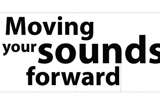
Create a new document in Illustrator (300x222mm) and type out your text with the Type tool. Arrange your type in a balanced way and make up a slogan. Outline the type so that you have paths to work with by selecting it and going to Type>Create Outlines. Note that Illustrator ungroups words in stages.
02. Customise your letters
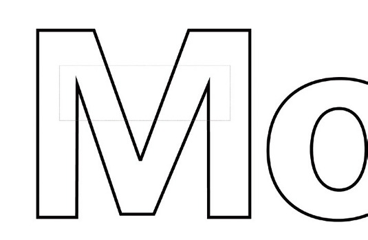
Adjust letters to suit your taste. We'll straighten the M's slanting sides using the Direct Selection tool (hit the A key) and selecting individual points. Our look is similar to the original Myriad, but we've adjusted the paths so they fit a more vertical and horizontal set of rules, making subsequent edits easier.
03. Make connections
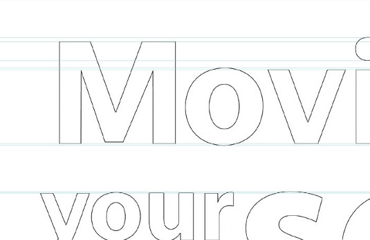
Add guides to the artboard by turning on Rulers (Cmd/Ctrl+R or View>Rulers>Show) and dragging guides out of them. Use the Scissors tool (C) to cut away parts of the first letter and then extend lines and make connections between other letters for a sense of flow in your piece.
04. More motion and flow
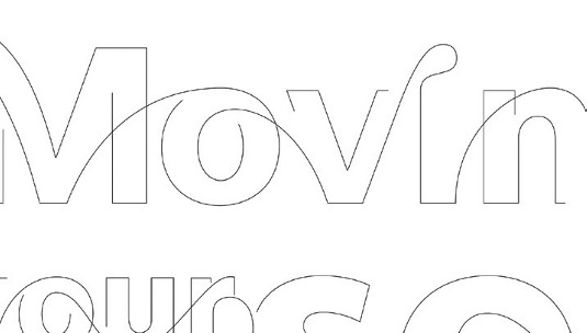
Use the Pen tool to draw new elements connecting your letters, dragging the Bézier handles for ultimate control over your curves. Overlap lines and draw waves to accentuate the flow. Link the other letters in a similar way to achieve a feeling of motion from one letter to the next, creating a balanced effect.
05. Blending lines
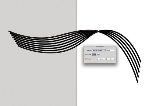
Now start blending paths that overlap. Duplicate the type layer and hide and lock the original. On the new layer, cut overlapping lines using the Scissors tool. Hit Shift+Opt/Alt+B or go to Object>Blend>Make to blend overlaps. You may need to redraw the path lines you edit to get the blends to work properly.
Get the Creative Bloq Newsletter
Daily design news, reviews, how-tos and more, as picked by the editors.
06. Create the overlaps
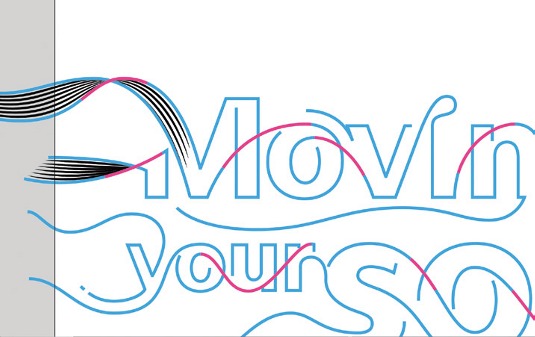
Photoshop doesn't recognise overlapping lines, so create these on a new layer. Select all your type and create a new layer. Thicken the type on the original layer and colour it, then make the type on the new layer white. Show all your layers, make type strokes the same width, then colour them in to contrast.
07. Smart Objects
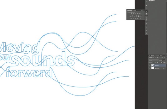
Create a new Photoshop document. Paste the first type layer as a Smart Object and call it 'Type'. Do the same for the blends layer and overlapping type areas, with the former below and the latter above the type. Add a Multiply layer above the background with a Gradient Overlay Layer Style, set to Radial.
08. Inner Glow

Select the 'Blends' layer and add an Inner Glow Layer Style. Reduce the fill opacity to 75% and check Layer Mask Hides Effects. Add a white overlay at 100% opacity. Create a mask on the 'Blends' layer and start to paint out the edges to soften it and make it flow better.
09. Shear the type
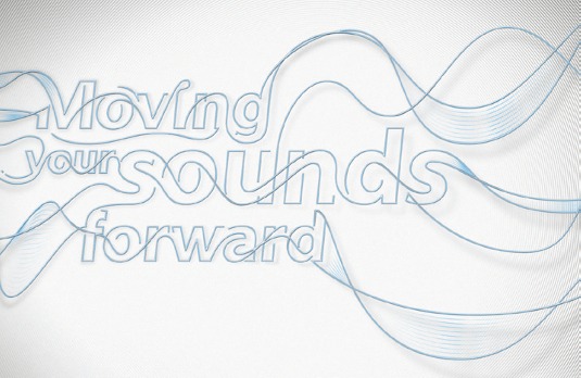
'Italicise' the full type layer via Edit>Transform>Shear, using one of the anchors. Duplicate the layer, rename it 'Shadow' and lock its pixels to fill it with black. Now unlock it and apply a Gaussian Blur. Hit Cmd/Ctrl+T to apply a transform box. Hit the Warp Mesh icon in the Control bar and distort the shadow for depth.
Words: Steven Bonner
Originally hailing from Stirling, Scotland, illustrator and letterer Steven Bonner has recently jumped across the Atlantic to join the design team at ad agency Goodby, Silverstein & Partners. This article originally appeared in Computer Arts issue 229.

Thank you for reading 5 articles this month* Join now for unlimited access
Enjoy your first month for just £1 / $1 / €1
*Read 5 free articles per month without a subscription

Join now for unlimited access
Try first month for just £1 / $1 / €1

The Creative Bloq team is made up of a group of art and design enthusiasts, and has changed and evolved since Creative Bloq began back in 2012. The current website team consists of eight full-time members of staff: Editor Georgia Coggan, Deputy Editor Rosie Hilder, Ecommerce Editor Beren Neale, Senior News Editor Daniel Piper, Editor, Digital Art and 3D Ian Dean, Tech Reviews Editor Erlingur Einarsson, Ecommerce Writer Beth Nicholls and Staff Writer Natalie Fear, as well as a roster of freelancers from around the world. The ImagineFX magazine team also pitch in, ensuring that content from leading digital art publication ImagineFX is represented on Creative Bloq.
