Craft vectors with style
Tom Lane explains how to create detailed type treatments by hand
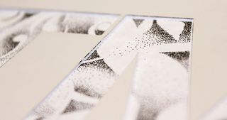
08 As you start to encounter different parts of your drawing below, start selecting areas to leave blank. Dot around the forms, and add a shadow underneath aspects to ‘pop’ them out from the canvas.
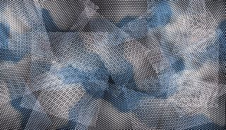
09 Create dynamics. Explore the shape of the characters in the stencil along with the forms you’ve drawn underneath. See if you can abstract the letterforms.
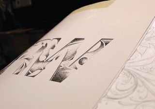
10 Don’t be afraid to release the bottom sketch layer and move it around to bring in particular elements you like or that you think will fit in better. Begin sparsely: as you start to build up the shadow and highlights, you’ll see where you need to concentrate the density and where to leave it clear.
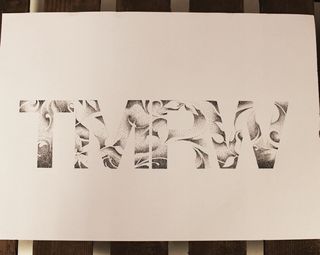
11 Once you have a good covering and you’re happy, remove the stencil and the bottom layer. Now step back from the artwork and assess your piece. Select areas that you think need more density to create more rhythm and legibility.
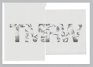
12 Now it’s time to scan in your artwork, but because this is A3 you might need to do it in sections. Scan at 600dpi if possible, and in black and white mode. Open an A3 (600 dpi) document in Photoshop, and copy and paste the scans into it.
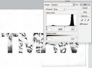
13 Reposition the separate scans so that your artwork is back intact. Now let’s create more contrast using the levels. First merge the two layers (Cmd/Ctrl+E). Go to Image>Adjustments>Levels and use the sliders to pull them closer to the middle, adding more contrast.
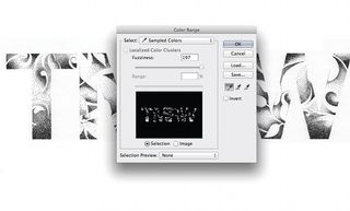
14 Go to Select>Color Range and use the Eyedropper tool to select the black parts of your image. Make sure that Fuzziness is set to near full and hit OK. A selection will now be visible on your artwork. Create a new layer, hold Shift and press Delete. Choose Use>Color, select black and hit OK.
Get the Creative Bloq Newsletter
Daily design news, reviews, how-tos and more, as picked by the editors.
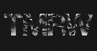
15 You should now have completely independent layers. Hide your original artwork layer and you can adjust the background and artwork colours easily.

Thank you for reading 5 articles this month* Join now for unlimited access
Enjoy your first month for just £1 / $1 / €1
*Read 5 free articles per month without a subscription

Join now for unlimited access
Try first month for just £1 / $1 / €1
The Creative Bloq team is made up of a group of design fans, and has changed and evolved since Creative Bloq began back in 2012. The current website team consists of eight full-time members of staff: Editor Georgia Coggan, Deputy Editor Rosie Hilder, Ecommerce Editor Beren Neale, Senior News Editor Daniel Piper, Editor, Digital Art and 3D Ian Dean, Tech Reviews Editor Erlingur Einarsson and Ecommerce Writer Beth Nicholls and Staff Writer Natalie Fear, as well as a roster of freelancers from around the world. The 3D World and ImagineFX magazine teams also pitch in, ensuring that content from 3D World and ImagineFX is represented on Creative Bloq.

