Computer Arts cover contest 2015: top 30 entries revealed
After much deliberation, we can reveal the top 30 cover designs for the forthcoming New Talent issue.
Goce Veleski
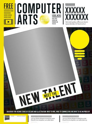
- Goce Veleski
- Age: 26
- Education: FON University / self-taught
- Concept: Goce conceives this as an ego-boost for new creatives with a mirror-like polaroid, allowing readers to see themselves on the front cover of CA in real time.
- Print/digital enhancements: The reflective surface could be achieved using a Mirri special finish, thinks Goce. He thought the digital version would benefit from activating the front-facing camera of the iPad to capture the reader's picture and display the selfie on the cover.
Grace Murray
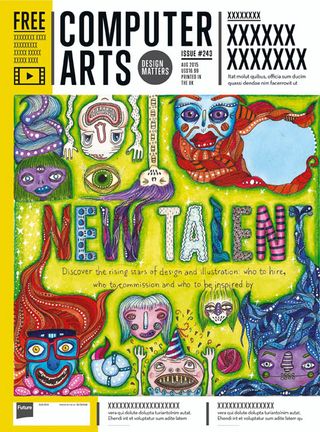
- Grace Murray
- Age: 22
- Education: Visual communications at Cork Institute of Technology, Ireland
- Concept: Grace's concept for the cover was for the faces to emulate different styles, tastes and personalities that designers and creators exhibit in their work.
- Print/digital enhancements: Grace suggests raising the 'New Talent' type on the cover to give it a tactile feel and enhance the aesthetic. The stars would benefit from a rainbow-hued, fluted diffuser foil, she thinks, similar to the one that appeared on CA's education special.
Hayley Lowndes
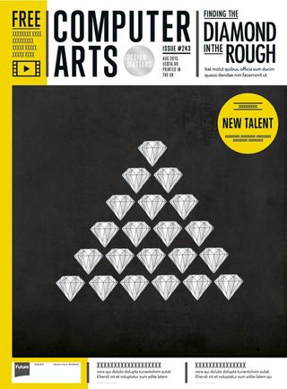
- Hayley Lowndes
- Age: 22
- Education: BA (Hons) Graphic design at Nottingham Trent University
- Concept: Hayley likens her cover to sifting out the rising stars - or diamonds in the rough - from amongst a mass of graduates.
- Print/digital enhancements: The diamonds could be created using a silver 'scratch-off' varnish, reckons Hayley, enticing the reader to scratch them and reveal the real diamond (which wouldn't scratch off). The digital version would be an interactive cover so that the iPad user could rub off the fake diamonds in likewise fashion.
Jaime Hayde Montiel
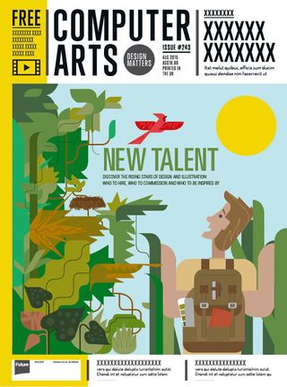
- Age: 27
- Education: Graphic design degree at the University of Basque Country, illustration at the School of Art and Design
- Concept: Jaime's concept was simple: “Time to leave the nest, discover the world and be seen.”
- Print/digital enhancements: For print, Jaime suggests a UVI varnish over the illustration except for the sky; for digital, he'd like to see the bird animated so that it can be seen leaving the nest.
Jake Gunn
- Jake Gunn
- Age: 24
- Education: Graphic design at the University of the West of England
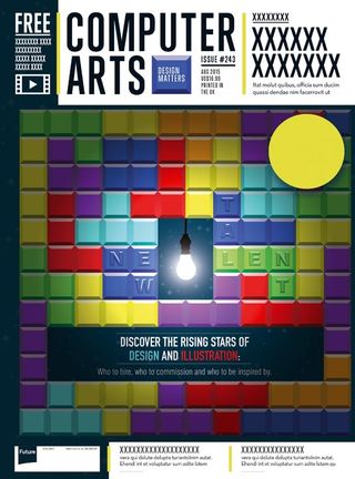
- Concept: “There's always space for new talent,” says Jake, describing the concept behind his cover. “The iconic game of Tetris represents the seemingly overflowing brilliant design that surrounds us, but all it takes is one new talent with a bright idea to find their space and shine a light on the industry.”
- Print/digital enhancements: Jake suggests a spot UV on the two colours of the letters that spell out 'New Talent'. His more adventurous idea is to print the cover on light sensitive paper and seal it in a light-proof bag, so that when people open it and take the issue out they see the cover turn from black to the full colour image.For digital, he envisions a really dark screen, with only a lightbulb hanging in the centre, and once you push the lightbulb it lights up, illuminating the rest of the cover. His second ideais to have the Tetris pieces fall down until the cover it complete.
Jenelle Hendey
- Jenelle Hendey
- Age: 21
- Education: Advertising and branding at the Vega School in Durban, South Africa
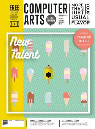
- Concept: “It takes more than just your usual flavours of design to earn a D&AD pencil and become the cream of the crop.”
- Print/digital enhancements: Jenelle suggests embossing the title and the white frame, including the red flash. Elsewhere the blue background could be a matte and all the ice creams in a spot UV.She likes the idea of making the ice creams actually smell like flavours of ice cream (chocolate, vanilla or strawberry) or the smell of pencil shavings/wood. For digital, she suggests the ice creams could fall to the bottom of the page if the iPad was turned upside down, while the pencil ice-cream stayed in the centre.
Joonas Jansson
- Joonas Jansson
- Age: 30
- Education: Visual design at Metropolia University of Applied Sciences in Helsinki, Finland
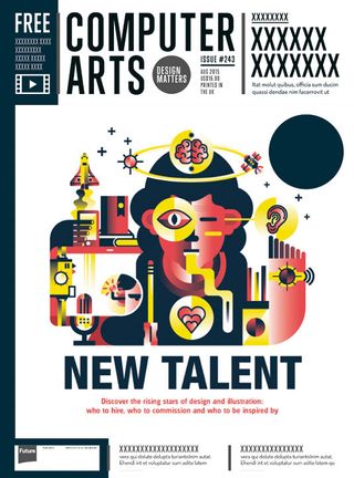
- Concept: Joonas envisions the “perfect new talent creature with all the physical and mental qualities of a top professional.”
- Print/digital enhancements: Joonas suggests a UV-spot varnish on the round skills bubbles (the eye, ear, heart, brain, and the 'sensor'). He also imagines some glow-in-the-dark ink on some parts of the illustration.In digital, he envisions plenty of animation. “I'l like to see the satellite circling around, the space shuttle taking off, the eye scanning, the heart pumping and the watch sending out signal,” he says. “Maybe also the tongue 'wobbling' and brain being electrified.”
Josie Gledhill
- Jose Gledhill
- Age: 21
- Education: BA Visual communication and illustration at Loughborough University
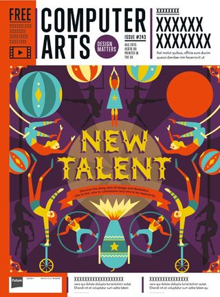
- Concept: “Like circus performers, designers are inventive, talented, and often a very colourful bunch who delight in showcasing their work for an audience,” explains Josie.
- Print/digital enhancements: Josie would like to see a spot varnish on certain areas of her design to add depth and “create a feeling of intrigue in the audience”, she says. That goes for the title, the performers in shadow and the explosion from the cannon.
Julia Frances
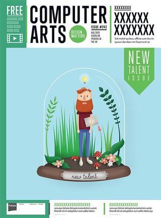
- Julia Frances
- Age: 27
- Education: BA Graphic design at Glasgow Clyde College
- Concept: “I wanted to show growth in my design and somehow combine it with the reality that as a designer looking to be hired, you are displaying yourself and your ability for all to see,” says Julia. “So I came up with a little 'Talent Terrarium' showing the designer, his tools and most importantly his bright ideas (the lightbulb) ready to go.”
- Print/digital enhancements: On the iPad, Julia thinks it would be good to show the bright idea (the lightbulb) popping up over the designer's head, with the bulb getting brighter. For print, she suggests a spot UV varnish on the bulb. Also, she mentions a foil/metallic treatment on the metal plaque could draw the eye to the theme.
Le Ha Linh
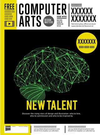
- Le Ha Linh
- Age: 19
- Education: Graphic design in Hanoi College of Industrial Fine Arts and FPT Arena Multimedia
- Concept: “Since talent doesn't just come out of nowhere, the brain's 'function button' for ideas is appreciated,” says Le Ha Linh. “As you can see, the brain in my design is complexly connected by thousands of neurons from all parts of the brain, representing the fact that the more experience and knowledge one can connect, the more creative and unique the ideas could be.”
- Print/digital enhancements: Le Ha Linh envisions using glow-in-the-dark ink for the brain to represent neurons firing as the brain works away. For digital, she imagines the connections ramifying through the brain structure as a new idea takes form.
Next Page: more of the top 30 CA cover designs
Get the Creative Bloq Newsletter
Daily design news, reviews, how-tos and more, as picked by the editors.

Thank you for reading 5 articles this month* Join now for unlimited access
Enjoy your first month for just £1 / $1 / €1
*Read 5 free articles per month without a subscription

Join now for unlimited access
Try first month for just £1 / $1 / €1
The Creative Bloq team is made up of a group of design fans, and has changed and evolved since Creative Bloq began back in 2012. The current website team consists of eight full-time members of staff: Editor Georgia Coggan, Deputy Editor Rosie Hilder, Ecommerce Editor Beren Neale, Senior News Editor Daniel Piper, Editor, Digital Art and 3D Ian Dean, Tech Reviews Editor Erlingur Einarsson, Ecommerce Writer Beth Nicholls and Staff Writer Natalie Fear, as well as a roster of freelancers from around the world. The ImagineFX magazine team also pitch in, ensuring that content from leading digital art publication ImagineFX is represented on Creative Bloq.
