Computer Arts cover contest 2015: top 30 entries revealed
After much deliberation, we can reveal the top 30 cover designs for the forthcoming New Talent issue.
Earlier this month, Computer Arts teamed up with our friends at D&AD New Blood to provide readers with the opportunity to design the cover for our upcoming New Talent special, on sale at the end of July.
Based on select criteria including creativity of concept, quality of execution and of course its suitability for use as a magazine cover, the team whittled the entries down to a longlist of 30.
We'll be unveiling the final 12 in a special exhibition on the Computer Arts stand at D&AD New Blood in London next week (1st–2nd July, Spitalfields Market, Shoreditch).
So without further ado, in no particular order (well, alphabetical order), here are the top 30:
Afroditi Constantinou
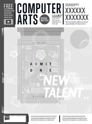
- Afroditi Constantinou
- Age: 24
- Education: BA Multimedia and graphic arts, University of Cyprus
- Concept: Afroditi's passport-like ticket serves to represent the new talent amongst the real life 'movie stars' and 'big shows' of graphic design.
- Print/digital enhancements: The white patterns on the ticket would be covered in security foil for a gleaming effect, says Afroditi. In digital, she envisions the ticket being pulled out using the iPad's 'swipe down' gesture or animated.
Assia Faheem

- Assia Faheem
- Age: 29
- Education: BA graphic and media design (advertising), UAL London College of Communication
- Concept: Assia based her cover on the idea of star trails and the association between stars and celebrity. "Star trails depict a journey, reflecting the journey new designers embark on in their creative career."
- Print/digital enhancements: Assia proposed foil block printing and screen printing. She thought creating translucent layers would give it more depth, especially if used on the astronaut and the typeface, while the foil block process would be for the star trail.
Ben Wills
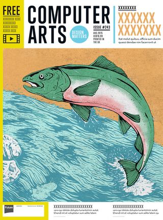
- Ben Wills
- Age: 23
- Education: BA Illustration, Plymouth University
- Concept: "A lone salmon leaps up against the stream, representing a talented, struggling creative who has finally been noticed," says Ben.
- Print/digital enhancements: Ben proposed the darker tones of water be debossed to add 3D depth and texture to the print cover.
Mr Black
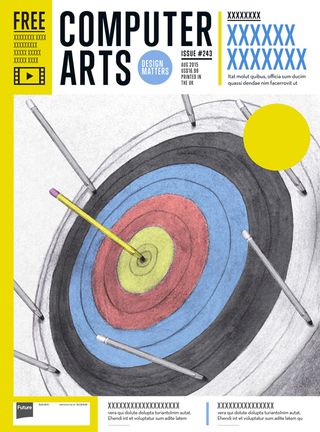
- Mr Black
- Age: 23
- Education: BA Illustration, Plymouth University
- Concept: "A unique yellow pencil hits the bullseye while all the grey, uniform pencils miss the target," explains Mr Black.
- Print/digital enhancements: Mr Black suggested the pencil and bullseye would be printed in UV spot varnish to make it pop out from the rest of the illustration.
Charlie Nolan
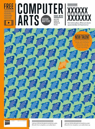
- Charlie Nolan
- Age: 23
- Education: Graphic communication with typography at Plymouth University
- Concept: Charlie's design celebrates creatives who "swim against the current" in order to advance their skills, knowledge and output.
- Print/digital enhancements: The print version would benefit from a reflective foil finish, thinks Charlie, while the digital version would feature a short animation conveying movement or a reflective effect.
Danny Rowe
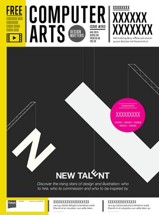
- Danny Rowe
- Age: 24
- Education: Graphic design at Staffordshire University
- Concept: Danny went for a simple, abstract visual representation of the building and crane-like construction of the words 'new talent'.
- Print/digital enhancements: "Print could involve the UV spot varnish/embossing of certain elements or possibly laser cutting of the type so that when the cover is opened the inner pages reveal more type surrounding the scene."
Darren Gate
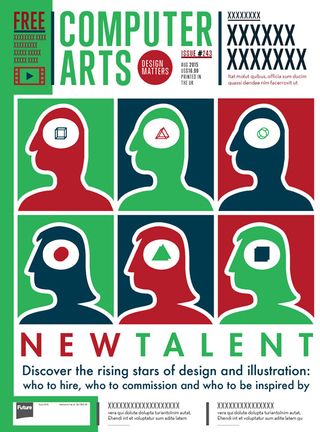
- Darren Gate
- Age: 26
- Education: Illustration and graphic design at De Montfort University
- Concept: "This cover illustrates how people can see the same basic concept through to very different outcomes," explains Darren. "Each aspect of the illustration has three alternatives which relate back from RGB."
- Print/digital enhancements: For print, Darren thinks the vector-based illustration could be turned into a screenprint to highlight how new talent can combine computer-based art with handcrafted creativity. A final print run could even use part-recycled paper stock with a matt finish, he suggests.
David Simões

- David Simões
- Age: 28
- Education: Animation 2D/3D at Professional Foundation of Setúbal
- Concept: David went for a fresh, colourful, eye-catching cover that's seasonal and summery, and which conceals the as-yet unknown identity of the next generation of 'young blood' creatives.
- Print/digital enhancements: David suggests embossing and selective coating for the title in print. He also submitted a short animation showing the gradual rendering of the digital cover.
Eliz Underhill
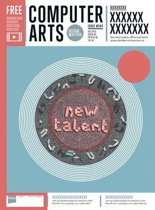
- Eliz Underhill
- Age: 28
- Education: Graphic design at Central Saint Martins (recently enrolled at Shillington)
- Concept: "This cover revolves around the concept of growth and the discovery of a new, adapted cell culture that's been incubated and nurtured, and is now fizzing with energy - the 'new talent' is about to outgrow its petri dish," says Eliz.
- Print/digital enhancements: The blue outer area could be silk or something soft to touch, while the white ridges of the petri dish could be embossed and the specks inside the dish debossed. For the digital edition, Eliz suggests animating the specks to create a sense of life and energy, with the 'new talent' hovering gently above.
Ferry Jayadi
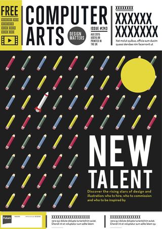
- Age: 21
- Education: Currently enrolled at Universitas Pelita Harapan, Indonesia
- Concept: Ferry uses the repeated pattern of pencils as a metaphor for the new generation of creative talent, with a rocket-propelled pencil representing the best of that talent.
- Print/digital enhancements: Ferry suggests a lenticular treatment for the print edition that transforms the look of the rocketing pencil when viewed at a certain angle. For digital, "tapping the rocket-pencil would set in motion a short two to five second animation of its launch, leaving a trail of smoke in its wake which condenses into a short quote."
Next page: more of the top 30 CA cover designs
Get the Creative Bloq Newsletter
Daily design news, reviews, how-tos and more, as picked by the editors.

Thank you for reading 5 articles this month* Join now for unlimited access
Enjoy your first month for just £1 / $1 / €1
*Read 5 free articles per month without a subscription

Join now for unlimited access
Try first month for just £1 / $1 / €1
The Creative Bloq team is made up of a group of design fans, and has changed and evolved since Creative Bloq began back in 2012. The current website team consists of eight full-time members of staff: Editor Georgia Coggan, Deputy Editor Rosie Hilder, Ecommerce Editor Beren Neale, Senior News Editor Daniel Piper, Editor, Digital Art and 3D Ian Dean, Tech Reviews Editor Erlingur Einarsson, Ecommerce Writer Beth Nicholls and Staff Writer Natalie Fear, as well as a roster of freelancers from around the world. The ImagineFX magazine team also pitch in, ensuring that content from leading digital art publication ImagineFX is represented on Creative Bloq.
