Computer Arts cover contest: final shortlist of 10 revealed
We chat to the 10 shortlisted entrants, one of whom will be designing the cover for CA's New Talent special
Last month, Computer Arts teamed up with D&AD New Blood to provide a unique opportunity to design the cover for our upcoming New Talent special.
Two weeks ago, we revealed the longlist of 30 -- and can now unveil the final shortlist. We've chatted to the 10 young designers to find out more about the concepts they submitted, so, in alphabetical order...
Arjun Makwana
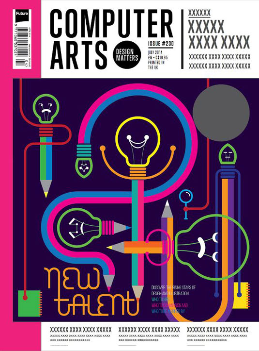
Arjun Makwana works as a visualiser at Ogilvy & Mather in Mumbai. His interest in design stems from a childhood spent in a tailor shop watching his father and grandfather work.
Observing the craft lit the touchpaper for his eventual study of graphic design and illustration at the Faculty of Fine Arts in Gujrat, India.
Makwana's self-described 'simple, logical' cover conveys his belief that design talent is synonymous with an ability to ideate -- the bulb representing the initial concept, and the pencil emblematic of its eventual realisation.
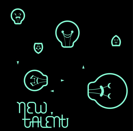
He chose fresh, contemporary colours to express youthfulness, and envisaged an interactive iPad version akin to a billboard where the bulbs glow whenever someone walks past.
Clare Dolan
Originally from Rugby, Warwickshire but now based in north London, Clare Dolan has been freelancing as an illustrator since graduating from Loughborough University, where she studied illustration.
Get the Creative Bloq Newsletter
Daily design news, reviews, how-tos and more, as picked by the editors.
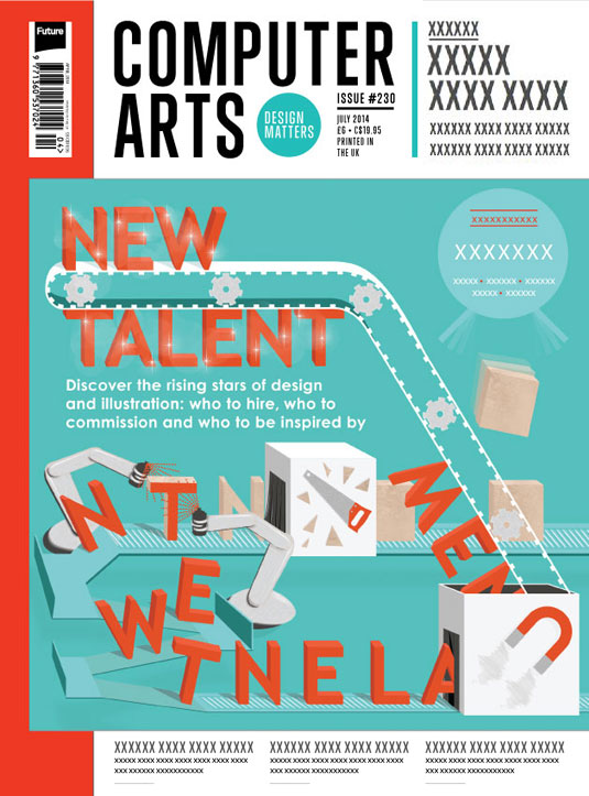
Her cover design draws on memories of being thrown into unfamiliar areas of design as a student, and the need to develop and refine skills along the way to suit your chosen path. "I transformed that idea into a production line, which shapes the physical letters from raw material into ‘new talent’," she adds.
Dolan believes the design could really come alive on the iPad: "I'd be excited to see the cogs, letters and conveyer belt moving," she smiles. "Perhaps readers could even activate the spray-can robots in a race against the speedy production line."
Jun Hun Yap
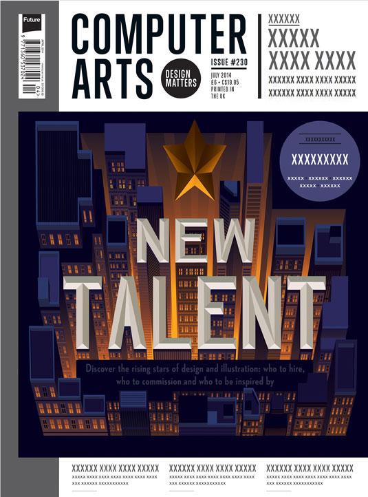
Jun Hun Yap has a diploma in illustration and a degree in graphic design, both of which he credits for strongly moulding his work. His cityscape idea for the cover came about when he considered the difficulty involved in pinpointing new talent in a crowded field.
Initially he wanted to hint that the rising star was the person looking at the cover. This progressed into an act of discovery on the viewer's part: by looking at the cover at a right angle the star appears to float above the city, giving an illusion of depth.
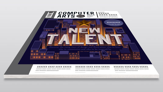
Jun chose a night scene to contrast with the streetlights and he suggests a lenticular treatment would add to the sense of 3D.
Marija Tiurina
Marija Tiurina is a 23-year-old Eastern European illustrator who last year completed a BA in multimedia design and technology at Brunel University while also working part-time as a digital artist in a Soho games studio.
Since then she has been a games artist by day and a freelance illustrator by night, trying out different mediums in an effort to discover her preferred style.
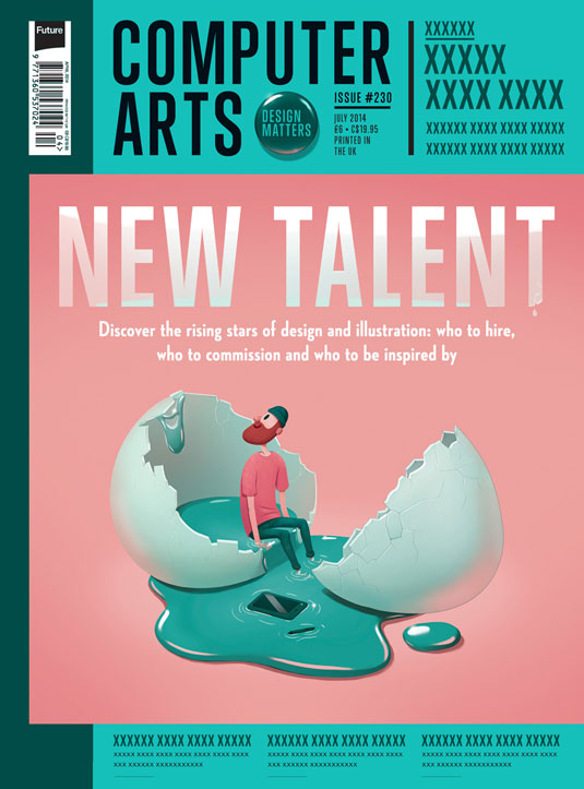
For her cover design, Tiurina wanted to emphasise the birth of novelty, which led her to settle on the image of a designer freshly hatched from a giant egg and looking around with curiosity.
Clean vectors and bright colours were chosen in Illustrator to reflect the freshness of new talent, however Tiurina wanted to preserve a hand-drawn element for the character, so she added some brush work and a hint of shading in Photoshop.
Meanwhile the interactive aspect of Tiurina's cover came to mind quite naturally: a tap on the closed egg could hatch it, making the character fall out and the title appear.
Milli-Jane
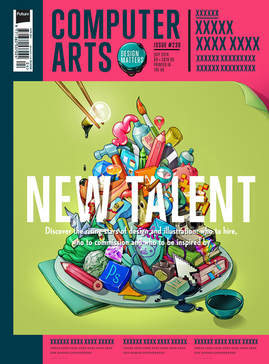
Milli-Jane Pooley -- whose illustration moniker is simply 'Milli-Jane' -- began drawing when she was little. An early interest in computers and coding Myspace profiles led her to enrol on an art foundation course, and carve out a path to freelance illustration.
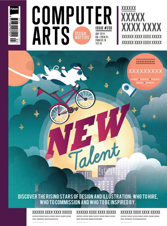
Her cover idea evolved quite a bit in the course of its conception, beginning as a talent stage show for dogs, moving to an Olympic ceremony in space, and finally settling on an inspirational fairytale scene in which a pup shows off its talent for sky cycling.
Milli-Jane's design hints at a general penchant for cute and humorous characters within the context of a simple, clean style and a complementary colour scheme. Her ideas for iPad interactivity include rotating stars, parallax clouds and rocket propulsion.
Olivia Ariferiani
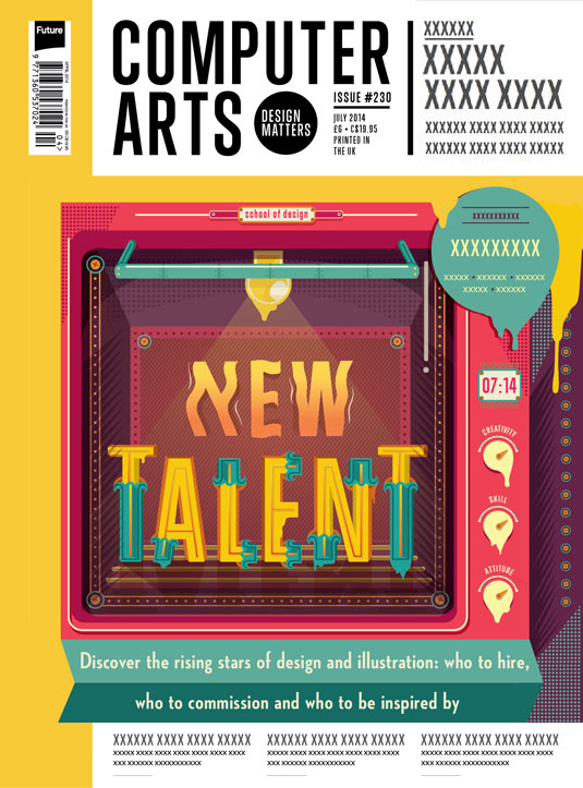
Olivia Ariferiani is a young designer whose interest in creative began with childhood doodles on her school books and led to a design major at Swinburne University, Melbourne, and ultimately a position in a Jakarta advertising agency.
Her idea hatched from a connection between 'hot new talent' and the saying, 'fresh from the oven'. The dull grey colours typical of white goods were eschewed in favour of bright tones for impact.
Ariferiani pictured the interactive version as having a flashing timer and illuminating lamp that highlighted the message 'Talent', before the 'New' arose like smoke.
Paddy O'Hara
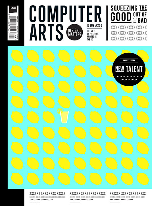
Paddy O'Hara recently completed a degree in graphic design at Falmouth University and confesses that he gets the most buzz from a project in coming up with the initial idea. In this respect, most of his inspiration is found outside the design world.
For his CA cover idea, Paddy wanted to represent designers in the competitive industry as bitter lemons and the 'new talent' as a glass of sweet lemonade.
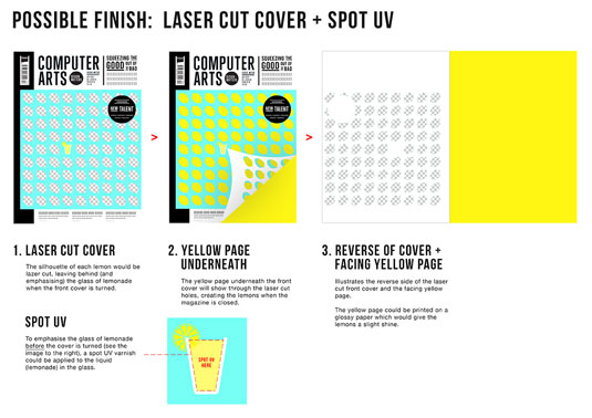
He settled on a two-colour palette of yellow and blue for its refreshing, ice-cold look, and thought a fluorescent version would benefit from a neon ink treatment and a spot varnish on the glass to give it a liquid sheen. Paddy also suggested moving the 'New Talent' title to a right-hand 'flash' to make room for extra lemons.
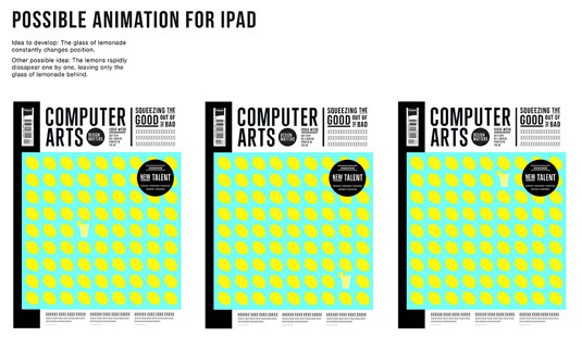
His ideal iPad version would continually switch the position of the lemonade to bring it to the viewer's attention, all of which attests to his focus on striking a balance between impact and simplicity.
Sam Rowe
By the age of 16, Sam Rowe knew he wanted to be a creative. An illustration degree at Plymouth helped him turn that dream into a reality, and he has since developed an adaptable, figurative style with surrealist influences.
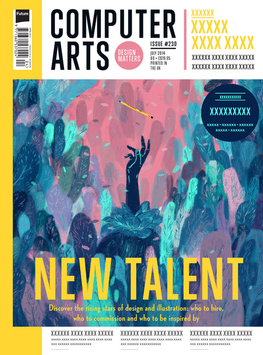
Rowe's starting point for his cover had one foot in nature, taking inspiration from notions of genesis in the worlds of flora and fauna.
He settled on the image of a blooming flower in the morning light as a metaphor for health, vitality and new beginnings -- substituting the stamen for a human hand to signify the birth of a new creative.
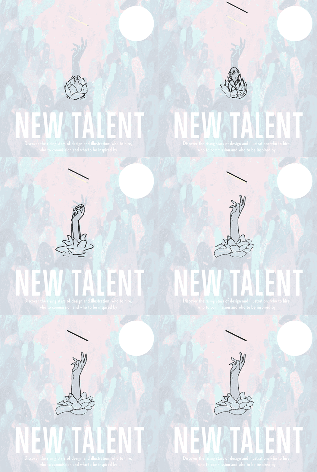
Rowe chose turquoise and cerulean to balance the pinkish sunlight, and thinks an iPad version could benefit by animating the hand rising from the flower to grasp the falling pencil just as dawn breaks -- as demonstrated in the above animatic.
Stephanie Lidbetter
Stephanie Lidbetter began her formal design education with a foundation degree in illustration and eventually graduated from Northbrook College with a BA in Communication Design. She now works as a freelance illustrator in Brighton.
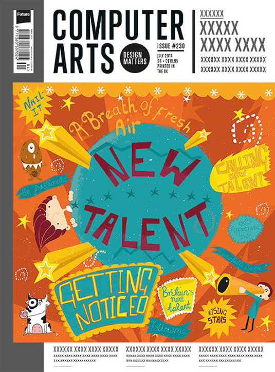
Her bold cover depicts the emotional journey of the new artist yearning for success in the design world. The central globe signifies the Earth, while the shooting stars symbolise the emergence of new talent, the surrounding words embodying the thoughts and daily routines of the aspirational designer.
Lidbetter's quirky style really comes through here, as does the fun she must have had creating the piece, none more so than with the addition of a few crazy characters as witnesses to the unfolding scene.
Tommy Parker
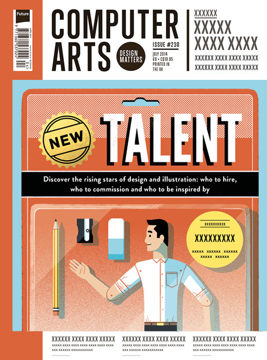
Tommy Parker recently completed a BA in illustration at Plymouth University and describes himself as a versatile artist with a contemporary style that isn't overly rigid or clean. He enjoys playing with metaphors and seeing how far he can take a concept.
This idea occurred to him when he recalled his boyhood excitement and impatience at the thought of relieving a new toy of its packaging.
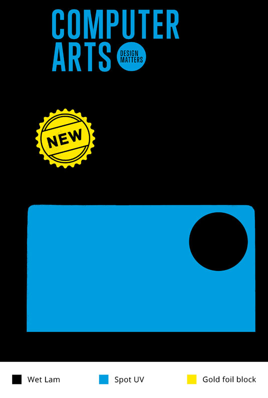
The composition took a while to pin down as Parker worked to get enough of the 'action figure creative' into the picture beside his stationery accessories, but he even had time to apply a gold foil and UV/plastic treatment to the work.
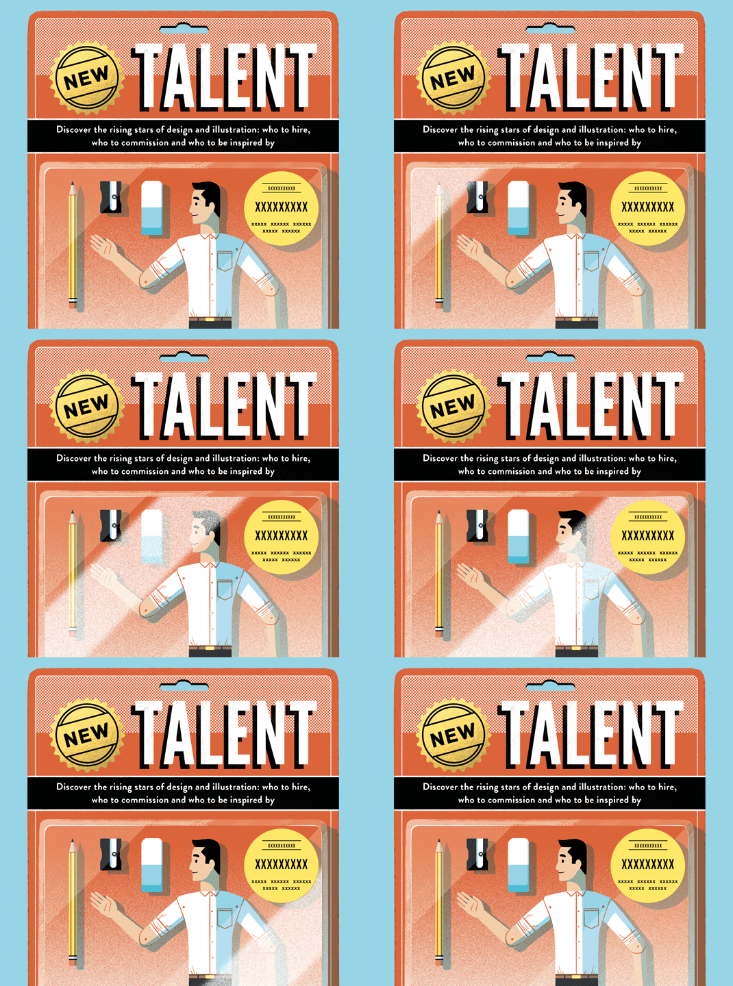
He also thought an animated 'brand new' shimmer would complement an iPad version, as demonstrated in the above animatic.
Winner revealed 18 July!
We'll announce the cover designer for our New Talent issue on Friday 18 July, shortly before subscribers receive their copy.
There'll also be a making-of video showing a very special treatment being applied by our finishing partners Celloglas -- and that's all the clues you'll get, we're afraid.
Guarantee your copy with a half-price Computer Arts subscription
In the spirit of new talent -- and to celebrate the 2014 degree show season -- we're offering an incredible 50% off an annual subscription to Computer Arts magazine.
For just £39 you'll receive an entire year of industry insight, opinion and inspiration, delivered directly to your door.
Sign up by 10 July and you'll receive the New Talent issue, featuring our guide to 2014's most outstanding design graduates -- plus, of course, the winning cover design.

Thank you for reading 5 articles this month* Join now for unlimited access
Enjoy your first month for just £1 / $1 / €1
*Read 5 free articles per month without a subscription

Join now for unlimited access
Try first month for just £1 / $1 / €1

Nick has worked with world-class agencies including Wolff Olins, Taxi Studio and Vault49 on brand storytelling, tone of voice and verbal strategy for global brands such as Virgin, TikTok, and Bite Back 2030. Nick launched the Brand Impact Awards in 2013 while editor of Computer Arts, and remains chair of judges. He's written for Creative Bloq on design and branding matters since the site's launch.
