Column-grid poster design made neat and easy
Mark Bloom, aka Mash Creative, walks through how to create perfectly aligned typography using a column-grid system for guidance
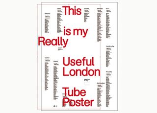
08 A lot of my design inspiration comes from the 50s and 60s International Typographic Style, made famous by the likes of Wim Crouwel and Josef Mller- Brockmann. The use of grids and large titles were commonly used by the ‘godfathers of design’, so to echo this style I’ve opted for an apt title name set in my own custom cut of AG Schoolbook, at a font size of 190pt.
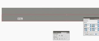
09 For the central visual element of my poster, I want to design something new that will symbolise all 12 of the tube lines. First, draw a rectangle. Hold and click on the object while pressing Opt/Alt+Shift, and drag the object directly below to duplicate it. Using smart guides, line it up perfectly underneath the original – then hit Cmd/Ctrl+D to duplicate the object until you have a total of 12 rectangles.
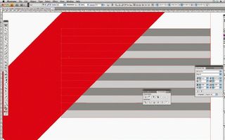
10 Draw a large rectangle, then use the Rotate tool to set it to -45°. Place the rotated rectangle above the 12 rectangles on the left-hand side (Object>Arrange>Bring To Front) and use the Direct Selection tool to select all 13 objects. Open the Pathfinder panel, select Trim and cut the rectangles at 45°. Doing this will automatically group the objects together, and give them one sheer face, so you’ll then need to ungroup the objects (Object>Ungroup).
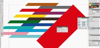
11 Repeat this process for the right-hand side of the rectangles to again get a diagonal line across, then change each rectangle to a different tube line colour. Now select alternate rectangles and drag them to the right to achieve the offset look seen here. Lastly, select all 12 objects, group them together (Object>Group), rotate the whole shape by -45° and then centre it to the artboard – both horizontally and vertically.
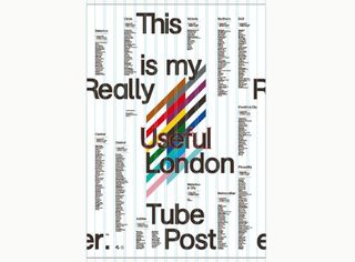
12 Once you have all of the individual elements required for your poster placed in the document, set about laying out the type around the central design element. Setting type is a bit like piecing a jigsaw together: it takes a while, but eventually you’ll find a basic layout that you’re happy with. Using the 16-column grid enables you to ensure all the text and elements are perfectly aligned with each other.
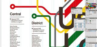
13 Now draw some lines using the Pen tool, joining the central element colours to each tube line description with routes that resemble the map of the London Underground system. Clicking on your start point, plan a way out from the central element to the tube line title – holding down Shift will enable you to draw straight lines and 45° angles. Next, round off the angles between lines by creating extra nodes near to the bends – using the Convert Anchor Point tool (under the Pen options), adjust them to achieve a smooth bend.
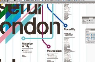
14 Now convert your main heading text to outlines (Type>Create Outlines), and then begin interweaving the letters into the central design elements. I’ve done this by both trimming (as in step 10) and bringing the tube lines forwards or backwards on layers (Object>Arrange>Bring To Front, or Send To Back. When converting text to outlines, remember that this is a destructive process so keep a copy of the previous version, just in case.
Get the Creative Bloq Newsletter
Daily design news, reviews, how-tos and more, as picked by the editors.
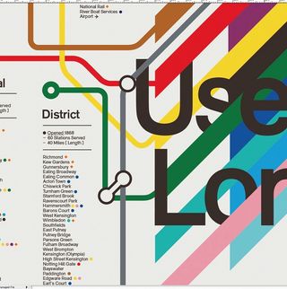
15 To finish off the poster I’ve added some final touches, including circles of colour to represent the interchanges at each station and junction points to join different coloured tube lines to each other. Lastly, check the alignment of individual elements to your column grid to ensure everything is perfectly aligned. The poster is available to purchase from the Mash Creative e-shop.

Thank you for reading 5 articles this month* Join now for unlimited access
Enjoy your first month for just £1 / $1 / €1
*Read 5 free articles per month without a subscription

Join now for unlimited access
Try first month for just £1 / $1 / €1
The Creative Bloq team is made up of a group of design fans, and has changed and evolved since Creative Bloq began back in 2012. The current website team consists of eight full-time members of staff: Editor Georgia Coggan, Deputy Editor Rosie Hilder, Ecommerce Editor Beren Neale, Senior News Editor Daniel Piper, Editor, Digital Art and 3D Ian Dean, Tech Reviews Editor Erlingur Einarsson, Ecommerce Writer Beth Nicholls and Staff Writer Natalie Fear, as well as a roster of freelancers from around the world. The ImagineFX magazine team also pitch in, ensuring that content from leading digital art publication ImagineFX is represented on Creative Bloq.
