Colour black and white images quickly
Luke O'Neill explains how under painting can quickly add a colour base layer to monotone images.
If you're anything like me, when starting a new image you'll build up shapes and areas of tonal interest in black and white first, creating the form and structure of your piece as quickly as possible.
This approach enables you to flesh out an image in grayscale mode in a relatively short amount of time, but can leave you a little stumped when it comes to introducing colour.
In this tutorial I'll demonstrate how you can quickly and intuitively add a base layer of colour to a piece of work in Photoshop using a technique akin to underpainting. This is a method used by painters, whereby a rough base layer of paint is applied to a canvas to define areas of tonal interest that can be built upon at a later stage.
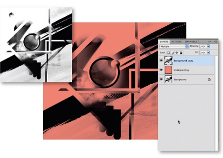
01 Begin by opening a black and white image, preferably one containing some depth and detail. Duplicate the background layer by dragging it onto the New Layer button in the Layers palette, and select Multiply as its Blending Mode. Beneath this, create another new layer and fill it with a colour of your choice.
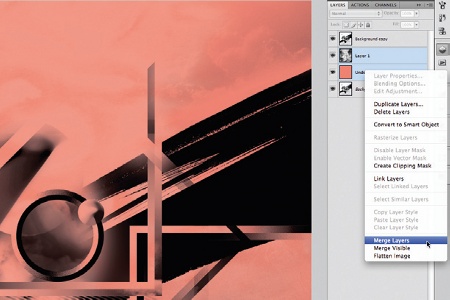
02 This stage is optional, but I've chosen to add some texture to the base layer to break up the solid colour. Simply open a texture and paste it above the colour layer. Now ramp up the contrast, choose Lighten as its Blending Mode and reduce its opacity until you're satisfied. Select both layers and merge them.
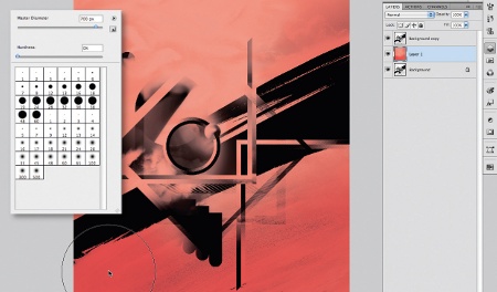
03 Now for the fun to begin. We're going to start adding some darker areas so choose a darker tone of the original colour. With the colour base layer selected, hit 'B' to select the Brush tool. In the Brush Preset picker choose a large Master Diameter and reduce the Hardness to zero. Reduce the Opacity of the brush to 50%, the Flow to roughly the same and begin gently brushing darker areas onto the illustration.
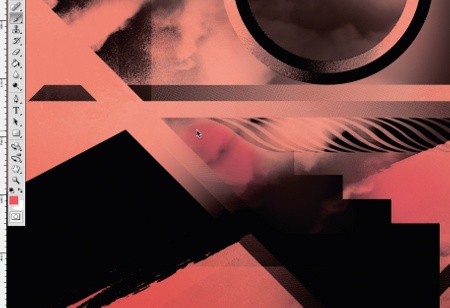
04 For the mid-tones, simply repeat the process but with a slightly lighter shade. At this stage it's not imperative to keep within the lines as such; it's more about getting an overall tonal feel to the piece. However, it is important to bear in mind where the tonal areas of the image lie, as it can be easy to throw the whole image off with an unnatural looking tonal range.
Get the Creative Bloq Newsletter
Daily design news, reviews, how-tos and more, as picked by the editors.
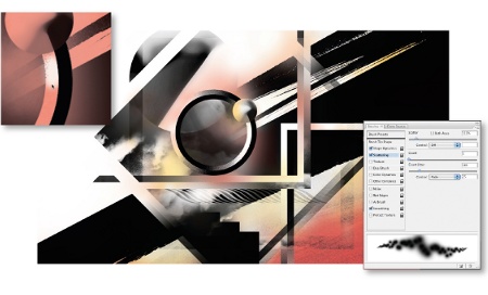
05 Now for the crucial highlight stage. It's important, now, to be a lot more accurate with your brush marks. Carefully begin to pick out highlight areas with a small, soft brush. You may also wish to add another colour into the mix - here I've simply brushed on areas of yellow using a soft scatter brush. And that's it: a quick and easy colour base layer that you can build upon as your piece develops.
Luke O'Neill
Deputy art editor of Computer Arts, Luke is a graphic designer and illustrator able to turn his hand to anything from complex layouts to illustrations and branding projects. Along with his usual magazine duties, Luke is currently working on designing his long overdue portfolio website.

Thank you for reading 5 articles this month* Join now for unlimited access
Enjoy your first month for just £1 / $1 / €1
*Read 5 free articles per month without a subscription

Join now for unlimited access
Try first month for just £1 / $1 / €1

The Creative Bloq team is made up of a group of art and design enthusiasts, and has changed and evolved since Creative Bloq began back in 2012. The current website team consists of eight full-time members of staff: Editor Georgia Coggan, Deputy Editor Rosie Hilder, Ecommerce Editor Beren Neale, Senior News Editor Daniel Piper, Editor, Digital Art and 3D Ian Dean, Tech Reviews Editor Erlingur Einarsson, Ecommerce Writer Beth Nicholls and Staff Writer Natalie Fear, as well as a roster of freelancers from around the world. The ImagineFX magazine team also pitch in, ensuring that content from leading digital art publication ImagineFX is represented on Creative Bloq.
