Choose the right magazine layout
Luke Hayman from Pentagram shares some ideas for making magazines that fit the bill
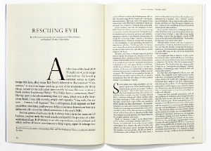
Column width is really important. Consider how the typography is set, and the text size. You can get away with smaller fonts for a younger audience, for example with youth magazines like Maxim, but consider something like The New Yorker, which is exquisitely designed typographically – it uses quite a large font because you’re reading multi-thousand-word articles. It has very different needs to a layout that’s cut up with a paragraph here and there. We’re currently working on a women’s consumer magazine and, even though it has very short text, the type size is relatively large because it’s a magazine for flicking through. Sometimes people put too many columns on a page and make it very narrow, so the typography gets chopped up and is unpleasant to read. If it’s justified it gets gappy, so it won’t set nicely.

Another common mistake is going for a two-column grid that’s very wide and bookish (see right) so it starts to look like homework. That’s okay for some magazines, such as serious medical journals, but for a consumer magazine it’s not very inviting. Magazines in the US and Britain are laid out in a different way and have different philosophies about grids. Often, I’ll pick up a magazine and be able to tell straightaway if it’s British or American. In the UK, there’s a tendency for a narrow column used just for pull quotes or captions. You rarely see that in the States, where there’s a different business model. Magazine subscriptions are more important than single-copy sales – it’s all about providing an environment that’s great for advertising.
Page design has developed differently because the beauty of a magazine is really important. In Britain, it’s about grabbing the reader. Not only are covers incredibly hardworking, the pages inside are too, with multiple entry points – heavy captions, sidebars and so on. This really developed in the UK, although it’s being used in the US now too. Ultimately it’s all about getting the right mix of point size and column width. Think about whether you’re using justified or ragged text, and then the leading. Great typesetting has an even tone, so there isn’t anything that jumps out and disturbs you.
Get the Creative Bloq Newsletter
Daily design news, reviews, how-tos and more, as picked by the editors.

Thank you for reading 5 articles this month* Join now for unlimited access
Enjoy your first month for just £1 / $1 / €1
*Read 5 free articles per month without a subscription

Join now for unlimited access
Try first month for just £1 / $1 / €1

The Creative Bloq team is made up of a group of art and design enthusiasts, and has changed and evolved since Creative Bloq began back in 2012. The current website team consists of eight full-time members of staff: Editor Georgia Coggan, Deputy Editor Rosie Hilder, Ecommerce Editor Beren Neale, Senior News Editor Daniel Piper, Editor, Digital Art and 3D Ian Dean, Tech Reviews Editor Erlingur Einarsson, Ecommerce Writer Beth Nicholls and Staff Writer Natalie Fear, as well as a roster of freelancers from around the world. The ImagineFX magazine team also pitch in, ensuring that content from leading digital art publication ImagineFX is represented on Creative Bloq.
