Can anyone design type?
We speak to three graphic designers who’ve created their own fonts, and some of the seasoned typeface designers whose rules they might be breaking
On one side: the old guard – master craftsman who have dedicated their working lives to the artform. On the other: the young pretenders – experts in their own field who want to spread their creative wings. Everywhere you look there are designers keen to show off their own take on typeface design.
And no wonder, because as technological advancements improve the ease with which fonts can be developed, designers have become increasingly tempted to experiment with type. Having a toolbox doesn’t make you a tradesman, of course. Which begs several questions: are designers pushing typography in new and innovative directions? Or are they cheapening the artform and producing inferior work? And is it creating animosity towards them from type specialists?
“I wouldn’t seek to call myself a traditional type designer,” reflects British designer and art director Craig Ward. “But, equally, if someone has asked me for a bespoke font, they’re asking for a reason.”
The New York-based creative has gained a reputation for bold, experimental work that blurs the boundaries between illustration and typography. Ward has formed typefaces from human hair and cherry blossom, vaulting horses and interlocking arms, and counts everyone from Wired to Mulberry and Chanel as clients. Lovechild was his first foray into type, and it’s an amalgamation of several of his favourite typefaces – used in collaboration with illustrator Pomme Chan.
“I needed a Didot or Bodoni derivative typeface that was somehow more geometric and evenly spaced to build an ambigram from,” he recalls. “Traditionally those things use blackletter fonts with even stroke widths and I wanted to do something similar, but in a way that felt more stylish.”
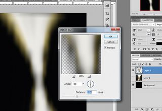
Ward has gone on to create numerous typefaces. He’s of the opinion that necessity is the best reason for designers to venture into creating their own type: “I think you need a good reason to get into designing a complete typeface from scratch,” he says. “The common theme with all my fonts is that I needed something for a specific purpose and couldn’t find anything that felt quite right. So I made my own.”
Ward isn’t concerned about objections from traditional typeface designers. “People just get angry because they didn’t get the work,” he shrugs. But he does concede that his lack of formal training in the field means he often meets with certain restrictions: “The problems you encounter tend to be along the lines of grid restriction – that’s when an amateur type designer struggles where a professional wouldn’t. Like, what the hell do you do with the letter ‘S’?”
Because he sets all his type by hand and doesn’t usually require a full typeface, Ward generally works on only the letters needed for each project. If he decides to extend it to a complete font, it’s done after deadline. These methods are at odds with those of traditional typeface designers.
“The devil lies not in the detail,” says Peter Bil’ak, “but in the whole image. So it is important to evaluate if the idea works across all letters, rather than just focusing on a single one.” Bil’ak set up type foundry Typotheque in 1999, and teaches type design at the Royal Academy of Art in the Hague, Holland. “In my view, this is the most complete body text font available anywhere,” said esteemed designer Dr. Mario Garcia of Greta Text, the font Bil’ak created for the Sunday Times.
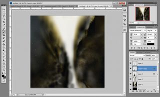
Despite his standing, Bil’ak isn’t supercilious towards designers who create typefaces. He commends them. But it’s hats off with a caveat: “I applaud people who try to make fonts. It deepens their understanding of typography and type design. They will appreciate existing typefaces better,” he says. “Having said this, type design is dependent on a particular set of skills, which take time to acquire.”
Bil’ak’s students often want to create, publish and sell typefaces as soon as they join his course. It takes them around a year to do so, during which time their fundamental understanding of letterforms has developed to such an extent they realise they have to start all over again. “Their skills haven’t caught up with their critical eye,” he says. “Anyone can learn to control the Bezier curves very quickly, but that doesn’t make one a type designer – at least not more than mastering basic grammar makes one a writer. Type design is like making pancakes. The first one will not be good, but it is important to make it to get the good ones later.”
Not everyone agrees with Bil’ak’s approach to typeface design. “I don’t think there is a proper way to design typefaces,” says Portuguese graphic designer Rafael Serra. “I respect the history and those people who dedicate their lives to typeface design, but I don’t think there is a general rule to design typefaces.”
Serra began creating his own typefaces at college, and they’ve played a central role in his work ever since. His designs take inspiration from a diverse and abstract breadth of sources, anchored in the history of his native Portugal – from embroidery to fragments of costal rock, to a 20th century military coup. It should come as no surprise, then, that Serra has such an iconoclastic attitude towards typography, trumpeting creativity over technique. “All designers – and I refer not only to graphic or typeface designers – are free to do one important thing: create. And creation is something we cannot rule. Yes, we can rule the way we use it, but not the process itself. We must let designers create.”
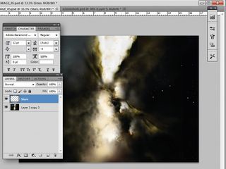
Like Ward, Serra began experimenting with type because he couldn’t find suitable font designs that matched his needs anywhere else. “It’s great when we can design our own typefaces,” he concludes, “rather than spending endless hours choosing what typeface to use in our work.”
Lecturer Gerry Leonidas agrees: “The more that graphic designers experiment with designing typefaces, the better,” he says. “They’ll gain insights into the very different skills that typeface designers employ, especially the ability to work in parallel with small scales and patterns within paragraphs.” Leonidas teaches typography and typeface design at the University of Reading’s Department of Typography. He sees many positives in the trend towards graphic designers creating typefaces – such as finding himself speaking in front of more diverse audiences. “It also allows typeface designers and graphic designers to communicate better in determining briefs, timing and budgets,” he adds, “which is a key concern, as branding is becoming more type-orientated. At the end of the day, we are all in the communication business.”

The creatives at Barcelona-based design studio Toormix echo Leonidas’ sentiments. “First we have an idea,” says co-founder Oriol Armengou. “Then we build the identity and the graphic code. And finally we find the perfect type to make it work in harmony with the brand. Finding the perfect type is always a hard exercise, as we try to find typography that will align perfectly with the brief and the idea. Sometimes, instead of choosing a type, we design one ourselves.”
Armengou founded the studio with Ferran Mitjans in 2000. Their work ranges from the experimental ‘In Bike To Life’ project, where they created an alphabet from discarded bicycle parts, to more subtle branding for Catalan Wines.
Armengou accepts that at Toormix they don’t have the expertise to circumvent traditional typeface designers altogether. And nor would they want to: “We are not specialist type designers, so we prefer to design display types,” he explains. “If we need fonts for text, we commission a specialist. When we work internally on a typeface, we always have the support of a specialist who helps us to refine and systematise the fonts and their technical elements.”
Similarly, Armengou extols the virtues of long-established typographical values, like those promoted by Bil’ak. “We like working on details, so we always defend an accurate application of typography. We are against type designs that have no sense of proportion, spacing and coherence. The type must work with the idea and the project, but also must be a perfect exercise of proportion, readability and beauty.”
As one of type design’s most renowned exponents, Erik Spiekermann is rather attached to his discipline. “I have been suffering from Typomania all my life,” he states on his website, “a sickness that is incurable but not lethal.” Like Ward, Serra and the Toormix crew, Spiekermann’s most successful creations have come from solving problems that crop up in projects: FF Meta was designed for small type on low-quality paper; ITC Officina for low-resolution laser printers prevalent in the 80s; Nokia Sans for the small screens on early mobile phones.
He understands why designers dabble in typography, and summarises the trend emphatically: “Good for them,” he says. “They will either succeed and discover type as a form of expression; or they fail and realise how hard it is to design type.”
It should come as no surprise that designers are looking to dip their toes into typographical waters. Doing so offers greater creative control over their work. But while this trend is leading type into exciting and unexplored territories, most designers recognise that creativity must be underpinned by a solid understanding of the artform – which is where traditional typeface designers come in.
The overall consensus is that a professional respect exists between both parties – the type designer acknowledging the designer’s DIY ethos, with the designer lauding the type designer’s expertise. And long may it continue.
Get the Creative Bloq Newsletter
Daily design news, reviews, how-tos and more, as picked by the editors.
Discover the 20 best free web fonts for designers at Creative Bloq.

Thank you for reading 5 articles this month* Join now for unlimited access
Enjoy your first month for just £1 / $1 / €1
*Read 5 free articles per month without a subscription

Join now for unlimited access
Try first month for just £1 / $1 / €1
The Creative Bloq team is made up of a group of design fans, and has changed and evolved since Creative Bloq began back in 2012. The current website team consists of eight full-time members of staff: Editor Georgia Coggan, Deputy Editor Rosie Hilder, Ecommerce Editor Beren Neale, Senior News Editor Daniel Piper, Editor, Digital Art and 3D Ian Dean, Tech Reviews Editor Erlingur Einarsson and Ecommerce Writer Beth Nicholls and Staff Writer Natalie Fear, as well as a roster of freelancers from around the world. The 3D World and ImagineFX magazine teams also pitch in, ensuring that content from 3D World and ImagineFX is represented on Creative Bloq.
