Brochure design re-imagined
Nick Cannons walks you through how to create neat, consistent brochure spreads using some of InDesign's finest features.
Sometimes it can be difficult to keep your body copy in order when using just one baseline grid. You might have a range of point sizes for quotes and side notes to use in a spread that will need to be aligned differently, for example. There are many different options for getting round this with InDesign - I find one particularly effective method is to work with text frame grids, which enable you to have multiple baselines in your layout.
In this tutorial, I will explain how frame grids can work for you, along with a handful of other useful InDesign features, such as the Balance Ragged Lines tool and page numbering. These will help your layouts look neat and consistent.
I'm going to be working with annual review spreads for a fictional fashion company. The original photography is supplied by Jay McLaughlin.
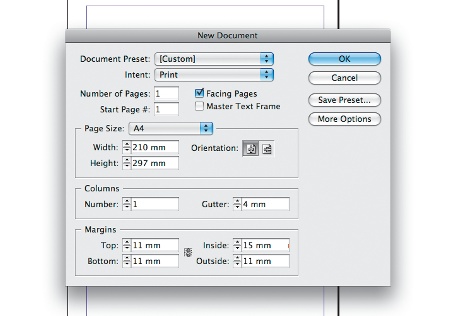
01 To start, create a new A4 document in InDesign (File>New>Document). Check the Facing Pages box and enter 4mm in the Gutter options. Then set the Margins to Top: 11mm, Bottom: 11mm, Inside: 15mm (so we don't lose anything in the gutters when binding), and put the Outside at: 11mm.
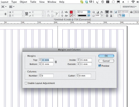
02 Select the A-Master in the Pages panel to set up your margins and columns. To do this, go to Layout>Margins and Columns and enter how many you need. In this project I've used nine columns, which should give enough diversity when designing each spread.
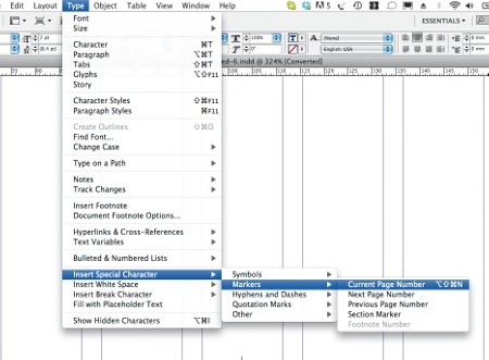
03 In the Master Pages, set your page numbering by creating a text box in the area where the number is needed. Go to Type> Insert Special Character>Markers>Current Page Number. You should then see the letter 'A' appear in that area. When you go back to your pages, the numbers will appear. Add any other assets needed, such as headers, on this page.
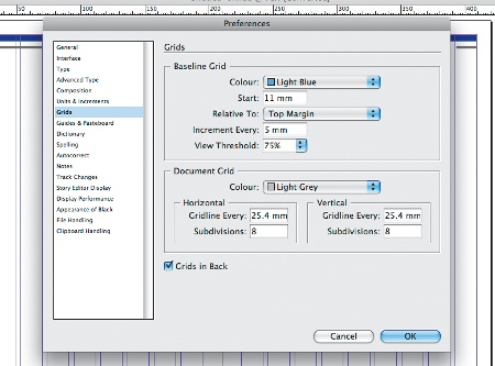
04 Set up your baseline grid. Go to the InDesign menu and select Preferences>Grids. For this particular project, my grid starts at the top of the margin and the leading is set at 5mm.
Get the Creative Bloq Newsletter
Daily design news, reviews, how-tos and more, as picked by the editors.
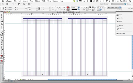
05 Now create some horizontal zones that you think could work well with your nine columns. Usually you would do this at the beginning of your project when you set your margins, but I find doing it at this stage gives some flexibility when I'm considering where to place a piece of information or an image. I've indicated these areas in grey. To mark them, drag a ruler guide and use the X and Y fields for a little more accuracy.
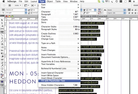
06 Now you can start styling up your layout, so choose a font. A good font won't need too much kerning, so for this project I'm using two: Brandon Grotesque for headings and subheadings, and Vectora Light and Roman for body copy. Aside from the headings and subheadings, I've used placeholder text (Ctrl/right-click and select 'Fill with Placeholder Text'). In your Paragraph panel, click 'Align to baseline grid'.
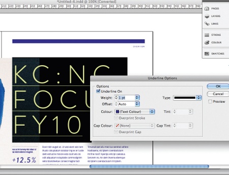
07 I've chosen an underline to style my headings. You can alter the style, weight and offset the line by going to the Character panel and selecting Underline Options. I've set the Weight at 1pt and kept the colour the same.
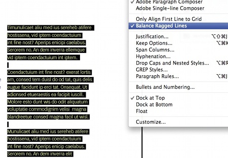
08 To neaten paragraphs, you can use the Balance Ragged Lines feature in the Paragraph panel. This balances out paragraphs that end with shorter lines, similar to 'Justify all'.
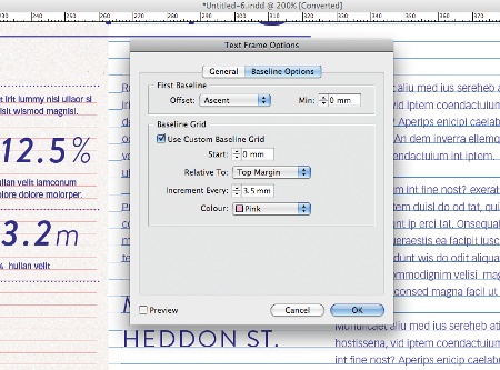
09 Captions are often much smaller in point size and leading value, so having another grid to snap to will keep these consistent. To create a text frame grid, select the text box, then Ctrl/right-click and select Text Frame Options, and tick Custom Baseline Grid. I have input a grid at 3.5mm, aligned to the top margin, and selected a different colour to make them easier to see. It's also worth noting that you can achieve a similar effect by aligning the text to the document baseline grid, and selecting the 'Only align to first line grid' option in the Paragraph panel.
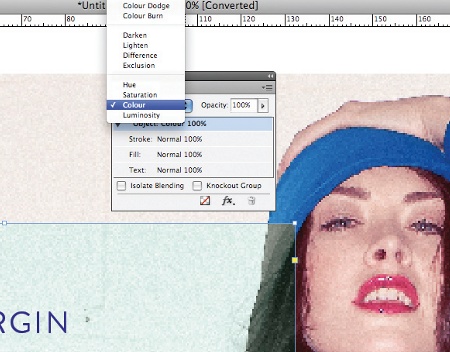
10 To keep within the overlapping theme of the spread, use the Rectangle tool to draw a shape that fully or partially covers an image, then choose a colour and fill it. Select Colour in the Transparency Effects palette (Window>Effects). If the image runs off to the edge of the layout, make sure you fill your bleed area.
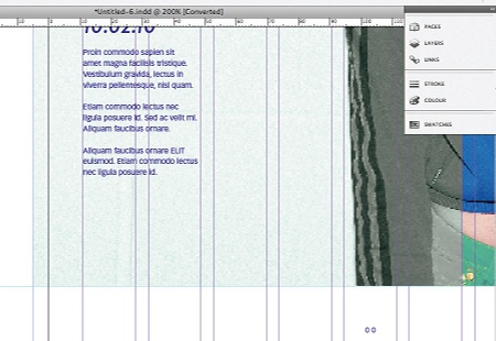
11 Once you've styled up all your spreads, you can prepare them for print. Check and double-check that you have the correct bleed for any images, and make sure they are all CMYK. All body copy should be proofread and any spelling corrected before the document is ready.
Nick Cannons
Nick is one half of Bekker, a creative agency that focuses on trend, technology and behaviour to bring inspiring brand propositions to life. To discover more, go to www.studiobekker.com

Thank you for reading 5 articles this month* Join now for unlimited access
Enjoy your first month for just £1 / $1 / €1
*Read 5 free articles per month without a subscription

Join now for unlimited access
Try first month for just £1 / $1 / €1

The Creative Bloq team is made up of a group of art and design enthusiasts, and has changed and evolved since Creative Bloq began back in 2012. The current website team consists of eight full-time members of staff: Editor Georgia Coggan, Deputy Editor Rosie Hilder, Ecommerce Editor Beren Neale, Senior News Editor Daniel Piper, Editor, Digital Art and 3D Ian Dean, Tech Reviews Editor Erlingur Einarsson, Ecommerce Writer Beth Nicholls and Staff Writer Natalie Fear, as well as a roster of freelancers from around the world. The ImagineFX magazine team also pitch in, ensuring that content from leading digital art publication ImagineFX is represented on Creative Bloq.
