Behind the scenes of Cruschiform's geometric illustrations
French illustrator Marie-Laure Cruschi, aka Cruschiform, used a unique, geometric system to illustrate six kaleidoscopic trend forecasts for a special edition of Wired UK.

The Wired World in 2014 is the second time that Wired UK has published a forecast of the must-know trends and big ideas for the year ahead. This is when the magazine takes a longer look ahead and forecasts the people, products, issues and ideas that are going to matter over the coming 12 months.
The special issue consists of eight sections in total, including media, environment, medicine and politics. Wired commissioned a different artist for each section, and they chose me to illustrate the lifestyle trends and ideas that they think will be big in 2014. The brief was very clear and complete when they contacted me: Wired wanted the illustrations to be complex and detailed, and there was a specific shade of red that needed to be used as the key colour.
The concepts were all really interesting: doing things will overtake owning things; learning to love living with less; men's liberation; Kenya academies; and the meteoric rise of smartphones. It was an exciting prospect for my first collaboration with Wired.
This commission dealt with very specific subject matter. The challenge was to make each concept visually attractive and easy to understand, which is something I like to do. I enjoy working on topics I might not otherwise learn about.
01. Visual formula
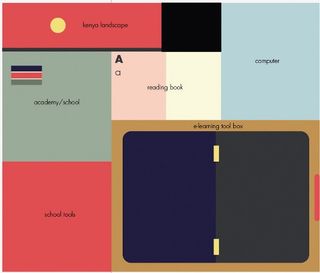
I had just one week to create the full set of six illustrations, so rather than coming up with multiple options or propositions, I focused on developing an adaptable visual formula. I used Illustrator for all the initial drawings, as I like the accuracy, the perfect lines and the modulation achievable with this program.
02. Kaleidoscope parts
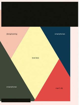
Wired wanted me to create super-detailed, clever illustrations. For the opening image, the brief was to create a kind of best-of teaser page. I decided to divide my design into five triangular parts that would correspond to the five illustrated section subjects. I saw it as being like a kaleidoscopic picture.
03. Colour coherence
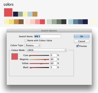
The brief specified that one shade of red (CMYK 0% 80% 60% 5%) was to make up around 15 per cent of the artwork, to give coherence between the illustrations. As it's a pretty sweet colour, I added some pastel and neutral shades to balance it out. Dark sections are deep blue, as I never work with black.
04. Spreading out
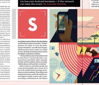
As most of the illustration would be appearing across a double-page spread, it was important to think about the space lost to the gutter between the pages. I designed the illustrations at 5mm less than the required width, and Wired's art team applied a step-and-repeat over the gutter to keep things readable.
05. Tangent lines
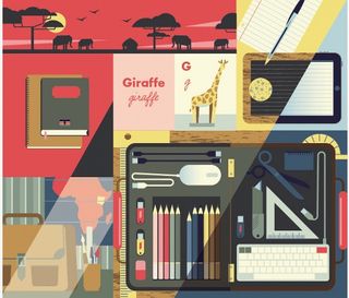
Every illustration presented a different facet of the subject matter, so each consists of various smaller illustrations that represent different scenes and moments in time. I used tangent lines to establish the structure. These create 'light gateways' between scenes, helping make for a dynamic composition.
06. Art of analogy
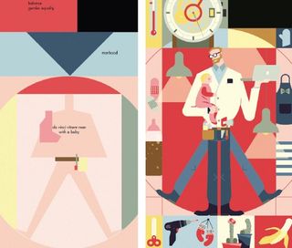
I like to play with formal analogy, such as the light bulb and building, the globe and clock, and the iPad and slate for the men's liberation illustration. The challenge was to make a coherent set of illustrations, while changing the atmosphere between them enough to emphasise the different subjects.
07. Finishing things off

At the end, I moved the designs into Photoshop to add texture, light and shadows, and to make the illustration warmer and more lively. Wired really trusted me, so the illustrations didn't change much from my initial sketches. I didn't need to make many adjustments or corrections to my final designs - which is always nice.
Words: Marie-Laure Cruschi
This article originally appeared in Computer Arts issue 222.
Liked this? Read these!
- Illustrator tutorials: amazing ideas to try today!
- The best collage maker tools - and most are free!
- Create a perfect mood board with these pro tips

Thank you for reading 5 articles this month* Join now for unlimited access
Enjoy your first month for just £1 / $1 / €1
*Read 5 free articles per month without a subscription

Join now for unlimited access
Try first month for just £1 / $1 / €1
Get the Creative Bloq Newsletter
Daily design news, reviews, how-tos and more, as picked by the editors.
The Creative Bloq team is made up of a group of design fans, and has changed and evolved since Creative Bloq began back in 2012. The current website team consists of eight full-time members of staff: Editor Georgia Coggan, Deputy Editor Rosie Hilder, Ecommerce Editor Beren Neale, Senior News Editor Daniel Piper, Editor, Digital Art and 3D Ian Dean, Tech Reviews Editor Erlingur Einarsson and Ecommerce Writer Beth Nicholls and Staff Writer Natalie Fear, as well as a roster of freelancers from around the world. The 3D World and ImagineFX magazine teams also pitch in, ensuring that content from 3D World and ImagineFX is represented on Creative Bloq.
