Averia - the 'average' font
Web developer Dan Sayers used his coding and creative nous to create a font that is the average of all the typefaces on his machine - and it looks great!
Helvetica. Some designers think it's great - the ultimate modernist font. But to many it's just another average and overused typeface. It's the same with Times New Roman. To some, a great body text font, to others it's strictly average. However if you want to know what a truly average typeface looks like, then check out Averia by Dan Sayers. He took all the fonts in his machine and worked out what the average letter forms would be like if they were aglomerated together.

The idea came to him when he was designing an ambigram business card for his wife - a typographic form that can be read in different ways depending how you look at it. He was musing over the curves and letter forms of the Chaparral font. He became curious to find out what the average of all the fonts on his computer would look like.
A freelance web developer, with a masters in artificial intelligence, to Sayers code was the way forward. "I'm interested in fun ways to get computers to do traditionally human tasks - particularly the repetitive stuff. Font shapes seemed like an ideal area to look at, because they are so simple to define. However, the all-important aspect - human aesthetics - is very hard to model," says Sayers.
First, he tried some script that would overlay semi-transparent images of each letter in big piles so that the darkest areas showed the greatest commonality between the letters. This produced slightly ghostly letterforms with whispery, or mushy, edges. It looks wild when presented as a colour image with the amount of overlap indicated chromatically.
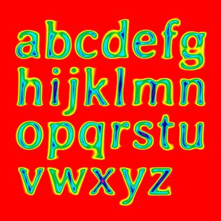
A better solution, he decided, was to create an application that placed points around the perimeter of the positive space in each letterform. As long as the same number of corresonding points were used on each character every time, the program could find an average location of the edge of the letter for each point, then draw a font based on the final perimeter points. "I just popped some fonts in the machine, and out came Avera. What's good about it - in terms of visual balance - is really due to the designers who created the source fonts," he says.

So what does it look like? Surprisingly, considering the process, it looks similar to an old fashioned hand printing typeface. Or, perhaps a bit like someone's been using an old typewriter with a very wet ink ribbon and hitting the keys way too hard. Sayers continues: "From early on, the results reminded me of some sort of antique letterpress process, and I was trying the font out with bits of Marlowe, Shakespeare and so on, which seemed to work nicely. To be honest, I was as surprised as others seem to have been that the results were so readable and evocative."
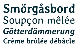
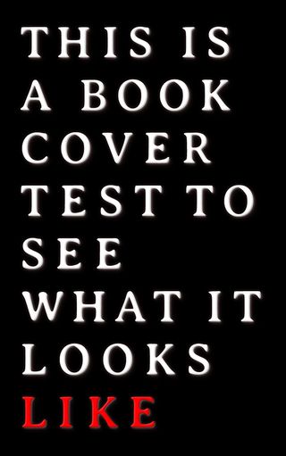
Averia is free to download from Dan Sayers' website, and he's had several enquiries from designers wanting to use it in apps, and for book covers.
Get the Creative Bloq Newsletter
Daily design news, reviews, how-tos and more, as picked by the editors.
Check out this fantastic selection of free fonts

Thank you for reading 5 articles this month* Join now for unlimited access
Enjoy your first month for just £1 / $1 / €1
*Read 5 free articles per month without a subscription

Join now for unlimited access
Try first month for just £1 / $1 / €1
The Creative Bloq team is made up of a group of design fans, and has changed and evolved since Creative Bloq began back in 2012. The current website team consists of eight full-time members of staff: Editor Georgia Coggan, Deputy Editor Rosie Hilder, Ecommerce Editor Beren Neale, Senior News Editor Daniel Piper, Editor, Digital Art and 3D Ian Dean, Tech Reviews Editor Erlingur Einarsson and Ecommerce Writer Beth Nicholls and Staff Writer Natalie Fear, as well as a roster of freelancers from around the world. The 3D World and ImagineFX magazine teams also pitch in, ensuring that content from 3D World and ImagineFX is represented on Creative Bloq.
