Aspex identity by Red
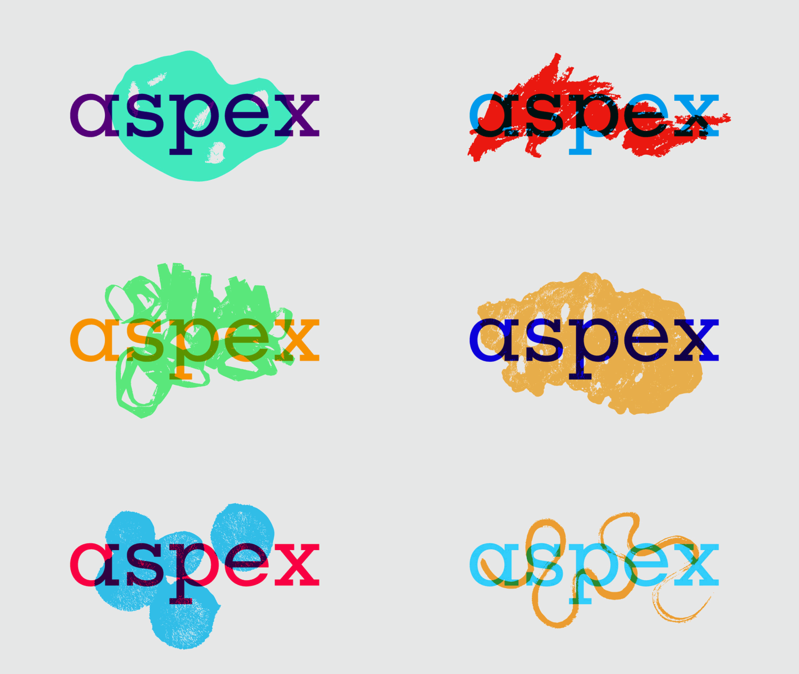
Red Design has created an identity for the Portsmouth art gallery, Aspex, and its work is part of an exhibition there
Brighton-based Red Design has taken part in an interesting design exhibition in the Portsmouth art gallery, Aspex. The gallery commissioned three studios to revamp its identity, and their work has gone on display. Visitors can view Red's work and compare it with that of Studio Baum and CHK, and compare the different creative processes that went on with each group of designers.
Josh Fletcher and Chris Bell worked on Red's contribution, and were inspired by the range of craft-based and community-generated art the gallery often houses. They wanted to work with type and came up with playful and naive designs. The logo accomodates simple marks and doodles which can regularly be changed so that the identity remains dynamic, the overall form held together by the type.

"When we visited the gallery we saw lots of doodles, paintings and other crafty things made by children and families from the art workshops they have on there," says Fletcher. "Interaction with the community was an important part of the brief so we took this inspiration and applied it to our catalyst shape idea where visitors, staff and artists could create shapes, adding to and constantly updating the identity."

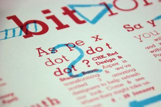
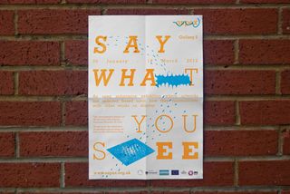
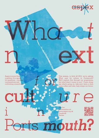
Along with the actual work, Red had to supply four A2 boards documenting the process of designing the identity and various other times such as promo posters and the gallery's calendar of events. It seemed natural to use the design ethos for the identity in the presentation of the work as well.

"We concentrated a lot on the concept to begin with and once that was in place we started experimenting with the type and shapes and the visual language developed naturally from there. Most of our documentation was note-based and when it came to explaining the processes behind it we found that the visual language we had created could also be used to explain the concept," says Fletcher.
Was there a sense of competition when it came to the other contributors to the exhibition? Not really, according to Fletcher. Each approached it quite differently. CHK had designed the gallery's original identity and they concentrated on advancing that, while Studio Baum went for a much more colourful approach.

Get the Creative Bloq Newsletter
Daily design news, reviews, how-tos and more, as picked by the editors.

Thank you for reading 5 articles this month* Join now for unlimited access
Enjoy your first month for just £1 / $1 / €1
*Read 5 free articles per month without a subscription

Join now for unlimited access
Try first month for just £1 / $1 / €1
The Creative Bloq team is made up of a group of design fans, and has changed and evolved since Creative Bloq began back in 2012. The current website team consists of eight full-time members of staff: Editor Georgia Coggan, Deputy Editor Rosie Hilder, Ecommerce Editor Beren Neale, Senior News Editor Daniel Piper, Editor, Digital Art and 3D Ian Dean, Tech Reviews Editor Erlingur Einarsson and Ecommerce Writer Beth Nicholls and Staff Writer Natalie Fear, as well as a roster of freelancers from around the world. The 3D World and ImagineFX magazine teams also pitch in, ensuring that content from 3D World and ImagineFX is represented on Creative Bloq.
