The art of minimalism from Arena to Apple
Minimalist design has been around for decades. Writer and curator Emily King considers how contemporary creatives are putting a fresh spin on the pared-back aesthetic.
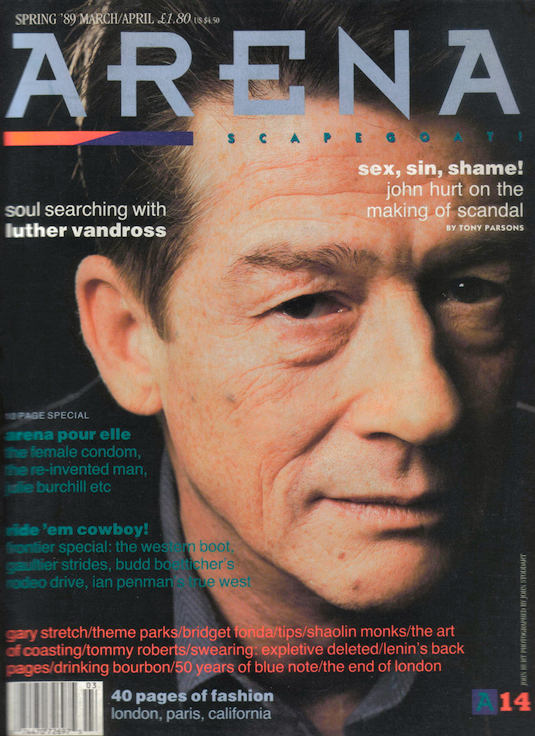
In 1986 the graphic designer Neville Brody became art director of the newly launched magazine Arena. According to Brody, the publication was aimed at "readers who had grown out of The Face", the magazine with which he had been associated in the early 1980s.
The Face was known for freshly designed, experimental typefaces and dynamic layouts, and the first issues of Arena were "very much in [that] mould". But then Brody decided to try something new. Looking afresh at Arena, he suggested "that some of the hysteria should be taken out of the contemporary design by adopting a very straightforward, informational approach, using Helvetica for headlines." In effect, Brody went minimal.

Pigs' cheeks and crisp white shirts
Without wanting to imply that any stylistic development is inevitable, it tends to be the case that a period of excess in a field is followed by a time of restraint. Right now, both in Britain and globally, there are examples of a toned-down approach across the board.
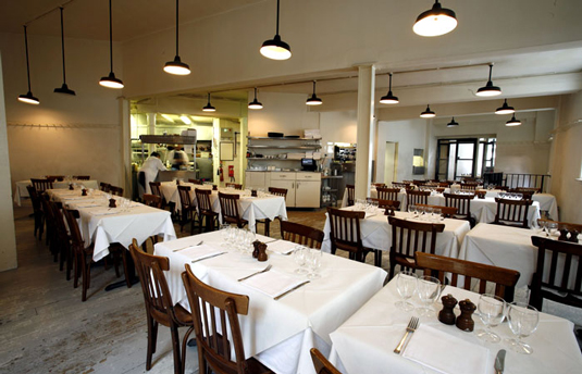
In food there is the St. John phenomenon. On the day I write, the menu at the original Smithfield's branch lists "Peas in the pod", "Brown shrimp and white cabbage" and "Crispy pig's cheek and dandelion". Order any of these items and you would get exactly what the text describes, served elegantly but without fuss on a white plate. The staff delivering your meal would be wearing long, white aprons and you would sit in an unadorned white room.
It tends to be the case that a period of excess in a field is followed by a time of restraint
If you wanted to chime in with your surroundings while eating at St. John, you could wear a Céline white shirt and a pair of slim-cut dark indigo jeans from Uniqlo, thereby mixing items from both ends of the market for minimally-oriented fashion.
If you're there for professional reasons you could take notes in a buff-coloured Muji notebook or record your interlocutor on your iPhone. All items are notably pared back and all could, and very likely have, been brought together by an individual whose life is guided by a less-is-more philosophy. Yet, to describe these objects as part of a single trend would involve glossing over their distinct histories.

St. John was launched in 1994 and was a reaction against the fussy food that was served by most restaurants at that time. It was hugely refreshing and had a sizable influence, not only in England but
worldwide. Since the height of the phenomenon in the early 2000s there has been a counter-reaction in the UK that gave rise to the relatively light-to-eat but ingredient-heavy cooking of chefs such as Yotam Ottolenghi. Nonetheless, St. John continues to be a success, even if it is no longer the 'hot' place to be.
Get the Creative Bloq Newsletter
Daily design news, reviews, how-tos and more, as picked by the editors.
St. John was hugely refreshing and had a sizable influence, not only in England but worldwide
Céline meanwhile launched in its current guise under the designer Phoebe Philo in 2009. The brand has shifted high-end fashion en masse toward the minimal, but in truth minimalism at the lower end of the market predated Céline by a couple of years, with the Japanese brand Uniqlo successfully launching in the UK in 2007.
Another Japanese retailer, Muji, has a longer history in Europe than Uniqlo, displacing Habitat and Paperchase as the go-to stores for basic household products and stationery in London around the same time that St. John was launched.
Finally, the iPhone is, of course, the work of a team at Apple led by Jonathan Ive. Ive has nurtured a passion for Dieter Rams' restrained designs for Braun since the start of his career. Presumably he would consider himself part of no trend other than being an unceasing proponent of Rams' 1970s manifesto, 10 Principles for Good Design.
The new age nineties
Writing about creativity and fashion in 1980s London for the V&A Magazine, Iain R Webb, fashion professor at the Royal College of Art and former editor of Blitz magazine, noted Rifat Özbek's epoch-changing Spring-Summer 1990 collection.
Declaring it a "catwalk show that is fashion legend", he remembered "an all-white collection of up-market rave club clothes... It was a moment of pure clarity that appeared as a panacea to all the madness and mayhem that had gone on during the decade. A cleanser to welcome in the New Age nineties."
The Rifat Özbek’s Spring-Summer 1990 collection was a cleanser to welcome in the New Age nineties.
There are parallels between this reaction and the reception of Philo's debut Céline Spring-Summer 2010 collection. But, while fashion writer Sarah Mower described that show as "a brisk mission to make classy utilitarianism sexy" and noted that members of the audience came away saying, "Oh, I just want to be like that!", Philo's clothes were not read as part of a wider cultural phenomenon of the order of the 'New Age'.
Perhaps the across-the-board minimalism of the early 1990s was the last of such all-encompassing trends. In the main a reaction against the wealth- flaunting tendencies of the 1980s, it took hold in every area of the lifestyle market. Since then, as a result of the dawn of online communication, trends like those outlined earlier have become multiple and complex.
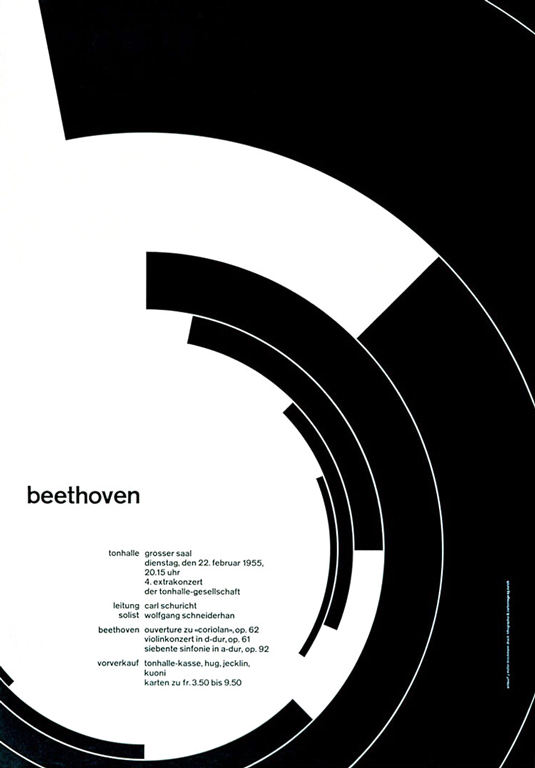
In art direction, the 1990s approach was typified by the design of Sean Perkins, who founded the consultancy North in 1995. Citing the influence of Swiss designer Josef Müller-Brockmann and his Dutch peer Wim Crouwel, Perkins favoured Helvetica, set hard left, ragged right, often without capitals. Perkins applied this style across the board, from record sleeves, through material for art galleries to large-scale corporate identities.

But that was then and this is now. Latterly directions in graphic design have not been a case of trend and counter-trend, but of mini and micro trends. In exploring the current turn toward the minimal among certain contemporary design practices, the key questions are not about general movements, but specific contexts. In certain areas, where excess has reigned for some time, graphic designers have seized the moment to exercise restraint.
Let them eat cake
Amongst North's stand-out work is the cake box the agency designed for the Chinese restaurant and pâtisserie Yauatcha in 2004. Its restrained pattern and exquisite colour palette were inspired by visits to China. Importantly, it was decidedly more minimal than anything else on the market at that time.
Also in 2004 North launched a new identity for the Barbican art gallery. However, while the design for Yauatcha seemed new and inspired, a related approach at the Barbican seemed tired and bombastic. By the early noughties several London galleries had gone for bold sans-serif identities and the Barbican looked simply to be falling in line. An approach that appeared fresh in one arena seemed deeply conformist in another.
North's design for Yauatcha never became part of a charge for more minimal cake packaging. The serif typography, decorative borders and gilding associated with companies like Ladurée have held sway in the mainstream. As a result, Barcelona group P.A.R's design for its local bakery Strata has considerable appeal, not only for being beautifully executed - with its centred sans-serif capitals and bold stripes in a palette that brings to mind pistachio, orange, chocolate and strong coffee - but also in that it's so unusual in its market.

Another example of minimally presented pâtisserie is Made Thought's rebrand of North’s Yauatcha that was undertaken a few years after the original. More 'New Age' than North's approach, Made Thought's designs cut back on the use of colour, but increased the application of texture and subtle pattern with the avowed intention of looking less 'male'.
Describing the project, the press used words such as "bespoke", "exquisite" and "indulgent". The motivation for the scheme is the belief that, by cutting back on excess, you can appeal to those who own too much and therefore have a desire for less.
By cutting back on excess, you appeal to those who own too much and therefore have a desire for less
For me it is The Hempel, a hotel opened by the interior designer Anouska Hempel in 1997, that best encapsulates this kind of high-end New-Age minimalism. Tucked behind the façade of a row of Georgian houses, it was all white walls and floors, white cushions and staff in slippers. The hotel closed earlier this year, but it's not known if this was down to bad financial management or if the mega-rich simply lost their love of white orchids.
Perhaps it's surprising given the tendency for excess at the upper end of the market that restraint is not employed more often in these areas. In particular, the literature produced by property developers tends to arrive between heavy covers or even in hardboard boxes with all sorts of unnecessary embossing and shininess.
This is why Australian agency Studio Hi Ho's design for the small-scale Melbourne property developer Milieu feels so timely. Using a smart combination of modest but elegant materials, minimal type and simple, bright photography, Hi Ho has managed to create the impression of a fresh-thinking, fleet-of-foot approach to commercial development.
Stripped-back strategy
Designers are branded as minimalists because of their desire to strip away, but the exploration of what they choose to leave behind demands a more nuanced form of categorisation. Already mentioned are the 'New Age' and the Swiss-oriented approaches to paring back.
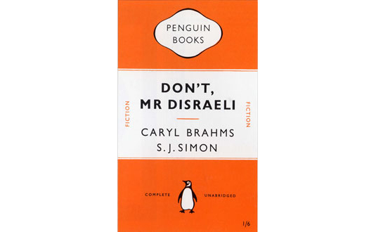
Alongside those there is also a school of minimalism that could be traced to the German typographer Jan Tschichold's designs for the British book publisher Penguin in the 1940s. Tschichold created a set of design rules that favoured restraint, but that also allowed for a measure of flexibility. His approach was strict, but humane.
Contemporary design in that model includes the biannual men’s fashion magazine Fantastic Man and its sister publication The Gentlewoman. In the spirit of Tschichold, Jop van Bennekom - the Dutch creative director of the two titles - tends to centre headlines and uses both serif and sans-serif typefaces, although he mixes them more freely than did his German forebear.

Overall, the magazines have an elegant and authoritative look, but they also communicate a degree of self-knowledge. This quality is particularly evident in the tone of the text. Depending on the sympathies of the reader, the strategy can either be viewed as playful or as arch.
In interview, Björn Kusoffsky of design group Stockholm Design Lab (SDL) associated minimalist graphic design with fine qualities such as straightforwardness, simplicity and honesty. Proponents of such an approach in most of its work, nonetheless SDL explores more maximal approaches where it deems appropriate. In designing proprietary products for the Japanese retailer Askul, where the field at the time was full of graphic noise (the territory of contemporary batteries, for example) it turned the volume down, but where there was general graphic silence (garbage bags being a case in point), it ramped up the visual sound.
To some, graphic minimalism implies honesty
To some, graphic minimalism implies honesty, yet it seems that even those who sign up to that ideology are not above the strategic use of graphic frills. Perhaps, rather than being viewed as a trend, contemporary minimalism is more accurately characterised as a recurring element of an established graphic vocabulary.
In the early 20th century, modernist minimalism was associated not with vague characteristics such as honesty and simplicity, but with a clearly defined left-leaning political approach. In a world where commercial property developers use typefaces that look like the 1920s Utopian German design Futura, it's clear that is no longer the case. As much as it may be clean and honest, minimalism, just like maximalism, is used to seduce.
Words: Emily King
This article originally appeared in Computer Arts magazine.
Liked this? Read these!
- Brilliant Wordpress tutorial selection
- Free tattoo fonts for designers
- Create a perfect mood board with these pro tips

Thank you for reading 5 articles this month* Join now for unlimited access
Enjoy your first month for just £1 / $1 / €1
*Read 5 free articles per month without a subscription

Join now for unlimited access
Try first month for just £1 / $1 / €1

The Creative Bloq team is made up of a group of art and design enthusiasts, and has changed and evolved since Creative Bloq began back in 2012. The current website team consists of eight full-time members of staff: Editor Georgia Coggan, Deputy Editor Rosie Hilder, Ecommerce Editor Beren Neale, Senior News Editor Daniel Piper, Editor, Digital Art and 3D Ian Dean, Tech Reviews Editor Erlingur Einarsson, Ecommerce Writer Beth Nicholls and Staff Writer Natalie Fear, as well as a roster of freelancers from around the world. The ImagineFX magazine team also pitch in, ensuring that content from leading digital art publication ImagineFX is represented on Creative Bloq.
