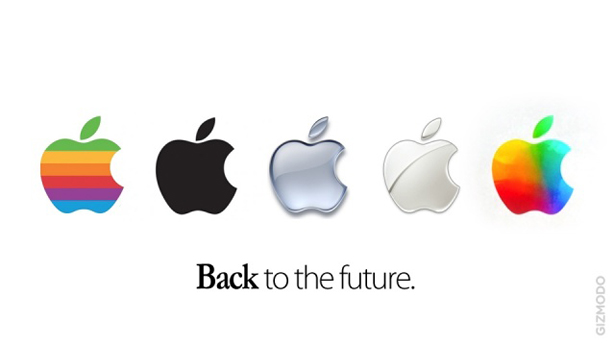
Apple logo revamp: Computer Arts readers react
Apple revealed a new look logo at the end of its iPad keynote yesterday and we asked for your reactions. Here's what you think so far
Computer Arts readers have responded to our call for thoughts on Apple's new multi-coloured logo - and they make for interesting reading:
"Bring this colour stuff back to your icons in OS X" - David Kessler
" I think sometimes colour is a more powerful brand element than even shape. While I like the idea, the color scheme reminds me of the multi color Windows logo" - Jim Payne
"For all those devoted Mac fans since foreva-eva... perhaps you forgot they used to have the coloured Apple icon for years that Steve had commissioned to 'humanise the company' and he even picked the order of the colours so that the green on top for the leaf. Steve also introduced the coloured iMacs. The coloured icon is just as iconic as the monochromatic icon and I, for one, think it's a great tribute to the man who so greatly changed the world we live in" - Heather Legg
"It looks like the spinny beachball of death too much" - Patterns For Colouring

"I have nothing against the new / old colourful logo, but I'd rather the grey ones that appear to me more conservative serious and still fashion and modern" - Anderson Moreira
"The oldest logo looks way better than the new one" - Dries Lambrecht
Get the Creative Bloq Newsletter
Daily design news, reviews, how-tos and more, as picked by the editors.
"I think that Steve Jobs never would approve this! But whatever" - Lucas Critchi
"Am I really one of the few people who actually likes it? I think it's a nice reference to their roots" - Ruud Renssen
"I like how Apple's logo now looks 'Windows-y' and Windows 8's logo looks 'Apple-y'... ha ha" - Mark H. Evans
"Horrible! Keep it minimal apple!" - Johnny Delap
Feel free to add your own thoughts below or why not post them on Computer Arts' Twitter and Facebook pages instead?

Thank you for reading 5 articles this month* Join now for unlimited access
Enjoy your first month for just £1 / $1 / €1
*Read 5 free articles per month without a subscription

Join now for unlimited access
Try first month for just £1 / $1 / €1

The Creative Bloq team is made up of a group of art and design enthusiasts, and has changed and evolved since Creative Bloq began back in 2012. The current website team consists of eight full-time members of staff: Editor Georgia Coggan, Deputy Editor Rosie Hilder, Ecommerce Editor Beren Neale, Senior News Editor Daniel Piper, Editor, Digital Art and 3D Ian Dean, Tech Reviews Editor Erlingur Einarsson, Ecommerce Writer Beth Nicholls and Staff Writer Natalie Fear, as well as a roster of freelancers from around the world. The ImagineFX magazine team also pitch in, ensuring that content from leading digital art publication ImagineFX is represented on Creative Bloq.
