Anagrama
In just three years Gustavo Muñoz, Miguel Herrera and Sebàstian Padilla have gone from working in a spare room to becoming the rising stars of Mexican design. Garrick Webster finds out how
Cast aside your preconceptions about Mexican style. The lucha libra costumes, imagery of Dia de los Muertos and tattoo art of Latino street culture have a certain visual flair. But they’ve quickly become clichs and if you look inside Mexico itself you’ll uncover a far more sophisticated design culture evolving. Anagrama is a great example – here’s an emerging studio that oozes class and consistency in everything it does.
“We do not see design as being regionally defined. Design must firstly be functional and it must communicate no matter what language you speak,” says designer Miguel ‘Mike’ Herrera. “When we see the projects by Stockholm Design Lab or BVD, we think everything should be done that way. We love how history gave Switzerland, Germany, England and France a chance to be innovators in the fields of information design and typography.”
Herrera’s comment is a great clue as to what inspires the studio, and it always shows through in the effusion of wonderful typography that comes out in their work. The other co-founders of Anagrama are Gustavo Muoz, who runs the business and project management side of things, and Sebstian Padilla who, like Herrera, is a self-confessed design perfectionist. The trio’s long list of international influences covers everything from Mies van de Rohe to Metallica, Haruki Murakami and Joseph Muller Brockman, with a little Daft Punk, Call of Duty and old calligraphy thrown in for good measure.
The studio was founded in 2008 after Muoz and Padilla had collaborated on a few projects together. They brought in Herrera and set up in a spare bedroom at Muoz’s house. Three years on and the studio has moved into a two-storey house in the downtown area of San Pedro Garza Garca, in the Nuevo Len region near Monterrey. They’ve been joined by three more graphic designers, two web developers and an extended team that includes an architect and two industrial designers.
Anagrama’s business is small but, as the saying goes, perfectly formed. It enables the team to get right inside projects and offer a service that bigger studios cannot: “Small is not a representation of expertise or success. For us, in part, it is a way of letting our clients know that we are committed to delivering ultra-high-quality work, and giving them personalised attention,” explains Muoz. “When evaluating projects, we make sure that we have a connection with our client and that the project will be executed with great results.”
The main focus is on brand development and this has three elements – consistency, attention to detail and process. A structured approach to branding is something they feel is quite new to the Mexican market, but there are still plenty of opportunities in the country for studios that can achieve high quality brand design. As an agency that recognises this, Anagrama positions itself as part of an emerging culture-shift in Mexican design. However, because Mexico is still a developing country, there are plenty of challenges.
Padilla explains: “Culturally speaking, in Mexico it is very common for clients to expect you to work without a process or structure, especially in design projects. Often we need to work extra hard to let our clients know that we need to follow a process in order to ensure great results. That pressure gives us an advantage in how we work with clients.”
Although they clearly don’t feel that being Mexican affects their design ethos much, one of their most interesting projects was actually for a new Mexican restaurant in the chic Palermo Soho district of Buenos Aires. The brand design for La Fabrica del Taco had many Mexican elements to it, and a slight cheekiness in its re-interpretation of the country’s internationally known cuisine. “We were inspired by the informal Palenque, which is a type of Mexican fair where taco stands compete using hand-crafted posters made with markers and fluorescent colours,” explains Herrera. “Often the results can be horrendous, but for us there was a lot of rescuable aesthetic value.”
The bright colours are reflected in the signage, menus, flyers, business cards and posters that Anagrama designed for the restaurant. Research also included checking out cumbia music posters and a lot of thought about tortillas. In a nice touch, the business cards for staff are all circular and folded in half, just like the corn chip tortilla used to make a taco.
To evoke the idea of the Palenque they hand-rendered all the headers, but did it in a classy style for a more up-market representation of the eatery. “We paid a lot of special attention to how local taco stands communicated, but we reinterpreted it in a way that maintained cultural and folkloric characteristics, taking care of the correct execution of typography,” adds Padilla.
Because the studio specialises in branding, Anagrama’s work takes in everything from logos to websites and interior design. However, as with its designs for La Fabrica del Taco, print is of huge importance and nearly every project includes a print element. Like designers around the world, they still seem to get a special buzz out of holding a finely printed piece of work in their hands. The key thing for the designers at Anagrama is that the print integrates consistently with the rest of the project and that it supports the look and feel they and the client are after.
“Specific accents and details in a printed element make it feel unusual or special when you hold it in your hand,” says Herrera. “Many times, the level of detail, the paper or ink processes and finishes, and how they combine, are related to how aspirational or upscale a brand needs to feel.”
Using print in the Mexican market brings challenges of its own, he adds. “We have been really limited in print work as we lack access to local high quality printing resources. On the other hand, clients have little idea of the costs of high quality printing which often limits the potential of our work as we need to be very careful of costs to keep projects feasible.”
However, sometimes they get the chance to really let loose and create some incredible examples of print design. The arrival of the patisserie Theurel & Thomas in San Pedro offered just such an opportunity. The company specialises in colourful French macarons, made from almond paste, which are not well known in Mexico. Making locals feel comfortable with the concept of a French caf was a key part of the brief.
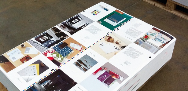
“When thinking about the concept we decided it was important to create an imposing brand that would emphasise the unique value, elegance and detail of this delicate dessert. To achieve this goal we got involved in everything from getting the best raw material suppliers to finding the best chef that could develop the perfect recipe and flavours,” explains Padilla.
“White was our primary tool for the design. As a result of this, the viewer’s attention turns entirely to the colourful macarons,” he goes on. “We placed two lines in our design in cyan and magenta, relating to a modern French flag, to inject a vanguard vision to the identity. We selected the Didot typeface, created by Firmin and Pierre Didot, so that French typography would present the brand with sophistication.”
In their complete invention of the brand, they designed the interior of the caf and all the packaging and collateral. They deployed foil stamping for some parts of the logo and for other decorative elements on the packaging, but on the whole kept the design simple to keep focus on the sweet biscuits.
As a result of its slick packaging, the caf is already fast developing a reputation as a luxurious brand: “People will identify a present from Theurel & Thomas as something valuable, and often this is how new customers are discovering the brand,” explains Herrera.
Another interesting project saw Anagrama get a completely blank canvas in the rebranding of a local print shop, which by definition called on their print design skills. Micheline is a boutique founded in the 1970s that became an icon in the area, and mainly supplied stationery for weddings, baptisms, communions and party invitations. However, as grandchildren of the original customers are now visiting the shop, and with no brand development having been done at all, it was time for Anagrama to step in to help.
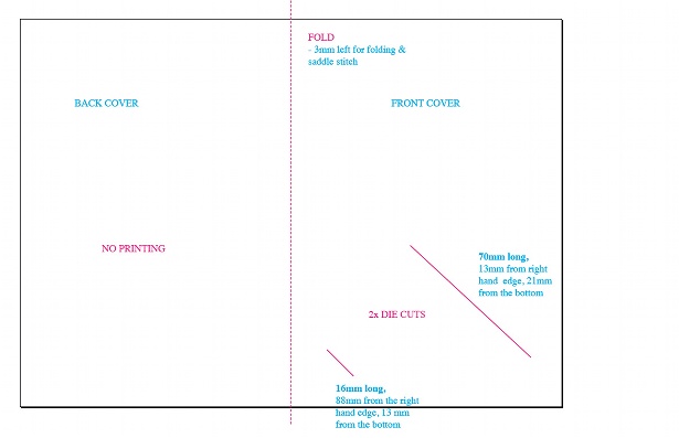
The studio’s strategy was to make the ordering of stationery a buying experience aimed mainly at young women. The design took in the logo, shop interior, the catalogues of print products offered for sale and all of the packaging and collateral. “We wanted different ‘happenings’ within the printed elements and interior design so that people could come in the store and walk around a few times admiring the use of various materials and lightning,” says Herrera. “We wanted the brand to be communicated from the time they came in the store and placed an order, right through to the time that the printed material was delivered to their homes.”
As we go to press, Anagrama are involved in exciting new commissions that will see their profile grow within Mexico and internationally. They’re currently rebranding a multinational steel company, revamping its offices in Mexico with new furiniture and interiors. Another project will see them rebrand a major restaurant in Saltillo.
“We hope to become a reference point for Latin American and international design,” says Muoz. ”We’d love to expand into other countries, establishing offices, and keep expanding our multi-disciplinary team, while being extremely careful to maintain the quality of our work. We’d love to get involved with airlines, hotels and the Olympics.”

Thank you for reading 5 articles this month* Join now for unlimited access
Enjoy your first month for just £1 / $1 / €1
*Read 5 free articles per month without a subscription

Join now for unlimited access
Try first month for just £1 / $1 / €1
Get the Creative Bloq Newsletter
Daily design news, reviews, how-tos and more, as picked by the editors.

The Creative Bloq team is made up of a group of art and design enthusiasts, and has changed and evolved since Creative Bloq began back in 2012. The current website team consists of eight full-time members of staff: Editor Georgia Coggan, Deputy Editor Rosie Hilder, Ecommerce Editor Beren Neale, Senior News Editor Daniel Piper, Editor, Digital Art and 3D Ian Dean, Tech Reviews Editor Erlingur Einarsson, Ecommerce Writer Beth Nicholls and Staff Writer Natalie Fear, as well as a roster of freelancers from around the world. The ImagineFX magazine team also pitch in, ensuring that content from leading digital art publication ImagineFX is represented on Creative Bloq.
