Add text to complex surfaces in Photoshop
Per Gustafsson on how to use Photoshop's Transform tools to manipulate perspective and add text to tricky surfaces
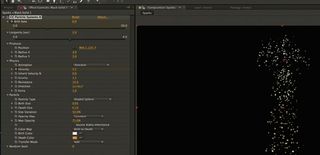
06 Let’s add some lettering to the composition. Using the Vertical Type tool, enter your text and merge it to a new layer. Now the type is an object and you can distort it. Go to Filters>Tools>Wave, or Ctrl/right-click on the object and choose Warp. This tool might make the text blurry, so use it carefully. Another way to avoid the blurriness is to create the text object separately and apply the effects at a higher resolution, then import it into the artwork and use it at a smaller size.
07 Transform the vertical text so that it follows the lines from top-left to bottom-right at a 30 degree angle with the Marquee tool. Rotate it to add some perspective. For a 3D feel, I duplicated the layer and went to Filters>Blur>Motion Blur. Now move this layer so it’s aligned with the right-hand side of the original copy. Experiment with the Gradient Overlay layer style, making the copy blend into the image by picking up colours from the lights. Motion Blur can add a lot of transparency to an object, so duplicate the blurred layer several times, adding one in front and two behind the original layer.
08 Now add some new typographic elements. Type your first word in a new font, on a new layer: this way you can adjust each one individually, placing them on your perspective lines. Use Distort by Ctrl/right-clicking on the layer with the Marquee tool. Select Rotate and put the word onto one of your lines. Duplicate the layer and move it to the right; then repeat this, moving it to the left. On these two new layers, experiment with some layer effects.
09 Repeat the process for your next word (‘station’ in this case), typing and merging it with a new layer to make an object that can be transformed right of the centre. Position it, add an Overlay blending mode to push it into the image, and move the layer around until you’re happy.
10 Finally I added ‘to Station’ below the words ‘From’ and ‘Station’ to make the phrase more legible, and rotated and scaled the words. Next, add a layer using a purple colour sampled from the image and adding a Soft Light blending mode. This will cast some light onto the text, to tie together the image.
Get the Creative Bloq Newsletter
Daily design news, reviews, how-tos and more, as picked by the editors.

Thank you for reading 5 articles this month* Join now for unlimited access
Enjoy your first month for just £1 / $1 / €1
*Read 5 free articles per month without a subscription

Join now for unlimited access
Try first month for just £1 / $1 / €1
The Creative Bloq team is made up of a group of design fans, and has changed and evolved since Creative Bloq began back in 2012. The current website team consists of eight full-time members of staff: Editor Georgia Coggan, Deputy Editor Rosie Hilder, Ecommerce Editor Beren Neale, Senior News Editor Daniel Piper, Editor, Digital Art and 3D Ian Dean, Tech Reviews Editor Erlingur Einarsson and Ecommerce Writer Beth Nicholls and Staff Writer Natalie Fear, as well as a roster of freelancers from around the world. The 3D World and ImagineFX magazine teams also pitch in, ensuring that content from 3D World and ImagineFX is represented on Creative Bloq.
