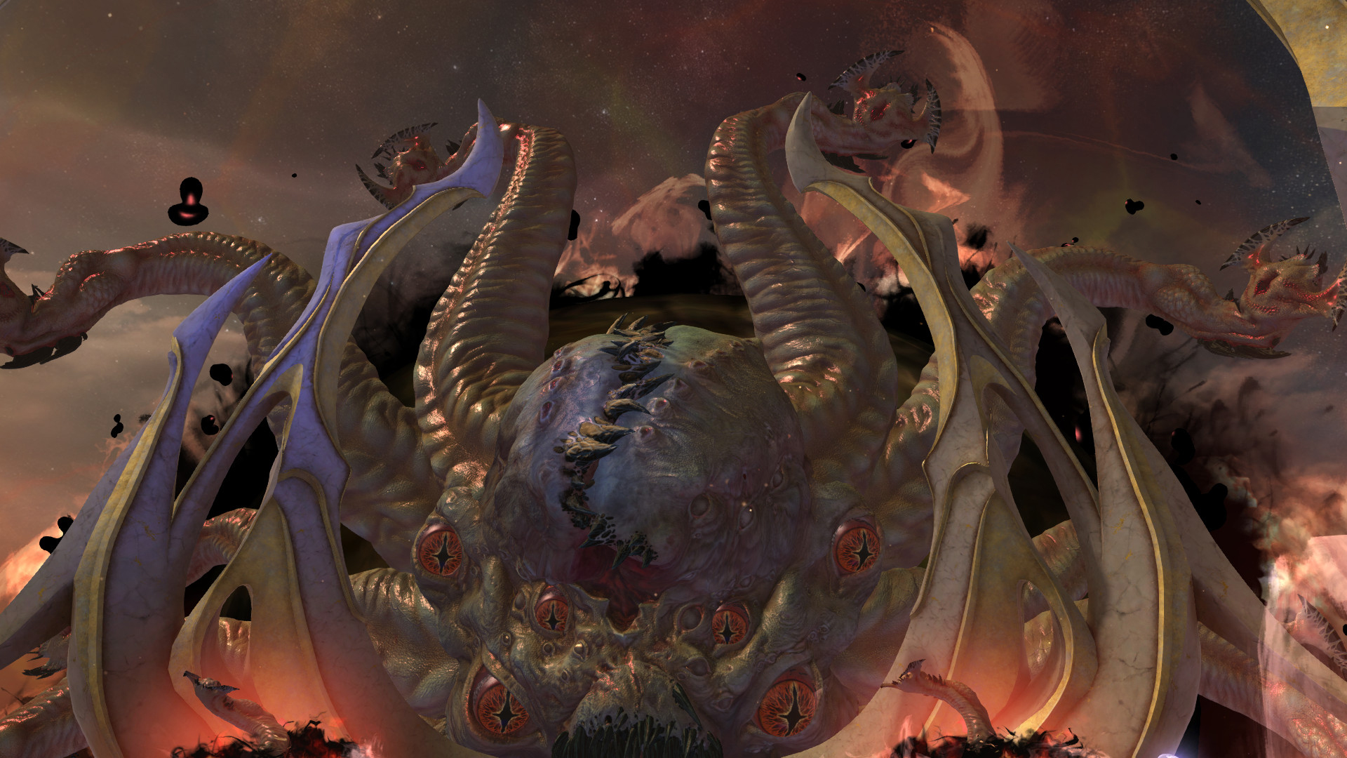
Add text to complex surfaces in Photoshop
Per Gustafsson on how to use Photoshop's Transform tools to manipulate perspective and add text to tricky surfaces
In this tutorial I’ll show you how to project typography onto a complex surface.
We’ll employ some basic text, give it a little perspective, place it into our image (an abstract composition in this case, but the techniques involved are universally applicable) and apply some effects to add depth and a sense of movement. To avoid complicating the process, we’ll do this all without using Photoshop’s 3D tools.
Discover 35 free Photoshop brushes that every creative needs, over at Creative Bloq.
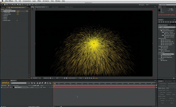
01 First open the background image or create your own – we’re just using a light texture with some clouds here. To give the image some depth and add a focal point, go to Filters> Distort>Pinch, and do this a few times to create some light beams flying out of the centre of the image.
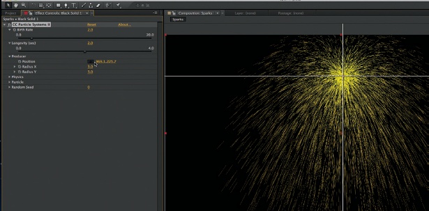
02 To create perspective, mark an abstract shape with the Polygonal Lasso tool, holding Shift to keep all angles at 45 or 90 degrees. Working from the centre, add lines parallel to the edges of the selection with the Pen tool. Create some boxes with the same angles, duplicate the layer, add a Difference blending mode and move the duplicate a little.
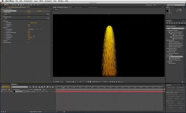
03 To enhance the angles, add some objects coming out from the centre of the image, like transparent tiles. Fill your tiles with a solid white using the Pen tool. I’ve added motion blur and lowered the opacity. Duplicate the layers and use the Transform tool to place them as though they are walls coming out from the centre area of light.
04 To increase the subtle feeling that these are walls and the light source is at the centre point, add some vertical lines at a different opacity. Duplicate the layers and play with the opacity after moving the lines. Stronger lines closer to the light source make for better depth.
05 To make the composition stronger, add circular elements to the focal point using the Elliptical Marquee tool, and a Color Overlay (from the Layer Style dialog) effect to help make the composition more consistent.
Get the Creative Bloq Newsletter
Daily design news, reviews, how-tos and more, as picked by the editors.

Thank you for reading 5 articles this month* Join now for unlimited access
Enjoy your first month for just £1 / $1 / €1
*Read 5 free articles per month without a subscription

Join now for unlimited access
Try first month for just £1 / $1 / €1

The Creative Bloq team is made up of a group of art and design enthusiasts, and has changed and evolved since Creative Bloq began back in 2012. The current website team consists of eight full-time members of staff: Editor Georgia Coggan, Deputy Editor Rosie Hilder, Ecommerce Editor Beren Neale, Senior News Editor Daniel Piper, Editor, Digital Art and 3D Ian Dean, Tech Reviews Editor Erlingur Einarsson, Ecommerce Writer Beth Nicholls and Staff Writer Natalie Fear, as well as a roster of freelancers from around the world. The ImagineFX magazine team also pitch in, ensuring that content from leading digital art publication ImagineFX is represented on Creative Bloq.
