Add some zing to your typography in Photoshop
Radim Malinic reveals how to produce exciting lettering with the Pen tool
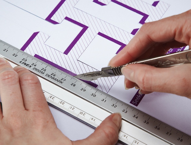
08 There are lots of ways to create a cast shadow, but since our main object will be sat firmly in the middle of the page, let’s use a Solid Color adjustment layer to help us achieve our ground point. Fill the layer with the colour 30/50/70/25 and hide all information via a pre-attached quick mask. Now you can either brush the colour back in, or draw an oval and feather in the selection via Refine Edge.
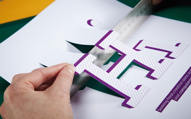
09 From the file we prepared in Illustrator, start bringing in shapes one by one. This might seem a rather lengthy process, but its always worthwhile in the long run. To navigate more easily between the layers, you can alternate between filling the shapes with the background and foreground colours as you go along.
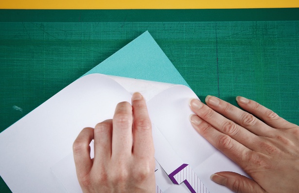
10 When you have the basic shape layers in place, you can take a shortcut and double up on shape profiles using a simple clipping mask technique. Drag one layer up in your layer stack, whilst holding Opt/Alt to create a copy. Hit Opt/Alt+ Shift+G to clip the path to the original shape of the layer below. Then move either up or down towards the edge.
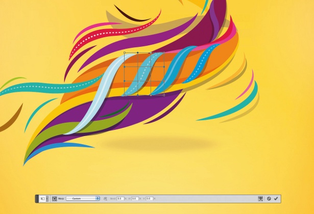
11 One of the main reasons we migrated the whole creative process from Illustrator to Photoshop is the easy handling of vector shapes in Photoshop via the Warp tool. Not only can we still pick up individual anchor points, but we can also move sections to suit the direction of our solid shadows.
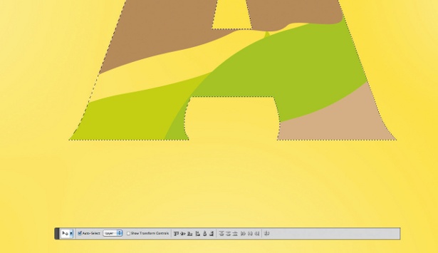
12 Even though we’ve been working with a solid letter shape from the start, we’ll now only be using the shape as a mask for infills around the swirling swooshes. Take one swoosh and click Cmd/Ctrl+G to group it. Create a selection from the main ‘A’, and mask the shape so every new layer within the group is only exposed within the character area.
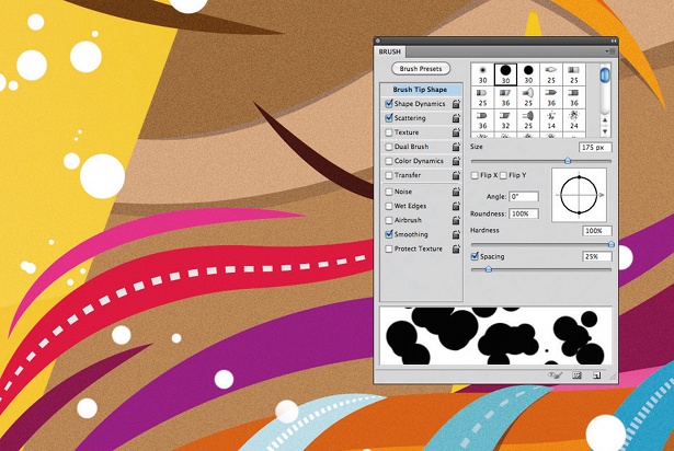
13 The image is taking an exciting shape, but let’s add a few extra details to make it really pop off the page. Firstly, take some of the leftover shapes from Illustrator and add splashes around the swooshes. Then, use the Brush tool at 175pt size with opacity and flow both set to 100%, and Shape Dynamic and Scattering ticked for random application. Brush around the objects to build up nice differences in size.
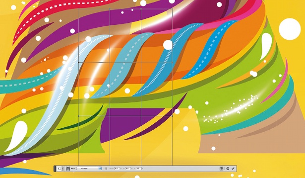
14 The last addition to the elements we’re building up will be a few light streaks to enhance the look of some of our overlaps. Drawn as a solid line, use Gaussian blur with an Outer Glow blending mode effect. When done, use Free Transform (Cmd/Ctrl+T) with the Warp tool to curve it around the objects.
Get the Creative Bloq Newsletter
Daily design news, reviews, how-tos and more, as picked by the editors.
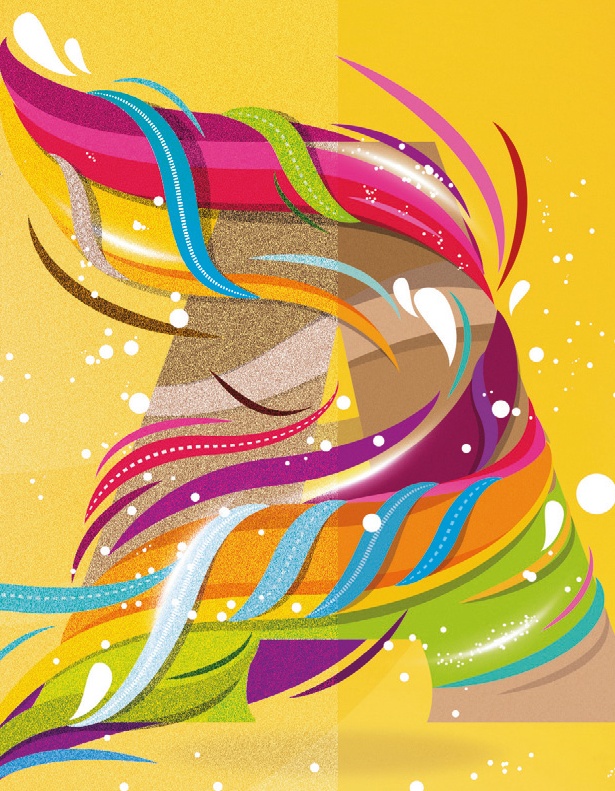
15 As always, this is the best time to step back for a moment and think about any final tweaks to make to the image. I have added a noise pattern into my Patterns presets that can be quickly applied at times like these, if needed. You can see the difference between a full noise overlay on the left, and the 10% application I settled on for the final image on the right.
Want more Photoshop action? Check out these 101 Photoshop tutorials

Thank you for reading 5 articles this month* Join now for unlimited access
Enjoy your first month for just £1 / $1 / €1
*Read 5 free articles per month without a subscription

Join now for unlimited access
Try first month for just £1 / $1 / €1

The Creative Bloq team is made up of a group of design fans, and has changed and evolved since Creative Bloq began back in 2012. The current website team consists of eight full-time members of staff: Editor Georgia Coggan, Deputy Editor Rosie Hilder, Ecommerce Editor Beren Neale, Senior News Editor Daniel Piper, Editor, Digital Art and 3D Ian Dean, Tech Reviews Editor Erlingur Einarsson, Ecommerce Writer Beth Nicholls and Staff Writer Natalie Fear, as well as a roster of freelancers from around the world. The ImagineFX magazine team also pitch in, ensuring that content from leading digital art publication ImagineFX is represented on Creative Bloq.
