Add more depth and texture to typographic compositions
Luke O’Neill uses Photoshop CS6’s blending modes to create stunning designs with typography
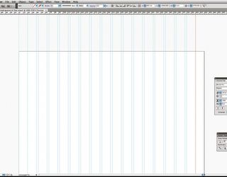
06 The piece is looking a little dark at the moment so, to lighten it, simply duplicate the circular spectrum gradient and move it to the top of the Layers panel. Go to Image> Adjustments>Hue/Saturation and slide the hue bar over to the far left or far right. Next, with a large, soft, round eraser begin to brush away softly over one side of the circle. Finally, select Screen as the blending mode.
07 With all the elements that we’ve added, the type has lost some impact. To lift it off the background slightly, duplicate the Type layer, move it to the top of the Layers panel and change the colour to white. Ctrl/right-click on the Type layer and rasterize it. Now, using a large, soft eraser, begin to gently brush away at the rasterized type. We want to be subtle here, so we can brush away quite a lot of the white type layer.
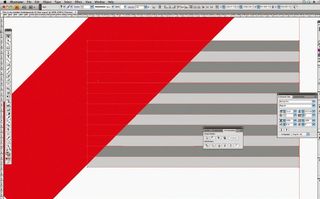
08 To add more contrast to the bottom part of the background, duplicate the Angle gradient and instead of Exclusion select Multiply as the blending mode. Now, using the Rectangle tool, draw a large oblong shape and, holding Shift, rotate it so it sits diagonally across the piece. Add a Drop Shadow layer style and set its blending mode to Vivid Light, opacity to 100%, choose a magenta colour and set its size to maximum.
09 Now turn the fill of the rectangle to zero in the Layers panel, duplicate it, place it near the top of the piece and change its colour to Black. Next, draw a large circle, reduce its fill to zero and, under the Layer Styles, add an outer glow with a Vivid Light blending mode and increase its size to roughly 150. Duplicate this and position it in the lower portion of the image.
10 Finally, Ctrl/right-click on the circle layers and rasterize them. Then, using a large, soft eraser again, carefully brush away at parts of the circles to create some interesting lighting effects. Finally, as with any image, flatten it and tweak the levels, curves and Hue/ Saturation to ensure that the piece has maximum impact.
Get the Creative Bloq Newsletter
Daily design news, reviews, how-tos and more, as picked by the editors.

Thank you for reading 5 articles this month* Join now for unlimited access
Enjoy your first month for just £1 / $1 / €1
*Read 5 free articles per month without a subscription

Join now for unlimited access
Try first month for just £1 / $1 / €1
The Creative Bloq team is made up of a group of design fans, and has changed and evolved since Creative Bloq began back in 2012. The current website team consists of eight full-time members of staff: Editor Georgia Coggan, Deputy Editor Rosie Hilder, Ecommerce Editor Beren Neale, Senior News Editor Daniel Piper, Editor, Digital Art and 3D Ian Dean, Tech Reviews Editor Erlingur Einarsson and Ecommerce Writer Beth Nicholls and Staff Writer Natalie Fear, as well as a roster of freelancers from around the world. The 3D World and ImagineFX magazine teams also pitch in, ensuring that content from 3D World and ImagineFX is represented on Creative Bloq.
