5 top examples of editorial illustrations
These beautiful editorial illustrations pop from the pages, conveying the theme of the article perfectly.
When it comes to producing a magazine or newspaper, the worded content is just the beginning. The overall design of the product must entice and highlight the article's importance as well as providing a beautiful aesthetic to the magazine's style. Here, we pick a few of our favourite editorial illustrations over the past few months.
01. Wijtze Valkema

Wijtze Valkema is a Netherlands based freelance illustrator, who specialises in bold, bright and colourful projects that are bound to catch the eye. This particular illustration was created as part of a cover and spread project for Het Financieele Dagblad’s weekend supplement 'Outlook' on crowd funding and research by patients.
02. Aaron Miller
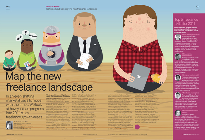
Graduating back in 2008, Aaron Miller is a Cheltenham based freelance illustrator who has created editorial illustrations for the likes of Virgin and Computer Arts. This adorable project was produced for a recent issue of Computer Arts magazine, that showcases the ways in which you can grow as a freelancer.
03. Bex Glover
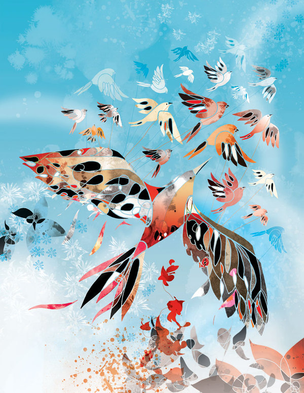
Bex Glover is a Bristol-based illustrator, who specialises in editorial and advertisement projects. This beautiful editorial illustration was created for Digital Artist magazine to showcase ways in which other designers could experiment with stylised illustration. We think Glover has nailed this one.
04. Tuomas Kärkkäinen
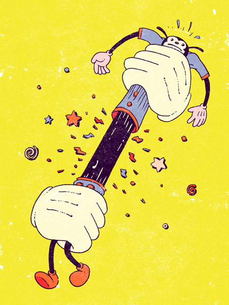
Helsinki based illustrator Tuomas is currently studying graphic design at Aalto University, whilst completing a wide range of freelance work.
Working with clients such as Helsingin Sanomat, Talentum, Amnesty International, Voima magazine and Grafia magazine, this brilliant piece is just a glimpse of what he can do.
05. Mark Smith
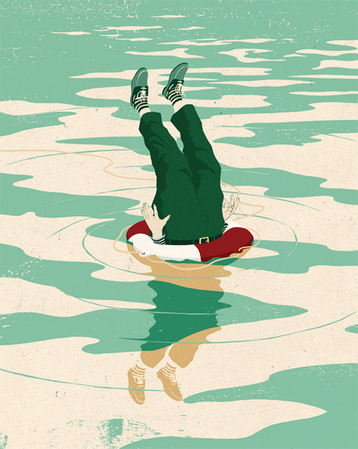
Mark Smith is an absolute pro when it comes to editorial illustrations. His weird and wholly inticing style has won him clients such as ESPN, The Guardian, Time Out and the New York Times. This particular illustration was created for Birmingham University magazine and is a perfect example of Smith's infectious outputs.
Have you seen an inspiring editorial illustration? Let us know in the comments box below!

Thank you for reading 5 articles this month* Join now for unlimited access
Enjoy your first month for just £1 / $1 / €1
*Read 5 free articles per month without a subscription

Join now for unlimited access
Try first month for just £1 / $1 / €1
Get the Creative Bloq Newsletter
Daily design news, reviews, how-tos and more, as picked by the editors.

Sammy Maine was a founding member of the Creative Bloq team way back in the early 2010s, working as a Commissioning Editor. Her interests cover graphic design in music and film, illustration and animation. Since departing, Sammy has written for The Guardian, VICE, The Independent & Metro, and currently co-edits the quarterly music journal Gold Flake Paint.
