The 10 commandments of typography
Have you been committing sins against type? We round up the most heinous crimes against typography and how to avoid them.
Whether you're an art director, graphic designer working from home or a web designer, getting your typography right is essential if you want to get your message across in the way you, or your client, intended.
For an in-depth look at various aspects of typography, check out our typography tutorials. In this post, we look at common type mistakes, how you can avoid them and offer up some further reading along the way.
01. Thou shalt not use default kerning

We see it far too often: a great piece of design ruined by shoddy kerning. When setting any headline in InDesign CC, IllustratorCC or even PhotoshopCC, don't trust the software's judgement.
Take your time to look at spacing between pairs of letters (kerning) and the spacing of the whole word (tracking). You have a lot of control (rather understandably) over kerning and tracking in InDesign.
First, go to Preferences > Units & Increments > Keyboard Increments > Kerning/Tracking and set your required increment. Now you can use the Alt/Opt and left/right arrow keys to fine-tune your spacing. You'll find further advice in our article on kerning tricks.
02. Thou shalt not overuse script fonts

Okay, there are times when a nice script font works (usually at large sizes; maybe in vintage logo designs or similar), but for most general design jobs they are unnecessary.
Think of how many times you've seen the awful Zapfino cropping up in headlines and even body copy on amateurish posters, leaflets and other printed collateral. Yuck. And you definitely shouldn't be even thinking about using a script font of any kind in body text. Just don't do it – no-one will read it.
Get the Creative Bloq Newsletter
Daily design news, reviews, how-tos and more, as picked by the editors.
On those occasions when script is appropriate, though, check out our collection of free script fonts.
03. Thou shalt not place type over busy backgrounds
There's nothing worse than not being able to read a message because the background is overpowering it. Yes, you may have a beautiful photo that needs to go in the background, but don't hunt for a space to overlay your type: think about the treatment in a sensible manner.
You may need to set your types in blocks of solid colour in order for it to stand out, or even crop the photo differently and run your text somewhere else in the design. Think about legibility. You may be able to read it – you know what it says – but your audience may just miss it.
04. Thou shalt not use many many fonts
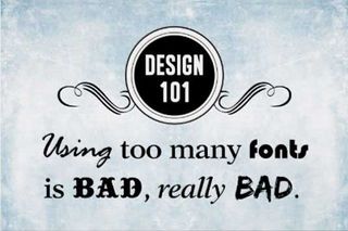
It's the cardinal sin of type – using too many fonts. Although we all have access to thousands of free fonts to use in our design work, thanks to the likes of Google Fonts and services such as Font Squirrel, you don't need to use them all at once.
Using multiple fonts across a site, magazine or, well, any piece of design can confuse and distract from your message. A general rule of thumb is to use no more than three fonts in your design (although there are exceptions, such as illustrated type pieces).
05. Thou shalt not fake small caps
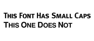
Faking small caps never looks good – in fact, it looks downright ugly. So, if you're looking to add a bit of variation to your headlines by using small caps, pick a font that has one. There are loads of free quality ones available – just take a look at these for starters.
06. Thou shalt not use fake italics
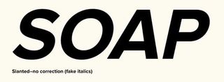
Though it's increasingly rare to find a font without an italic case, if you are using one don't be tempted to skew the font to make it italic – it won't look good. At all. Your curves will be distorted, stroke weight will be all out of sync and, well, do we need to say more?
Block the little Skew (False Italic) icon in InDesign out of your mind – it's for the best. For more on this, see this handy little post from type designer Mark Simonson.
07. Thou shalt not use all caps
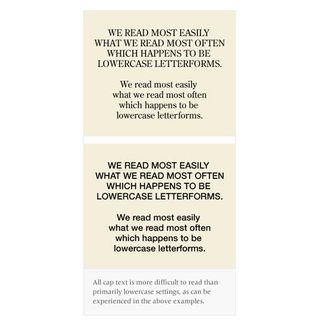
Whilst capitals can look much slicker and, dare we say it, cooler in body copy, using all caps will turn your important body copy into an illegible mess.
The reason? Well, according to this article on Fonts.com, the most common explanation is that we don't read letter-by-letter, but rather by word shapes "which are in part created by the position and frequency of ascending and descending characters". So if you set something in all caps, it becomes a challenge to read.
08. Thou shalt not reverse type

Just like commandment 07, reversing type out of a dark colour (so using it white) does nothing for legibility. As this useful guide from UXmovement.com mentions: "You should avoid using white text on a dark background when displaying paragraph text to make it easier from them to read. Forcing users to fixate on the white text for a long time can strain the user's eyes."
This is because white stimulates all three types of colour sensitive visual receptors in the human eye in nearly equal amounts. However, as the article also mentions, there are times when you can use white on a dark colour to highlight a particular element on your site or in your design.
09. Thou shalt not combine serifs
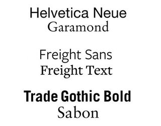
Whatever you do, don't use a serif for a headline and the body copy that follows. It will throw your typographic hierarchy all out of balance. In fact, try not to combine any fonts that are too similar. When using a serif for a headline, try a sans for body; when using a serif in your body copy, try a slab.
A lot is about trial and error, but we recommend reading our 20 perfect font pairings post to set you off on the right track. Remember… contrast, not conflict!
10. Thou shalt not use long measures
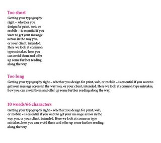
What is measure? Simply put, it's the length of a line of type – or the width of a column, if you like. Too long or too short and your reader will have to fight to construct the sentences; it can be very distracting.
There are a number of different theories on the ideal line length. Eric Gill in his 1931 book An Essay on Typography suggests that the ideal line length consists of 10-12 words, whereas Robert Bringhurst recommends in his 2004 book The Elements of Typographic Style that 66 characters is best for optimum legibility, but anything between 45 and 75 is okay. Choose a theory and stick to it.
And the 11th commandment...
Thou shalt not use Comic Sans. (Well, we had to put it in, didn't we?).
For more on this, see our post on the person who inspired Comic Sans, and what he thinks of the font.
Related articles:

Thank you for reading 5 articles this month* Join now for unlimited access
Enjoy your first month for just £1 / $1 / €1
*Read 5 free articles per month without a subscription

Join now for unlimited access
Try first month for just £1 / $1 / €1
Rob is editorial, graphic design and publishing lead at Transport for London. He previously worked at Future Publishing over the course of several years, where he launched digital art magazine, ImagineFX; and edited graphic design magazine Computer Arts, as well as the Computer Arts Projects series, and was also editor of technology magazine, T3.
Related articles
-
-
-
-
