24 hours with Jonathan Barnbrook
Garrick Webster dives into the mind of the VirusFonts and Barnbrook studio founder, for a day considering politics, psychology and the odd bit of design inspiration too
When he was younger, Jonathan Barnbrook spent a lot of time in cemeteries. Don’t worry, this wasn’t due to a Morrissey tendency, and there’s nothing of the Nosferatu about him. He was there to study the typography. Engraved text on old headstones and monuments has been a major inspiration for him, and reviving, adapting and giving a modern voice to bygone letterforms has been a key part of his work.
“I live in Highgate, because it’s where Highgate Cemetery is. Cemeteries and gravestones were a real inspiration when I was younger, for the typography and atmosphere,” begins Barnbrook. “I was interested in classical typography and the places to go for it in London, where I was studying, are churches and graveyards. Highgate is especially good, as it’s completely overgrown. It’s like going to this lost civilisation. When you went in, there were trees everywhere and gravestones, covered in ivy and broken. It’s a really beautiful atmosphere.”
There are all sorts of reasons why he finds classical lettering so interesting. One is the permanence of what’s carved in stone, the opposite of today’s throwaway culture. A headstone sums up someone’s life in three lines, but it can’t just be discarded. Another thing he finds fascinating is that even today inscriptions are hardly ever considered to be proper design – they’re regarded as semi-skilled folk art.
“The normal person’s gravestone isn’t considered to be proper art, design or typography, and I find that quite interesting,” he continues, looking down at his mug of tea and speaking in a quiet, considered manner. “That non-design is also a very strong influence on creativity in contemporary graphics. People find something that hasn’t been produced by a designer but they kind of bring it into their work for an aesthetic.”

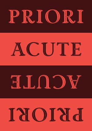
The most recent release from VirusFonts, Barnbrook’s foundry, is Priori Acute. This adds a display face to the Priori family that he first began developing a decade ago. The influence of hand-carved script is unmistakable in its 3D grooves and shading, but the earlier serif and sans serif text versions of the font also resulted from Barnbrook’s love of classical lettering. Alongside Virus, Barnbrook runs a design studio, where Priori is used extensively. You’ll see it in books the studio designs, on album covers and even as part of the identity work it did for Roppongi Hills, a huge development in Japan that includes shops, an art gallery, cinemas and hotels.
Priori is widely used by other designers, some of them right on Barnbrook’s doorstep. One day he noticed a new sign being painted above the Archer Street bar, across the road from the Barnbrook studio. He laughs when he thinks back. “The sign writer was doing it and I said, ‘Do you like that font?’ He said, ‘Yes, yes, yes, but we’ve got to charge you for taking that photograph.’ And I said, ‘I did the font!’”
From his home in Highgate it’s a quick ride into central London to his studio, just a few blocks from Piccadilly Circus, right behind the Apollo Theatre. If the weather’s warm enough he prefers cycling. You engage much more with the world around you than you would in a car, he says. He doesn’t own a car and can’t drive, and it’s likely to stay that way. Anyhow, a car isn’t necessary in London, where he’s always worked. There may be road works all the time, and ugly new developments going up, but he likes the city’s vibrancy. Avoiding the tourist areas, he still discovers streets with just the right atmosphere. Fleet Street, even though all the newspapers have gone, is a favourite at the moment.

This contrasts with Luton – on the far fringes north of London – where he grew up. Both his parents worked in the Vauxhall factory there and, if it hadn’t closed, he might have ended up employed there too. His love of classical typography developed as a reaction to the place. “I shouldn’t do it down too much,” he says. “There was no history, it was just a modern industrial town so I can understand how I naturally gravitated towards that kind of typography and aesthetics – the opposite to what I was brought up with.”
When he left to study design in London, the main theme was Modernism. Just like Luton, for him Modernism lacked vitality. History, culture and communication were being simplified down to a clean, organised but ultimately narrow aesthetic, dreamed up by middle-class white Europeans. It had no traction with him, so he started creating things that reflected life rather than things that reduced it.
“Those wonderful Modernist buildings from 40 years ago look rubbish now and are being demolished,” he points out. “And Helvetica, which was used for all the nice European newspapers, was also used for the dole office in my local town. It had different associations – there was authority and the grimness of life in with all that Modernism, not the socialist utopian idea that it started off as.”

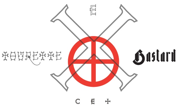
The names of some of the fonts Barnbrook has released over the years will make you smile. How about doing some layouts with Bastard, Expletive, Moron or Tourette? Olympukes or Infidel, perhaps? These amusing and somewhat confrontational titles certainly reflect some of the Barnbrook attitude, but they also say something about the typefaces themselves. For him, the name of a typeface should work at different levels.
Tourette, released in 2005, is a good example. It is named after the neuropsychiatric disorder Tourette’s syndrome. Some sufferers are unable to stop themselves from barking out the worst words at the most inappropriate moments. This contrasts with our normal boundaries of speech, and crossing them was something Barnbrook wanted to explore with the typeface – there are the visual aspects of letterforms, and then there’s how they are used in words and, ultimately, in language.
“Tourette is based on an early 19th century slab serif form,” he says. “Having Tourette’s means that people move outside an agreed code of language. That’s why it’s so interesting when you see someone sitting there and they’re having a conversation and they’re saying ‘fucking shit wanker piss’ at the same time.” Barnbrook finds this juxtaposition of ‘civilised’ speech and speech that falls outside of accepted social norms interesting. “That’s what I was trying to say in Tourette. There are swear words that are banned, but it’s necessary that they appear in language as well, because we can’t calibrate it otherwise. And I do like swearing,” he adds with a wicked grin.

Thank you for reading 5 articles this month* Join now for unlimited access
Enjoy your first month for just £1 / $1 / €1
*Read 5 free articles per month without a subscription

Join now for unlimited access
Try first month for just £1 / $1 / €1
Get the Creative Bloq Newsletter
Daily design news, reviews, how-tos and more, as picked by the editors.

The Creative Bloq team is made up of a group of design fans, and has changed and evolved since Creative Bloq began back in 2012. The current website team consists of eight full-time members of staff: Editor Georgia Coggan, Deputy Editor Rosie Hilder, Ecommerce Editor Beren Neale, Senior News Editor Daniel Piper, Editor, Digital Art and 3D Ian Dean, Tech Reviews Editor Erlingur Einarsson, Ecommerce Writer Beth Nicholls and Staff Writer Natalie Fear, as well as a roster of freelancers from around the world. The ImagineFX magazine team also pitch in, ensuring that content from leading digital art publication ImagineFX is represented on Creative Bloq.
