Create an outer world ambiance
Christoph Ruprecht reveals how to add an extra dimension to your work by manipulating the laws of light and shadow.
In this tutorial I am going to show you how to create an 'outer-world' feeling using an experimental Photoshop process. My personal works often deal with the idea of hybrid realities and extra dimensions, so in this project I have created a situation where a person is experiencing an abstract moment that transcends the regular boundaries of nature and reality.
To achieve this kind of ambiance, I'll explain how to manipulate the regular laws of light and shadow by partly inverting your images, and merging positive with negative. I'll also make use of interesting textures, and use vibrant-coloured gradients to make sure the image leads the observer into a portal where they can drift off and dream in their own personal universe.
The female image used here is from a photographer named Katanza-Stock at deviantART, but you can use your own if you wish. A good site for free textures is CGTextures.
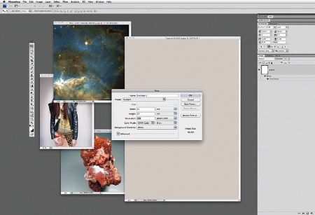
01 Open Photoshop and create a new CMYK document, setting the width to 25cm, height to 35cm and background colour to C:21, M:21, Y:21 and K:0. Now select your images: I opted for a human figure, a night sky for the background (taken from the Hubble Space Telescope) and a crystal texture, which I chose for its surface properties.
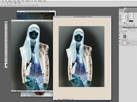
02 First of all invert your images (Ctrl/Cmd+I). If they are in RGB mode, invert them before dropping them into your CMYK document. You would lose lots of lighting information and end up with a much darker image instead if this was done in CMYK.
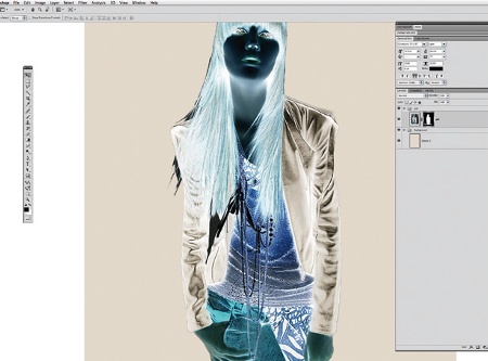
03 Temporarily add more contrast via a Levels adjustment layer so that you can easily select the background with the Quick Selection tool, and then create a quick mask to crop your figure from the background. Now go to Select>Refine and refine the mask.
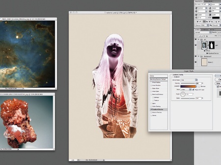
04 Experiment with the colours of your inverted image until you're happy with the results. I added a Gradient Overlay from violet to orange, and set the Blend Mode to Hue.
Get the Creative Bloq Newsletter
Daily design news, reviews, how-tos and more, as picked by the editors.
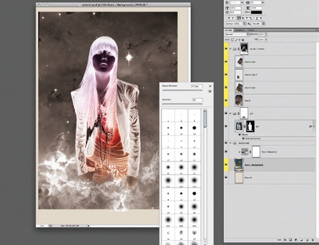
05 Paste your background image into the document. Desaturate and duplicate parts of it, and set the Blend Mode to Lighten. Add a layer mask, and use different brushes to let the clouds from your background fade in front of and around and of your figure.
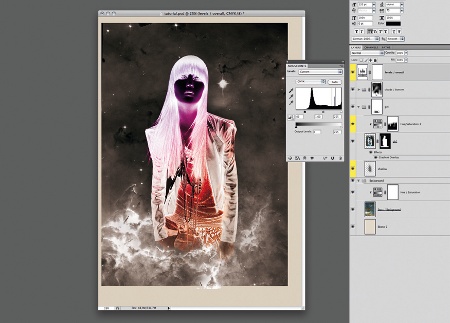
06 Enhance the contrast now by adding a Levels adjustment layer on top. For your figure, create a Hue/ Saturation adjustment layer with +100 Saturation. Next, use a Gradient and some brushes on its mask, so that the effect only applies to the upper part of the body. Give the figure a soft, painted shadow.
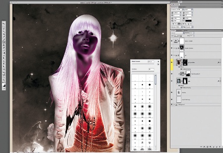
07 Duplicate your figure layer, and invert it to positive. Add a black layer mask, and paint with a soft white brush to reveal areas of the positive image. Do this partly over the face and arms, merging positive with negative for a more illustrated and plastic look.
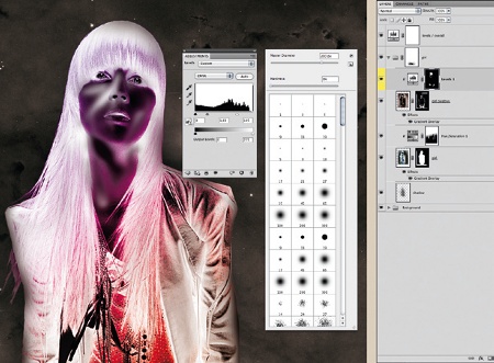
08 Now add a locked Levels adjustment layer to bring in more light, but only apply the effect to the face and hands - making them stand out more.
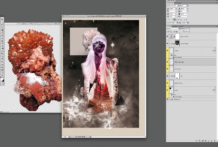
09 To give some variety to the image, add a simple square and triangle shape. Now crop some elements from your crystal image, press Ctrl/Cmd+U, and increase the lightness so that you end up with a white image that you can cut, duplicate and integrate into your scene.
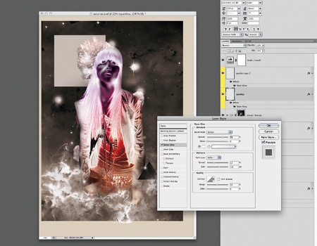
10 Next create a new layer, and go to Layer>Layer Style>Outer Glow. Select Screen for the Blend Mode, Opacity: 75%, Technique: Softer, Spread: 32%, Size 141%, and Range: 50. Duplicate the layer, but reduce the Size value of its glow, then use different brushes to paint on each layer where you feel an extra highlight might work well.
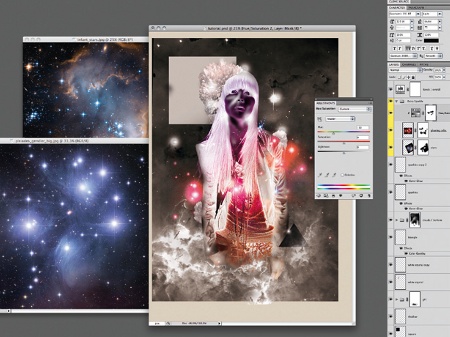
11 Source some additional night sky images and add them, setting the Blending Mode to Lighten, and adjusting the Levels so that all you have left are the glowing stars. Interesting results can be achieved with a Hue/Saturation adjustment layer, and by using some brushes to merge the two versions.
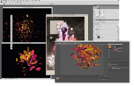
12 It's now time to create some dynamic particles for the image. Open Cinema 4D, and play around with a simple explosion effect. Render and place the images back into Photoshop, positioning a big cluster behind your figure, and two smaller ones behind the triangle, with each one desaturated.
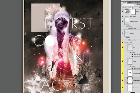
13 Next, add some type. Choose a clear and graphical font - I've used Geometric - to create a tension between the type and the illustration. Arrange the letters in a way that is illustrative and experiment with positioning. Play around with some letters, like the 'O' here.
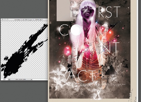
14 Now trace a black smear in Illustrator, and place it behind your figure in a way that supports the dynamic. I also used the smear to put some dirt on the edges of my background image.
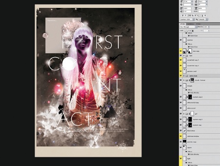
15 Finally add the last few details, such as a white, brushed glow underneath your figure, and check whether you can improve any masking or shading effects. Have a play with the masking and Brushes palette, mixing different coloured versions of the image into one by adding more adjustment layers on top - and you're done.
Christoph Ruprecht
Besides working as a freelance art director, typographer and illustrator for brands such as Alfa Romeo and Umbro, Chris is also part of the award-winning interactive art collective Futura Epsis 1, where he takes care of creative direction. See his work at www.crispycrystal.com

Thank you for reading 5 articles this month* Join now for unlimited access
Enjoy your first month for just £1 / $1 / €1
*Read 5 free articles per month without a subscription

Join now for unlimited access
Try first month for just £1 / $1 / €1

The Creative Bloq team is made up of a group of art and design enthusiasts, and has changed and evolved since Creative Bloq began back in 2012. The current website team consists of eight full-time members of staff: Editor Georgia Coggan, Deputy Editor Rosie Hilder, Ecommerce Editor Beren Neale, Senior News Editor Daniel Piper, Editor, Digital Art and 3D Ian Dean, Tech Reviews Editor Erlingur Einarsson, Ecommerce Writer Beth Nicholls and Staff Writer Natalie Fear, as well as a roster of freelancers from around the world. The ImagineFX magazine team also pitch in, ensuring that content from leading digital art publication ImagineFX is represented on Creative Bloq.
