How to reinvent a classic mythological character
Artist Jakob Eirich explains how to paint a mythological folklore creature in a fresh new light.
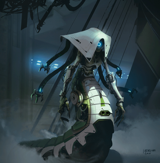
I chose Medusa for this task and before I start drawing I always do some research. This stage is crucial, because you need to get to know your subject. What are its most important features? How was it drawn hundreds of years ago? How is it depicted in recent illustrations, films or video games?
Doing this groundwork also means I become aware of what's been done before, and what to avoid if I want to find a new and fresh direction.
To give my character an original twist I consider experimenting with different genres. How about a zombie Medusa? A mutant Medusa? A cyborg or robot? If you don't have a specific brief then you have a wide range of possibilities to explore.
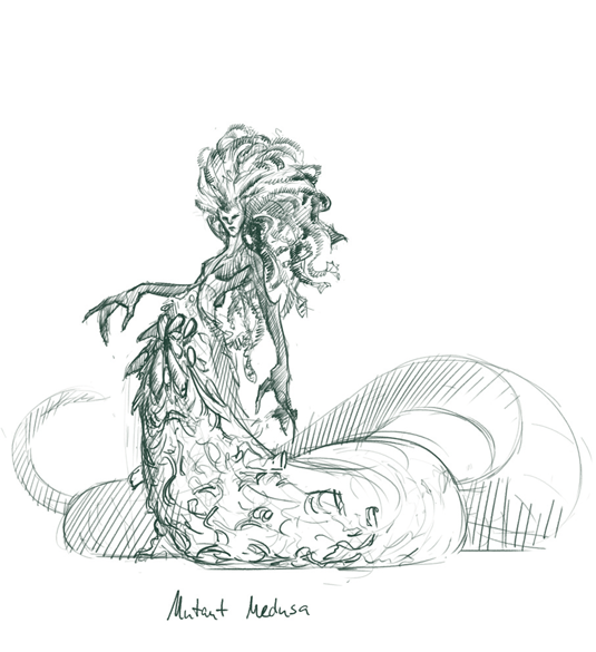
Pick one or two ideas and carry out the same research as for Medusa herself, but this time look for ways these genres are depicted in different media. Don't copy what you see, though. Take what you like and mix it with things you find in real life. These can be totally unrelated objects or your own ideas.
Taking this approach will give you a better chance to create something fresh, that no one has thought of before.
01. Concept is key
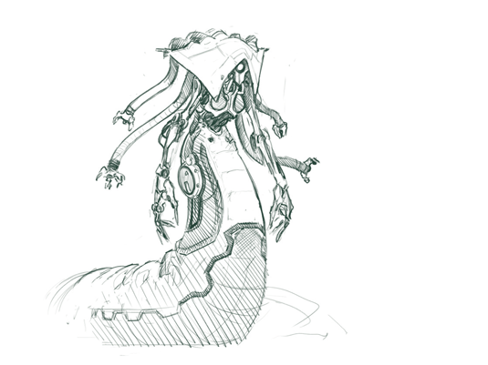
The idea is key, so this is what you should focus on when you start a design. Put down a couple of sketches to generate different approaches. Usually I produce my best results after I've got the initial ideas out of my head. Here I draw a mutant Medusa and a sci-fi Medusa.
02. Add value
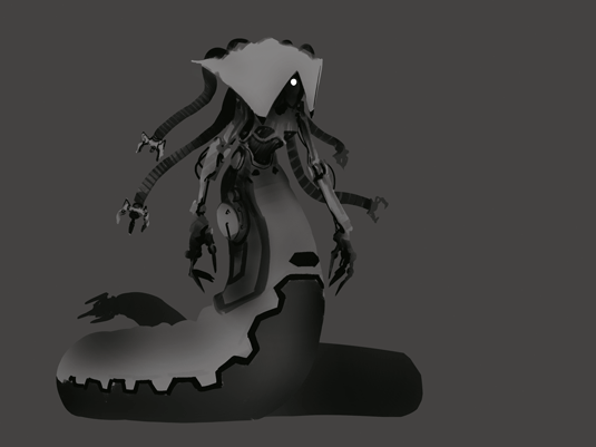
Value and shape is something you need to always have an eye on. You should even write it on a piece of paper and stick it to your wall in front of your desk! Both should be optimised to a point where it's interesting to look at, even from greater distance or with no shading at all.
03. Creative colour
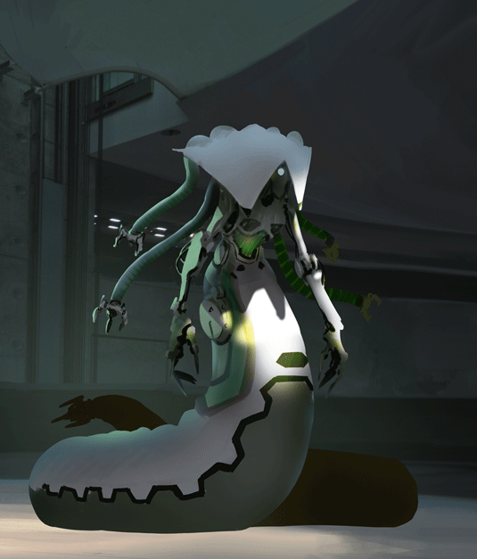
I add colour and put my Medusa in an environment I imagine she would dwell in. To add visual interest I play with a spotlight. If your illustration is all about design in a production pipeline you shouldn't have fancy light and very dark areas, for maximum readability.
Words: Jakob Eirich
Jakob graduated in graphic design in 2009 and has been freelancing since. He’s keen to tell stories with his illustrations and create worlds that he’d love to explore himself. This article originally appeared in ImagineFX issue 126.
Like this? Read these...
- 12 pro tips to improve your artistic composition
- 3 top tips for illustrating personality
- How to become an artist without traditional art school

Thank you for reading 5 articles this month* Join now for unlimited access
Enjoy your first month for just £1 / $1 / €1
*Read 5 free articles per month without a subscription

Join now for unlimited access
Try first month for just £1 / $1 / €1
Get the Creative Bloq Newsletter
Daily design news, reviews, how-tos and more, as picked by the editors.
The Creative Bloq team is made up of a group of design fans, and has changed and evolved since Creative Bloq began back in 2012. The current website team consists of eight full-time members of staff: Editor Georgia Coggan, Deputy Editor Rosie Hilder, Ecommerce Editor Beren Neale, Senior News Editor Daniel Piper, Editor, Digital Art and 3D Ian Dean, Tech Reviews Editor Erlingur Einarsson, Ecommerce Writer Beth Nicholls and Staff Writer Natalie Fear, as well as a roster of freelancers from around the world. The ImagineFX magazine team also pitch in, ensuring that content from leading digital art publication ImagineFX is represented on Creative Bloq.
