How to create a believable character
Use gesture and poses with personality to help create a believable character.
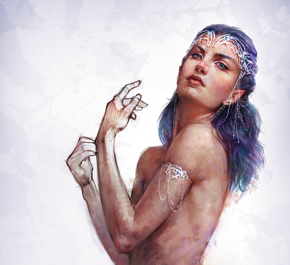
Character design belongs to many areas of concept art and illustration, whether they're main characters or simply a small figure in the distance. One of the important aspects of learning how to draw and design characters is to create a sense of believability, so that these characters could really exist in the world you're designing them for.
While dressing your character and styling their visual appearance helps to define their overall look, the most important step to making your character believable – especially when adding them to a larger scene – is to portray their personality through gesture, and show how they would move and compose themselves.
A great example of this is animation and the use of caricatured exaggeration to sell an idea. These same principles can apply to realistic character concepts, too.
One of the important aspects of character design is to create a sense of believability
In this workshop I'm going to take you through my process of developing a figure using Photoshop. We'll begin by sketching gestures, landmarks and simple volumes, refine the sketch and then take it through to adding values in greyscale.
I'll also explain the importance of working with thumbnails. I'll be colouring the image using different blending modes before rendering out the figure. Throughout the process I'll discuss the use of colours, brushwork and edge control. This will help to add variation to the image and single out key focal points.
Watch the video above to see how I created this elegant elf character, and read my step-by-step instructions and tips below to create your own.
- Download the assets for this tutorial here
01. Sketch quick poses
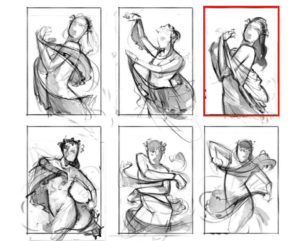
I start the process by gathering a page of reference material for my female elf character. I then sketch a range of poses, keeping the gestures simple and not going into too much detail. The idea here is to create basic shapes and movement. I receive feedback from the ImagineFX magazine team, and make some refinements and changes. The team then chooses a final sketch for me to work up.
Get the Creative Bloq Newsletter
Daily design news, reviews, how-tos and more, as picked by the editors.
02. Use gesture
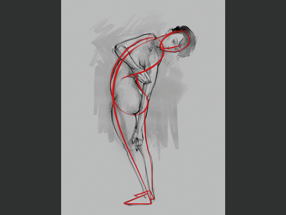
A solid figure gesture can set up your entire painting. You have the head, followed by a connecting line that will describe the longest movement of the figure. We then have feet placement and this is crucial for showing balance. Here I use the classic 'bean' technique to show torso twists and bends. I then add the rest of the figure.
03. Refine the sketch
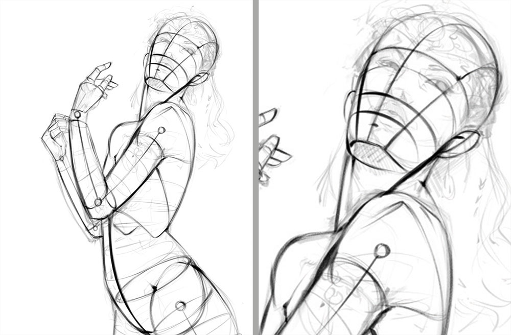
I imagine the figure as simple tube-like forms, then sketch a rounded bucket shape for the pelvis and a circular shape for the ribcage. External signs of the skeleton are great landmarks to show angles of the figure (hip bone, elbows, collarbone and suchlike). I pay attention to negative space around the figure to plan the silhouette and proportions.
04. Add values
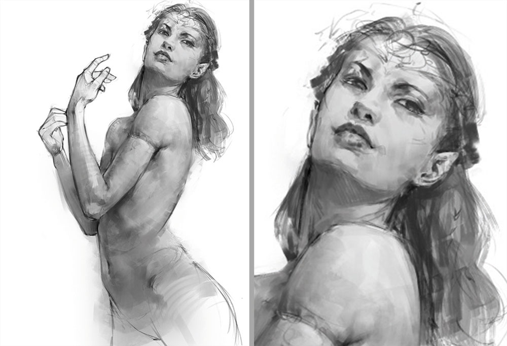
On a new layer, I begin using large brush strokes to build simple shapes and forms. I brush around the contours to show volume more clearly. When it comes to value, less is more. My initial value range will rarely go beyond 20-80 per cent, meaning that I'll not go entirely black or white. I can always boost the image later on.
05. Apply colour
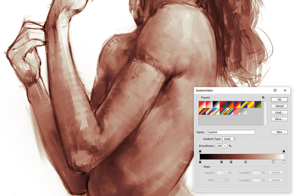
When adding colour, my first step is to use gradient maps. Red for the shadows, saturated pink/cream for mid-values and desaturated cream for highlights. On a Color layer above, I add purple to the hair, overall variations in hue and red to her cheeks, nose and ears. I use a Hard Light blending mode to add saturated colours and darken areas simultaneously.
06. Paint realistic hair
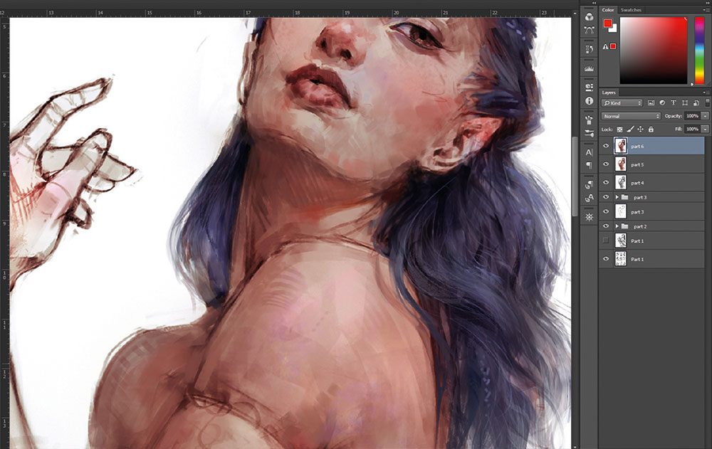
I'm not fond of the term 'spaghetti hair', but it's an accurate description for something you want to avoid. A common mistake with hair is to paint every strand individually. Realistically hair doesn't do this; it will cluster and form groups. In this step I paint larger shapes first. Single strands are then added afterwards for an element of realism.
07. Introduce a painterly texture
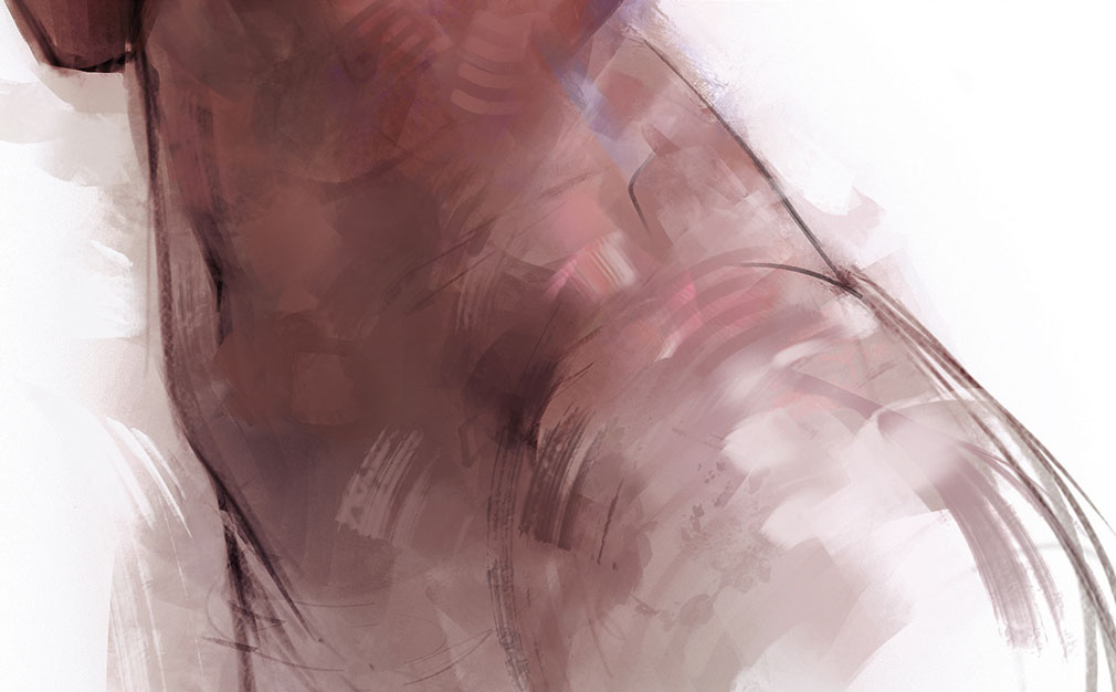
To achieve a painterly feel in my work I use Hard-edged brushes at 100 per cent Opacity and Flow (in Brush Settings/Transfer set Control to Pen Pressure). I use fewer brush strokes, placed carefully. I apply them heavily and leave strokes more exposed. Using hatching and scatter brushes is a great way to blend areas together and add variety.
08. Give characters accessories
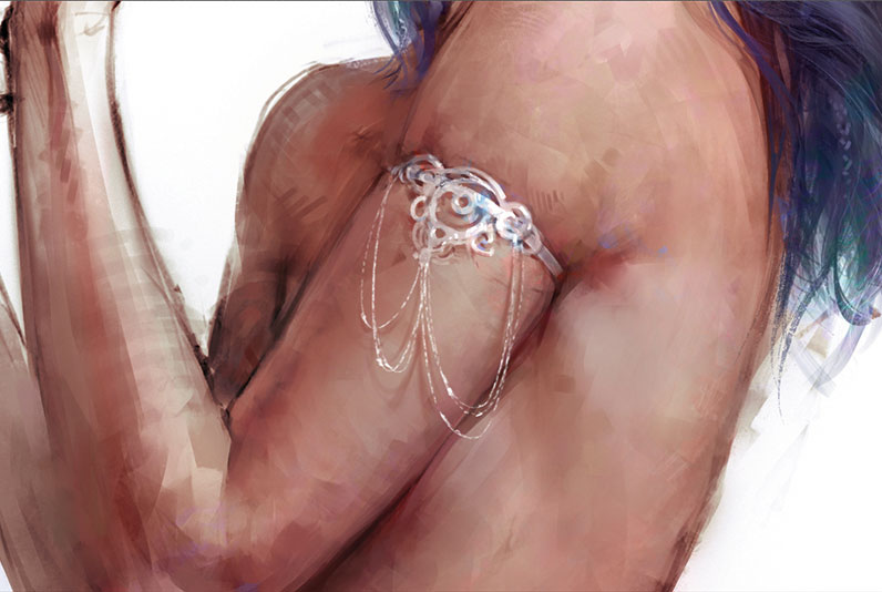
Because my character is an elf, I feel I need a fantasy element to an otherwise nude female figure. I decide to give her an arm ornament made of the silver-like mithril. The ornament curves around the arm to match its tube-like shape. Darkening the skin above shows the indentation of the skin and I add shadows around the edge, and finish with highlights and chains.
09. Render the face
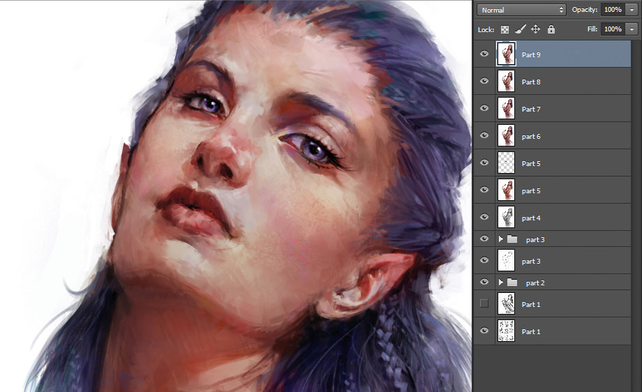
I refine the face by reducing the brush size and working on smaller details. I blend out unwanted brush marks and focus attention on the face geometry (planes). Her face is looking a little flat, so I used the Liquify filter (Cmd/Ctrl+Shift+X) to correct the curvature. Increasing the saturation and sharpening edges helps to define the face as a stronger focal point.
10. Use Photoshop's Smart Objects
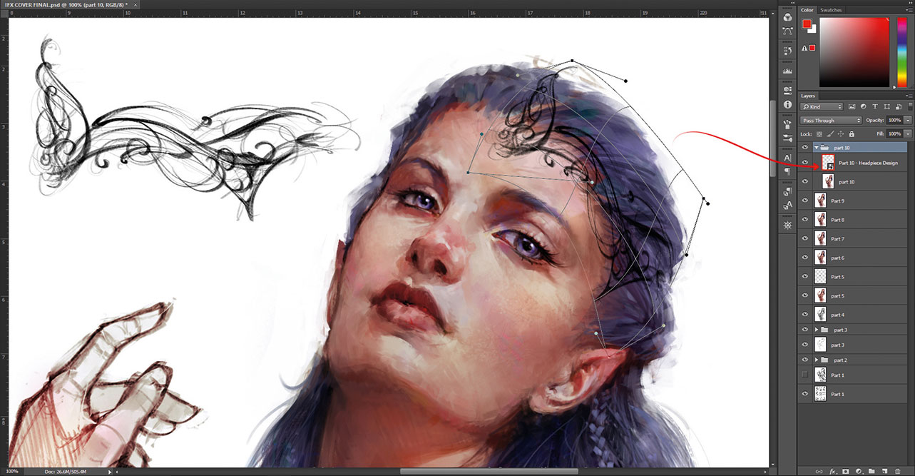
To match the armband, I design a tiara-like mithril headdress. I want to bend and shape the object. So, using a flat design, I right-click the layer and select Convert to Smart Object. Holding Ctrl/Cmd+T for Free Transform, I right-click the bounding box and choose Warp. The design can be edited at any point by double-clicking the layer icon and saving it. The design will update automatically in the main file.
11. Make eyes come alive
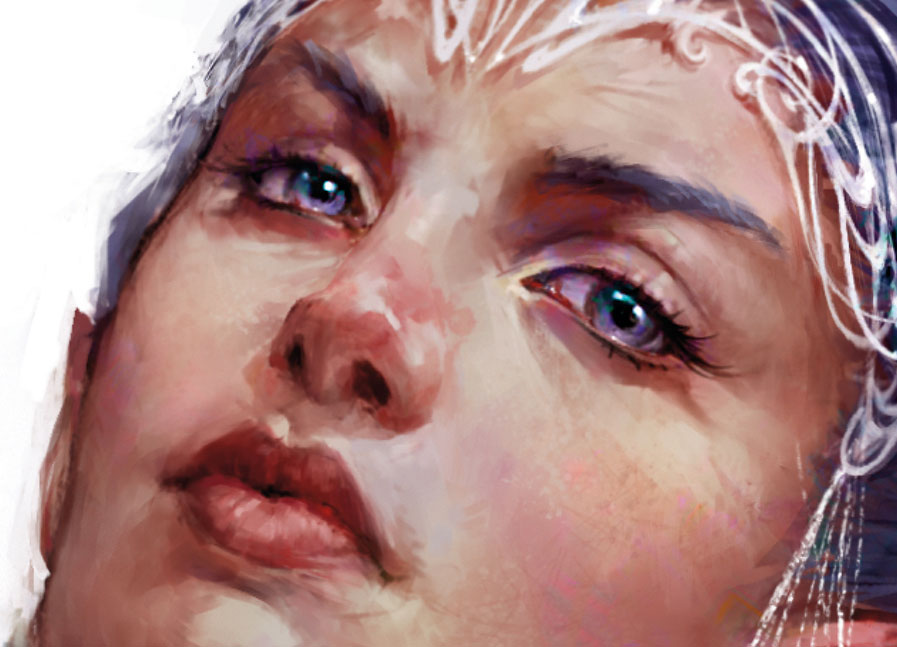
Eyes are a very engaging feature for the viewer and they hold a lot of emotion. A common mistake is to make the white of the eye too bright – instead, adding subtle colour and shadow will improve their form. Here I add specular highlights to the eyes and a burst of colour around the highlight edge. I've found this to be a great way of making them pop.
12. Drape fabric naturally
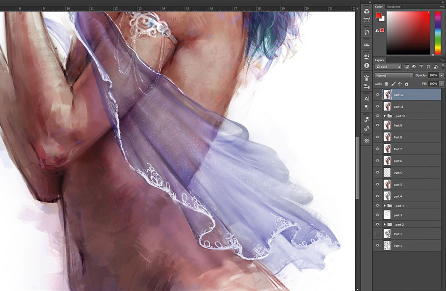
On a new layer I sketch the shape of my fabric. It's important to keep true to the laws of nature by having the material fall naturally. With translucent material I ensure that any areas that overlap are more opaque. Using the dotted speckle brush I lightly add a glittery texture and finish with details to complement her jewellery.
13. Remove distractions
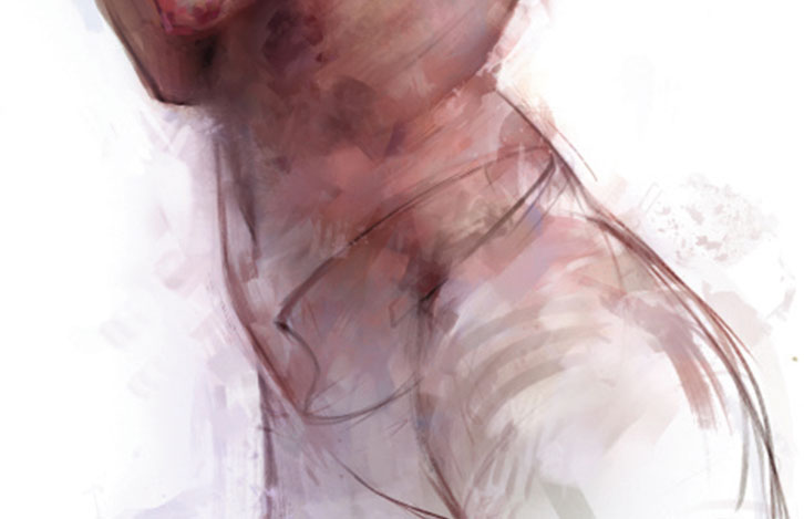
The magazine team thinks that the fabric might distract from the character's anatomy, so I remove it. I brush white over the bottom half of the figure and use large brush strokes to loosely paint back in areas of my choosing. I reduce saturation in the lower body by using black on a saturation layer and I brighten the face using the Dodge tool, set to Highlights.
14. Add final touches
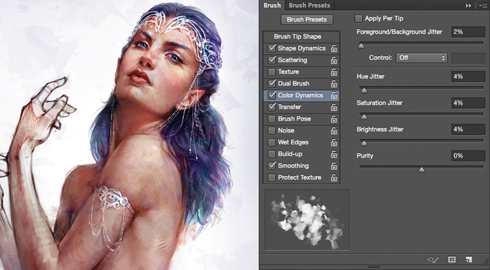
The final stages to my paintings undergo similar refinements. These include the blending or sharpening of edges, a final Color layer where I scatter random hues to add interesting variations, lighting tweaks and a final overall sharpen. For this illustration I add a subtle purple vignette that frames the character's upper body and draws the viewer's eye to her face.
This tutorial originally appeared in issue 135 of ImagineFX, the world's best-selling magazine for digital artists – packed with workshops and interviews with fantasy and sci-fi artists, plus must-have kit reviews. Subscribe to ImagineFX magazine here.
Related articles:

Thank you for reading 5 articles this month* Join now for unlimited access
Enjoy your first month for just £1 / $1 / €1
*Read 5 free articles per month without a subscription

Join now for unlimited access
Try first month for just £1 / $1 / €1
