How character design has shaped our world
Characters can define a concept and even take on a life of their own. Pictoplasma takes us through the history of character design.
Remember the days when the internet was so slow that loading one picture took several minutes, you needed to know an hour in advance what song you wanted to listen to next on Napster, and video was completely out of the question? Only about a decade and a half ago, at the dawn of the digital age, we were excitedly listening to the dialling tones of our 56k modems tuning into a new world, eagerly waiting to be greeted by a handful of pixels.
The new breed of figurative design at the turn of the millennium was dominated by friendly, abstract and flat characters, so highly reduced they were almost bordering on typography. Characters were made up of bulky, rectangular pixels as if to celebrate the new medium of the computer screen.
At the same time, they avoided all narrative, biographical or cultural context, functioning purely in terms of appeal. It was exactly this quality that set them up to be the main players in a new, minimal yet highly emotional aesthetic that has since spread across the visual world.
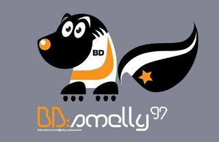
Some of the most memorable characters of the time were designed by typographers like Büro Destruct. The Swiss graphic design agency was among those at the forefront of reduced figurative design, releasing very minimal, geometric characters alongside new typefaces.
It makes sense to understand the aesthetics of character design in terms of communication. Tellingly, the English word 'character' has multiple meanings. It describes a coded icon in a system of language, a figurative representation, as well as a persona. Fulfilling all three qualities was a distinctive feature of these early characters on the internet. The characters needed to function as a replacement of language - as if, with their universal appeal, they could transcend cultural differences and language boundaries, creating a graphical Esperanto that would put us all in the same global village.
The third meaning of the word, personification, was linked to the idea of the internet opening a new, virtual world in which these characters were supposedly at home. It is the most complex concept of character and brings us to the controversial question of whether humans can be graphically represented by avatars.
Non-narrative mascots
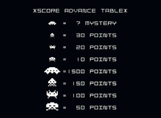
Before the internet gave characters a new territory to populate, their natural habitat was mainly in the worlds of animation or comics, as commercial mascots or in video games. Space Invaders - one of the first and most iconic arcade games to introduce character visuals - was all about playfully taming our technological angst. The unknown was clearly represented as an archetypical, hostile alien race approaching our world.
Get the Creative Bloq Newsletter
Daily design news, reviews, how-tos and more, as picked by the editors.
The design of the aliens was focused on anthropomorphising a handful of pixels, which created an iconic logotype that continues to communicate with generations even today. In contrast, the graphical representation of the player was nothing more than a pixelated icon of a gun firing to the sky. The idea of representation was completely non-existent.
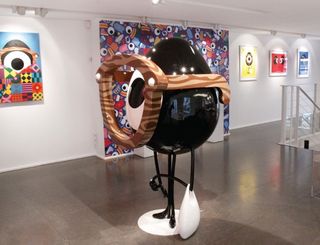
Graphic novels, comics and the animation industry have created an endless stream of iconic characters that continuously dominate popular culture. But these genres subject their characters to a strict narration and biography. Our understanding of them is guided by a knowledge of their behavioural patterns, aims, needs and their interaction with others. This is where the character iconology of the internet differed fundamentally - the characters here were solely dependent on making a visual connection and had nothing more to tell us than 'hello'.
Cutting through the white noise
Indeed, the characters of the internet boom had much more in common with the idea of a commercial mascot. The history of this phenomenon started with the Michelin Man. In 1894, a stack of tyres reminded the brothers who were running the business of a standing man, and the first mascot ever to be developed by a corporation as the face of a brand was born.
What followed was an avalanche of new mascots. Characters on cereal boxes; Ronald McDonald, both in costume and graphics; the Esso Tiger, blown out of proportion on the roof of gas stations; and the chocolate drop-shaped creatures for M&Ms are just a few examples of the mascots still known globally today. The mascot is a phenomenon that can best be understood in terms of visual communication. Positioning Theory, predominant in marketing since the 1970s, uses the example of a ballooning mass communication that makes it more and more difficult for any message to reach the recipient.
In order for a brand to succeed, it needs a focused and simple position that differentiates it from any other, making it unique in the consumer's mind. Only a clear, direct message can cut through the growing white noise of information overload in order to reach the consumer. And mascots have been conceived as essential partners in this process.
Positioning Theory can also enhance our understanding of how characters communicate on the internet. The character visuals that emerged online reinforced a reduced and minimal facial pattern, an aesthetic that has been linked with the very origins of image culture. These patterns were the key to communication without words, drawing our attention to websites. They acted not as a form of human representation, but the incarnation of beings living in a virtual world - they were friendly gatekeepers, functioning more like a mask or mascot does than the narrative characters in animations and comics.
Of course, to conjure this mantra today seems anachronistic. By now we are used to instant photography and video, wherever and whenever we want it. We are uploading, sharing and multiplying a never-ending stream of photos, depicting our food, our pets, our faces. There seems to be no more need for reduced or abstract representation. So, where have all the characters gone?
The move to reality
The desire to break free from the internet came early on in its history. Urban designer toys - direct translations of digital perfectionism, with their minimal, geometrical shapes - saw their peak in popularity right at the beginning of the millennium.
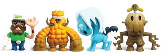
Growing out of a cultural phenomenon that originated in Hong Kong, renowned Western protagonists such as James Jarvis, Pete Fowler, Nathan Jurevicius and Kaws released a cast of characters that were immortalised in vinyl and became sought-after collectables.
As a counter to the often sterile, mass-produced feel of urban vinyl, a wave of cuddly, handmade, designer plush dolls followed. Most notably, David Horvath and Sun-Min Kim's Uglydolls, which started out as personal love-messengers during the pair's long-distance relationship, but became a mainstream product.
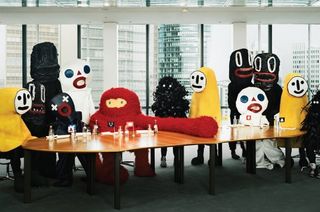
From there, the obvious next step was to grow in proportion, and soon character costumes from the hands of designers such as FriendsWithYou and Doma inspired many artists to translate their two-dimensional characters into the real world.
Back in 2006 we created the PictoOrphanage, a family of 30 costumes based on character designs by various artists, lifted by personal donors from the two-dimensional world into our three-dimensional one. Together, all these strategies can be seen as ways of transmediating the virtual world of the internet (or, any flat image, generally) to our reality. Lately, more and more digital artists have started to explore analogue techniques, thus questioning the divide between digital and analogue and anticipating the movement towards post-digitalism.
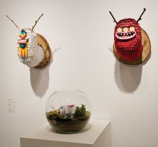
Nina Braun and Anna Hrachovec bring graphic structures and boldness to the meticulous craft of knitting. Roman Klonek translates his digitised sketches into woodcut prints, and Bakea has gained a following for his digital illustrations of sepia-toned, three-eyed monsters via social media, while his real passion lies in turning them into 'taxidermies'. Numerous artists vectorise their sketches before painting them onto canvas. The list could be endless.
While all these works may be perceived as mere analogue objects, their links with a digital aesthetic or tool transform them into a comment on the impermanent state of any digital image, for which the rule is: when power is off, it will be gone. Making the transition to analogue media helps increase longevity.
Mascots and street art
Another strategy of many artists in their quest to establish a recognisable character is to build upon a common visual vocabulary they share with their audience. Often, characters resemble popular commerical mascots, with slight variations and alterations freeing them from the product they used to stand for.
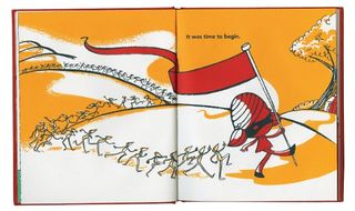
The playful quoting, remixing, deconstruction and echoing of established mascots can be seen in Juan Molinet's fake Japanese product designs, or Osian Efnisien's 'tiny' series. In 2003, Doma introduced a slightly altered version of Ronald McDonald as a presidential candidate in Argentina's times of national bankruptcy. Its animated commercials and street campaigns criticised the reduction of the economy to beef production and not off ering an aspiring generation other chances. Illustrator Jeremyville's ongoing series of Community Service Announcements casts iconic mascots making reconciliatory gestures to try and heal the damage they've done as representatives of their parent brands.
Back in 2013, Pictoplasma created its White Noise Serials installation; applying 500 different designers' characters onto empty packages, selling nothing more than the characters themselves. All of these examples manipulated the original mascot, and by changing slight details or putting them into new contexts, manged to evoke entirely diff erent meanings and associations for viewers.
Turning to the streets, urban artists have established their distinct characters as mascots, including The London Police, Flying Förtress, D*Face and Buff Monster. Street art stands in direct competition to branding – the practice started as a reappropriation of the public space that was so visually dominated by advertising.
By applying the same method as branding - positioning a clear message with a mascot - street artists turned advertising's means against its cause. The connection between the two can be seen in the Clean City law that São Paulo introduced in 2006, in which advertising was prohibited and removed from public space, and with it also all urban art.
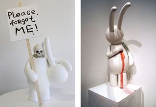
The artist mr clement presents his bunny character, Petit Lapin, as a generic rabbit shape, plain white and almost featureless. It's as if it were an empty, white screen, offering itself to our projections and longings. Still, he uses it as a mascot throughout his work. With an output of paintings, comics, sculptures and toys, mr clement is creating a growing body of artwork that revolves around a character as an empty shell.
From the deconstructive critique of the mascot, via the reclamation of the public space, mascots are starting to divorce from product associations and stand for themselves. This becomes most obvious in cases where the character clearly functions as an alter-ego to mask or replace the artist.
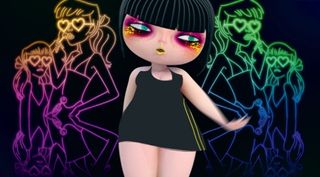
For instance, Cherry - singer of virtual electro-pop band Studio Killers - has been circulating as a graphical visual identity on the web and in animated music videos for some time. Fans were kept in the dark as to her actual creator.
When the artist behind Cherry revealed herself during a talk at the Pictoplasma Conference, she explained how the character was initially created as an alter-ego - her fantasy of a woman completely at ease with being different from the female stereotype. Perhaps the next stage of evolution for mascots will be a point at which creator and character have become completely indistinguishable.
Words: Lars Denicke and Peter Thaler
Lars and Peter are the co-founders of Pictoplasma, a unique organisation that specialises in contemporary character design, working across publishing, events and exhibitions. Its renowned Berlin Conference and Festival is celebrating its 10th anniversary this year. This article originally appeared in Computer Arts issue 227.

Thank you for reading 5 articles this month* Join now for unlimited access
Enjoy your first month for just £1 / $1 / €1
*Read 5 free articles per month without a subscription

Join now for unlimited access
Try first month for just £1 / $1 / €1
The Creative Bloq team is made up of a group of design fans, and has changed and evolved since Creative Bloq began back in 2012. The current website team consists of eight full-time members of staff: Editor Georgia Coggan, Deputy Editor Rosie Hilder, Ecommerce Editor Beren Neale, Senior News Editor Daniel Piper, Editor, Digital Art and 3D Ian Dean, Tech Reviews Editor Erlingur Einarsson, Ecommerce Writer Beth Nicholls and Staff Writer Natalie Fear, as well as a roster of freelancers from around the world. The ImagineFX magazine team also pitch in, ensuring that content from leading digital art publication ImagineFX is represented on Creative Bloq.
