What to do when a client rejects your designs
Win over sceptical clients with this advice for dealing with rejection from leading designers.
Picture this: the concept is sound – in fact it's the best you've designed in a while. The team has invested copious research, insight and creative juices, and come up with a presentation that will envelop the client in a wave of enthusiasm and appreciation.
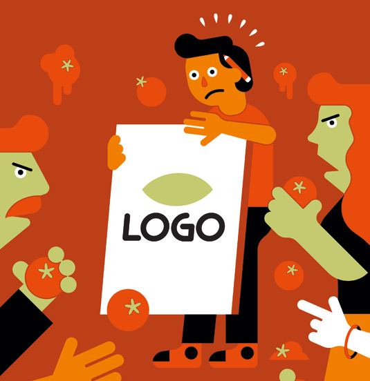
The deck is finessed, the sell is delivered with gusto and everyone looks up at the client in anticipation – only to find tumbleweed blowing, followed by a big fat 'no'.

Admittedly, this scenario is extreme. Everyone knows that good designers build relationships with clients based on trust and communication.
It's important to create that trust from the start, to challenge a woolly brief and seek access and exchange throughout the design process, making a point-blank dismissal unlikely.
As James Kent, founding partner and executive creative director of Why, says, communication is 80 per cent of a designer's job. A good designer needs to sell ideas, concepts and variations on a theme throughout the project, minimising the risk of outright rejection wherever possible.
However, the big fat 'no' can happen. If you're faced with rejection, don't panic. This is the point at which a designer's mettle and communication skills come into their own.
Read the room
If you find yourself in a client scenario that screams rejection, it's always important to remember that those clients are just people, stresses Steven Wills, creative director at Substance.
Get the Creative Bloq Newsletter
Daily design news, reviews, how-tos and more, as picked by the editors.
"It's easy to pick up the signals being projected by the people in front of you in a presentation," says Wills. "Therefore it's your job as a person, not a designer, to understand and pick up on this."
Get the measure of the room. "Some people need persuasion, some are skeptical from the start, some just want to learn more in order for them to make a decision on something which isn't their area of expertise," says Kent.
"A good designer and presenter would be able to see this and tailor their presentation to fit these people and to answer their requirements, allowing them to concentrate on the work and make informed and confident decisions."
Engage in conversation
So if a design is going down like a lead balloon, don't keep on presenting. You're better off acknowledging things aren't quite right. "Engaging in a conversation at this stage is vitally important," adds Kent.
"This is when the client is at their most engaged and this is when you can pick the key drivers that will make them love the next route you show. If you labour that first route that they hate and drone on, then when you get to route three, even your excitement for it won't be enough to bring them round."
Sarah Cattle, creative director at Pearlfisher, agrees, adding that giving clients the time and space to absorb the ideas is a good idea. "What on first viewing may evoke a strong reaction, either way, can change within 24 hours," says Cattle. "Encourage clients to combine their immediate gut reaction with their perspective 24 hours later."

If the response is an ultimate rejection, however, it's time to listen even more so. Go Media president and designer William Beachy suggests restating the client's feedback back to them. "This shows the client that you are listening and it also helps to eliminate any misunderstandings," he explains.
"It's tough to hear negative feedback about your design. And it's quite natural to throw the defenses up and fight. But just stop. Take a deep breath and consider what the client has told you. Maybe they're right."
As many point out, designers are not artists, but hired to produce great creative work within the confines of a brief. "Designers must remember this," says Wills. "Clients have a far greater understanding of their specific business and marketplace than the designer does and therefore have a valid and important perspective in shaping what is ultimately created."
Fight for ideas
Nonetheless, having listened to and understood a client's feedback and views, you might still want to stand up for what you believe is the right design route.
Algy Batten, owner at branding agency Fivefootsix, reckons that doing an about-turn the moment a client doesn't see the value in something suggests the designer might not have confidence in the solution, making the client lose faith.

Fredrik Öst, co-founder and creative director at Swedish agency Snask, says that he has experienced rejection of design ideas many times, but has always managed to fight for them. "Fight for your ideas and design concepts. If you don't know how to then you haven't designed with the right process," he says.
"If you have a good relationship with the client, then it shouldn't be persuasion but convincing. The difference is that convincing is showing evidence and reason as to why and how your idea and concept works."
"Then the client will have to reason as to why it doesn't work, and then you can agree or disagree but it will end in a compromise, and you will want that compromise to be beneficial for both sides."
Design-based reasoning
Showing the evidence and reason behind a good design is crucial. Before a presentation, Robert Soar, creative director at Dragon Rouge London, tries to think of all the questions a client may have. "I need to prove that I have thought of everything and this gives the client more confidence in us. They become more open to being persuaded that our idea is right as a result."
"You need to back up all ideas with concrete insight," adds Kent. "Frank and honest conversation is always the best solution. If you genuinely don't think a client's preference is right, then you need to offer the suggestion why."
"If through your research and background work you can honestly say that pink will offend 36 per cent of the audience, then this is what will convince otherwise. Do your research and have a reason for everything, don't stew in the studio pushing pixels."
The way you present those facts can also make a marked impact. You have to state your case calmly and knowledgeably. "If you can't intellectually explain the merits of your design choices, maybe your design choices are more subjective than design driven," says Beachy.
"For instance: 'Well Bob, we shouldn't put yellow text on a white background because there isn't sufficient contrast for anyone to read it' is a design merit-based point. 'Well Bob, we shouldn't make your logo pink because, uhh, it's ugly' is just your subjective opinion and isn't going to convince anyone of anything."
Provide real world examples
Using real-world examples to make a case can help to convince a client of the merit of a design idea, adds Beachy. "It's hard for clients to argue with you when you're following a design principle that Nike, Apple and Coca-Cola are also employing."
Another trick, says Beachy, is to show clients both options – their preferred way, and yours. This gives the client the feeling that they are in control. In fact, reassuring the client that they are in charge is a crucial step in dealing with rejection. "You need to start by lowering their defences," says Beachy.

No matter how adept at communicating a designer is, eventually there will come a situation, in which a return to the start is required. At this point, the challenge is to refuel and find energy to start over again, says Öst.
Kent suggests taking a significant step back. "Don't try and design yourself out of it. Don't sit at a computer, fiddling with things, hoping the next route will solve the problem – it won't," he explains.
"You need to take a bigger step back and work with the client, take each step of the process with them so they are party to all the information, reasoning and background. Then when you re-present ideas they will see how you came to that conclusion."
Know what the client doesn't want
Coming up with an entirely new design can have an impact on costs and time, but there are ways of tackling this challenge too. When Cattle and her team were at the first stage of a project for natural skincare brand Green&Spring, she loved a concept that was later rejected.
"I took it on the chin," says Cattle, "but rather than give them another set of three worked-up concepts, which would have taken another two weeks, I decided to approach it differently."
Cattle created loose conceptual boards, with sketches and inspirational imagery, which took her around two days. When those pieces were presented to the client, they fell in love with the 'British Bird' concept.
Ironically, the second solution is often better than the first, Soar points out. And so it should be: "You are now very clear what the client does and does not want."
Through the fog of possible disappointment and the energy spent on extolling the merits of your brilliant original idea, one thing in particular is worth remembering. "Pick your battles," Beachy says.
"Take a moment to remind yourself that you're a commercial artist. You're being paid to help a client execute something. You should always work to produce good design, but know when to fight and when to just give the client what they want."
"Learn to put your ego on the shelf for a while. Ultimately, your design is not you. You have tens of thousands of these projects ahead of you. So let's not give ourselves a heart attack over every one."
Words: Anna Richardson Taylor

The full version of this feature first appeared inside Computer Arts issue 245, a branding design special packed with expert tips for creating outstanding branding.
Liked this? Read these...

Thank you for reading 5 articles this month* Join now for unlimited access
Enjoy your first month for just £1 / $1 / €1
*Read 5 free articles per month without a subscription

Join now for unlimited access
Try first month for just £1 / $1 / €1

The Creative Bloq team is made up of a group of design fans, and has changed and evolved since Creative Bloq began back in 2012. The current website team consists of eight full-time members of staff: Editor Georgia Coggan, Deputy Editor Rosie Hilder, Ecommerce Editor Beren Neale, Senior News Editor Daniel Piper, Editor, Digital Art and 3D Ian Dean, Tech Reviews Editor Erlingur Einarsson, Ecommerce Writer Beth Nicholls and Staff Writer Natalie Fear, as well as a roster of freelancers from around the world. The ImagineFX magazine team also pitch in, ensuring that content from leading digital art publication ImagineFX is represented on Creative Bloq.
