How designers can make the most of social media
Clever use of Instagram, Twitter, Facebook and Flickr can boost your design career. Tim Easley explains how.
As a designer it's important to be on top of your social media. It's often the best way to promote yourself and your work, as well as a good way to collect stalkers, if you're into that sort of thing.
Although it's tempting to join every platform out there to make sure people see you, I've found it's best to concentrate on a few so you don't spread your efforts too thinly. I use four very different platforms, so here are some of my tips for using each one.
01. Facebook
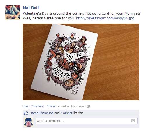
- Don't be a mirror. If you're posting on a few different social sites, it's tempting to link them or just repeat content across platforms, but you should be aware that a lot of your followers will be adding you on a few different networks, so try to keep your content fresh. Post up albums of images, links to articles or other people's work that you find interesting, and also try sharing and commenting on other designers' work. This will help keep your page's content varied, as well as introducing yourself to potential new contacts. And we all know that making friends is fun.
- Engage people. Facebook is a great platform on which to ask questions, and so it can often be good to invite discussion when you post content. Ask people what they think of a work in progress, impart some advice, or ask people what their favourite piece of your work is, but most importantly get people talking. The more comments, likes and shares you get, the more likely it is that your posts will show in people's feeds, so the more likely it is you'll get new likes.
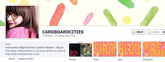
- Add apps. There are a variety of apps available for Facebook, including ones to add your Etsy store to your page, link your Instagram, or run competitions. It's often hard to find the good ones, so stalk other people's pages to see what they have, and if you like the apps they're using then it's usually pretty easy to find a link to install it yourself, or to give to your sidekick to do.
02. Instagram
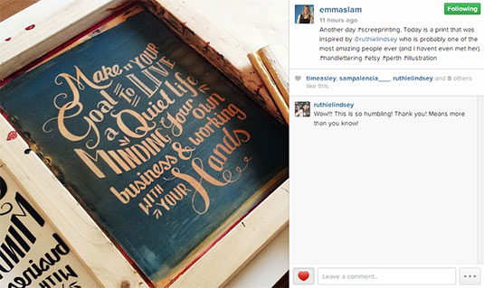
- Keep it varied. Instagram is obviously a very visual platform. For that reason you want to make sure you keep your feed visually interesting. It may sound like a stupid thing to say, but it's something that's often overlooked. You might be making your next masterpiece, but nobody wants to see 100 different shots of the same bit of work from different angles - you're not making a stop motion animation. Unless you are, in which case post a video instead.
- Show your process. Let people see how you do what you do by posting images of roughs, or videos of you working. Many users on Instagram are students and still developing their style, so they'd love to see what equipment you're using or your creative process - probably even more than photos of your cat and your half eaten breakfast.
- Get personal. Of all the main social networks, Instagram is the one where people can most comfortably mix their work and personal lives, which is great for letting your 'fans' feel more connected to you. But do consider who will be looking at your feed and what they're likely to want to see. Posting photos of interesting things you see on your travels is usually fine, but showing everyone that weirdly coloured lump that just appeared on your foot may be a post too far.
03. Flickr
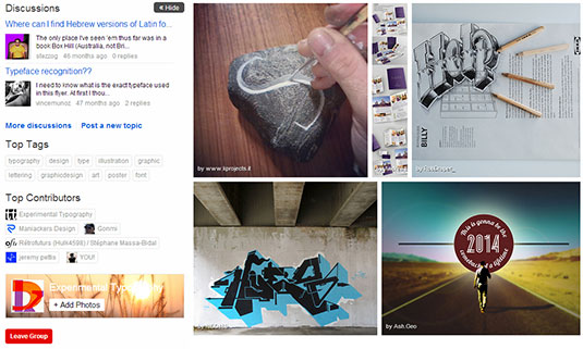
- Protect your content. The most important thing to do when uploading to Flickr is setting your default copyright for new uploads. You'll find this in ‘settings / privacy & permissions / defaults for new uploads’. Set it to ‘all rights reserved’ if in doubt and you're good to go. You don't want to accidentally give permission for Jenkins from accounts to use your designs in his PowerPoint presentation.
- Tag tag tag. There are a lot of magazines, websites and companies that search Flickr for content to license, so make sure you use as many tags as you can to get your work seen by the right people. Add the obvious tags and variations such as 'design' and 'graphic design', but also think about the overall content or feel of your work. Tags such as 'bright' or 'melancholy' can describe your work in more specific but less obvious ways, so will be more likely to show up compared to other people who haven't thought so carefully about theirs.
- Group together. One of the main ways to get your content seen on Flickr is to add your photos to groups. Search for the design groups, and also any others that may be relevant to your work, then add some images! Content from groups show up in people's feeds, so even if someone doesn't have you as a contact they'll bump into your work. And because this is the internet, they won't damage it when they do.
04. Twitter
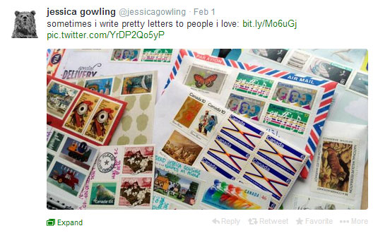
- Interact with your followers. Twitter is an awesome way to interact with people, and that's exactly what you should be using it for. If you try to use it as a kind of broadcasting system, where you shout about how awesome you are and then put your fingers in your ears, then you won't get very far.
- Make sure you reply to people. Especially those who retweet you or mention you to their followers. Keep in mind that they're doing so because they like your work or find you interesting, not because they're in your fan club and just can’t help proclaiming their love for you. If you ignore followers you'll soon lose them, and without them you're essentially just talking to yourself, which isn't much fun at all.
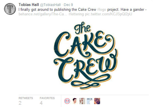
- Balance yourself. You should be looking to strike a good balance between general tweets and promoting your work. Nobody wants to follow someone whose tweets are mostly just links to their store or automatic posts from Facebook. Yawn. If you try to keep things interested and varied, people will want to know more about you and visit your store or portfolio without you nudging them.
- Get visual. There have been a lot of changes to Twitter over the last few months, and one of them is that tweets with images are displayed in a much better way now. You're a designer, so get visual. Instead of just posting a link to your work, stick a little preview up at the same time. It'll show in people's feeds and get them a lot more interested in what you're posting. People checking Twitter on mobile don't necessarily want to click on an external link, but they can quite easily enlarge your image.
Words: Tim Easley
Tim Easley is a self taught designer and illustrator from London, who enjoys hand drawn lettering and bright colours. As you might expect, you can follow him on Twitter, Facebook, Instagram and Flickr.
Liked this? Read these!
- Use social media to get design work
- Free social media icons: 14 sets to download today
- The designer's guide to getting a life
What other social networks are you using to advance your design career? Let us know in the comments!
Get the Creative Bloq Newsletter
Daily design news, reviews, how-tos and more, as picked by the editors.

Thank you for reading 5 articles this month* Join now for unlimited access
Enjoy your first month for just £1 / $1 / €1
*Read 5 free articles per month without a subscription

Join now for unlimited access
Try first month for just £1 / $1 / €1

The Creative Bloq team is made up of a group of art and design enthusiasts, and has changed and evolved since Creative Bloq began back in 2012. The current website team consists of eight full-time members of staff: Editor Georgia Coggan, Deputy Editor Rosie Hilder, Ecommerce Editor Beren Neale, Senior News Editor Daniel Piper, Editor, Digital Art and 3D Ian Dean, Tech Reviews Editor Erlingur Einarsson, Ecommerce Writer Beth Nicholls and Staff Writer Natalie Fear, as well as a roster of freelancers from around the world. The ImagineFX magazine team also pitch in, ensuring that content from leading digital art publication ImagineFX is represented on Creative Bloq.
